
Excerpted from InDesign Magazine, April/May 2011 (issue 41). You can also download the excerpt as a PDF that retains the full design of the magazine.
…
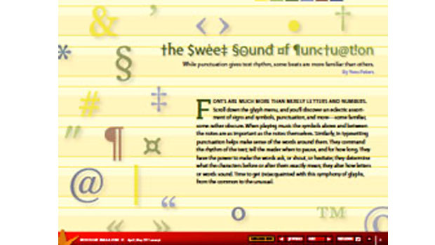
[editor’s update: to read this article, please visit this post: Typesetting Punctuation]
This article was last modified on September 8, 2025
This article was first published on June 20, 2011
Commenting is easier and faster when you're logged in!
Loading comments...