

Regular readers of this column know that I generally take a dim view of electronically manipulated type, such as fake obliques and digitally expanded and compressed type. But that doesn’t mean that I categorically just say “no” to fun, especially when it comes to decorative type. Decorative faces often put a premium on being offbeat, and that’s a notion I’m willing to pick up and run with. As proof, this installment is all about how you can create typographic mayhem using your programs’ controls over the stance, or angle, of your type, specifically employing backslanting to render obliqued or inclined typefaces upright. Since we’re abusing typefaces here, let’s abuse the English language too, and call these effects unitalics.
Decorative faces are meant to be eye-catching and unexpected, as shown in Figure 1. Taking familiar faces and giving them a new slant, so to speak, can be a quick route to this end.
Figure 1. Electronically manipulating typefaces tends to make them look weird, and in the case of most text and display faces, this is not a good thing. But many decorative faces are already unusual looking, so making them a bit more so isn’t a crime.
In Adobe InDesign, the stance of characters is controlled from the Character palette in the “Skew (false italic)” field. To input a negative value (creating a backslant), type in a number preceded by a hyphen as a minus sign. Alternatively, you can click the Skew setting’s down arrow to increment the backslant one degree at a time. In QuarkXPress, the only way to create this effect is to first render the type as outlines using the Item/Convert Text to Boxes/Anchored command. This turns the characters into vector objects in their own anchored frame. The angles of the character outlines can then be altered as with any other object, using the Skew control in the Item/Modify dialog box.
This process doesn’t create new typefaces, it just creates distortions of existing ones, but it can radically change the personalities of certain faces (Figure 2).
Figure 2. Classic faces Brush Script and Lydian Cursive get major facelifts if you give them an upright stance. In their vertical forms, they’re almost unrecognizable from their originals.
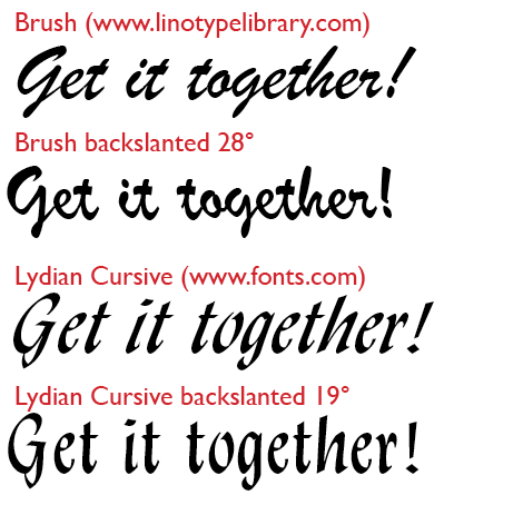
This effect works particularly well with script faces, especially those designed to imitate brush-painted lettering (Figure 3).
Figure 3. Roger Excoffon’s script types undergo subtle transformations when backslanted to a vertical stance.
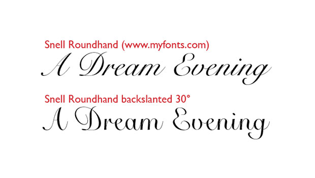
In general, the more extreme the slant of the original typeface, the more unrecognizable it becomes when stood upright (Figure 4).
Figure 4. Snell Roundhand loses its English hand script slant and takes on a quirky roundness of a different sort.
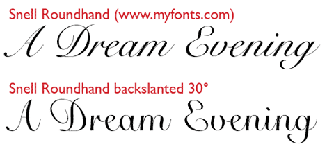
In general, applying backslants to connecting scripts — those whose characters link to each other in imitation of handwriting — doesn’t work very well. (Snell is clearly an exception.) The problem is that the connections tend to break up, and gaps appear between characters. Sometimes you can cure this by tightening tracking, but often not.
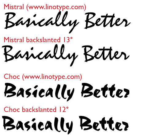
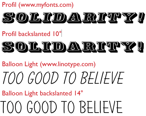
For other faces, the backslanting merely creates a vertical version, not radically different, but something likely unseen before, which may be all the distinction you’re after (Figure 5).
Figure 5. Taking the slouch out of Profil gives it a bit more of a 19th-century poster look, while standing Balloon Light up straight creates a more hand-drawn look, while also allowing you tighter tracking options that don’t work as well with inclined type.
Just because you’re creating weird type with this technique doesn’t mean you don’t have to pay attention to detail. For example, the angles of certain characters when backslanted may no longer seem in tune with their neighbors. To avoid having them stick out like sore thumbs, think about altering their stances individually.
Furthermore, you can only backslant a face as far as its uppercase letters will let you. In many oblique or italic faces, capitals are inclined less than lowercase letters. In these faces, getting the vertical stems of the lowercase characters upright may cause the capitals to look like they’re falling over backwards. You can adjust the angle of the caps individually, but it’s probably easier to stop backslanting when the capitals’ stance appears upright.
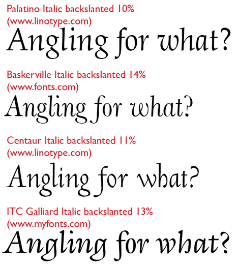
Figure 6 show what happens when you backslant italic versions of some popular text faces. I’ve put on the brakes when the capitals reached a vertical stance, so some samples still have some of their original oblique posture in the lower case. These examples are not going to win any beauty awards, but they have a certain charm in their weirdness.
Figure 6. Most italics treated like this look really, really bad. These look merely moderately bad. But if the idea is to catch the reader’s eye, bad can sometimes be good.
Using decorative type is all about being evocative, whimsical, and above all, eye-catching. Breaking the rules in pursuit those goals isn’t just legit, it’s fun too.
This article was last modified on August 12, 2021
This article was first published on October 6, 2010
Commenting is easier and faster when you're logged in!

Recommended for you

Book Excerpt: Typography Essentials
Ina Saltz shows how to make use of case, leading, images, and more to create bea...

InType: High-Contrast Fonts
InDesign Magazine issue 113This article appeared in Issue 113 of InDesign Magazi...

Scanning Around With Gene: Leather and Letters from Al Stohlman
My father was such a boy scout. I’m sure he had a lot of merit badges, and...