


In the first installment of this two-part article, we made the case for turning down the lights in computer editing rooms for graphic artists and photographers who need more-accurate color. Getting your workspace right for color-accurate situations may also require toning down the colors of walls, counters, and even monitor desktop color schemes. In this second installment, we’ll give you the information you need to turn your own office into a proper "digital" darkroom, or at least to move it in the right direction.
Experts agree that the most effective workspace for critical color work using computers is a specially designed, darkened room, in which the overall illumination is lower than the light emitted by the computer monitor. In recognition of this, the International Standards Organization (ISO) has issued updated standards for establishing proper lighting and environmental conditions in graphic arts facilities (see figure 1).

To incorporate the latest color imaging standards into your own workspace, you’ll first need to evaluate the overall quality of lighting in your editing room. Ultimately, you’ll want to get rid of incandescent (tungsten) bulbs and fixtures and switch to color neutral, 5,000°K light sources. To ensure the most color-accurate results, you’ll also need to evaluate wall paint, the color of your work surfaces, monitor placement, the affects of window light, and a host of other factors that affect color perception.
Spending time and money altering your workspace in the name of color accuracy may seem like overkill, but these changes can help you reduce miscommunications and color production errors and, ultimately, production costs.
Here are some important tips for transforming your own workspace into a professional color imaging facility. Figure 1 shows how I’ve set up my own office.
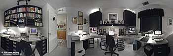
Figure 2: A "digital darkroom" that helps you achieve accurate color uses D50 (color neutral, daylight-balanced) lighting at a level that is lower than monitor brightness settings. Walls, ceiling, cabinets, and work surfaces should use neutral colors. Window light should be baffled so that a constant level of illumination is maintained throughout the work day. For a QuickTime VR version of the above, click here.
This article was last modified on January 18, 2023
This article was first published on March 6, 2001
Commenting is easier and faster when you're logged in!

Recommended for you

Printable Technologies Releases Next Generation Product – FusionPro 3.0
Printable Technologies, Inc., the world leader in e-commerce print workflow and...

InQuestion: Formatting Lists & Threading Text Frames
We answer the CreativePro InDesign community’s questions about multilevel bullet...
The quickest way to create a series of threaded text frames
Imagine you want four columns of text on a page, and want to do this with 4 thre...