


Hey folks-
Your faithful Editor-in-Chief here, checking in with a little behind-the-scenes info on all those free font articles I’ve written here over the past month or so.
It’s no secret that creatives love fonts, especially when they’re free. Free fonts are like puppies, pizza, and…that TV show that everyone loves.*
But if you’ll grant me an Orwellian ripoff, some fonts are more “free” than others. So herewith is my newly-minted personal free font manifesto:
- A font isn’t really free if you can’t use it in commercial projects.
- A font isn’t really free if it has defects that cause it to output incorrectly.
- A font isn’t really free if it corrupts your documents and crashes your apps.
- A font isn’t really free if you have to sign up for an account to download it.
- A font isn’t really free if you have to download and install a separate app to get it.
- A font isn’t really free if you look at one of the letters and can’t immediately tell what it’s supposed to be.
Fonts that violate any of the above rules, and in doing so waste your time and effort, are costly, even though you may not pay a cent for them.
So, when I set out to write a free font article, I take a lot of steps to make sure I don’t recommend a lousy font. I start by visiting a bunch of sites, browse for fonts that fit a theme, and if they look good to my eye, I download them.
Note that some free font sites have advertising that is designed to trick you into clicking it instead of the real download link for the font. This stinks, but when your price point is zero, you sometimes have to put up with a little nonsense. Here’s a tip: if there’s a big juicy button that says DOWNLOAD and a little boring gray one, click the little boring gray one.


Next, I actually read the license. I know! Who does that? Well, me. And I floss daily. Don’t hate me.

Mmm…legalese
Then I install the fonts on a computer and run a validation check to be sure they’re not crappy on the inside.
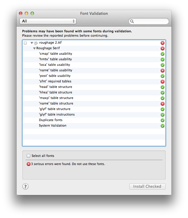
When the validation window looks like Christmas, I am not a jolly man.
Finally, I actually use the fonts in a document to make sure they show up correctly in the font menu and on the page.

Some fonts make my computer a little itchy. But I figure, better mine than yours.

Those fonts do not make it into one of my free font posts. And I have amassed quite a graveyard of not-quite-good-enough free fonts to save you the hassle of dealing with them.
And now I’ve added a final step of outputting the fonts in a Press-Ready PDF to confirm that each one can actually be embedded properly. For years, big foundries like Adobe have allowed all their fonts to be embedded for the purposes of print and display, so I’d assumed that unembeddable fonts were somewhat of a relic. Turns out I was a tad wrong.

One of the fonts in the original version of the 20 Free Sketch Fonts article (Sketchbook) turned out to be unembeddable, even though there was no mention of that in the license. So, my apologies for that. The post has been updated with a new font that can be embedded, and I’ve given myself a smack on head for violating the Felix Unger Rule of free fonts.
Hope you enjoyed the FontoberFest posts, and that you get some good use out those fonts. A lot of sites offer free fonts, but I’d like to think that the ones you’ll see here are a lot freer than others.
*Somehow I have failed to watch every cool, hip TV show for the last 20 years. Seriously. I still haven’t seen the X-Files. No spoliers, please.
This article was last modified on July 7, 2023
This article was first published on November 7, 2013
Commenting is easier and faster when you're logged in!

Recommended for you

Stylish New Fonts and Goodies from House Industries
Every design discipline resides at the crossroads of art, influence, relevance,...

Calling Type Lovers Under 30
Press Release SOTA Catalyst Award: Call for Entries The Society of Typographic A...
The Twelve Free Fonts of Christmas
Hope you were all good boys and girls this year so your holiday wishes come true...