

When Steve Jobs first introduced the iPhone in 2007, he may have done a slight disservice to the design community by implying that the beauty of the device was its ability to view full-blown Web sites, not scaled down versions. He went on to show the New York Times Web site and use the iPhone’s clever zooming capabilities to navigate the otherwise too-large front page.
Of course, it’s great that the iPhone and other mobile devices can surf the Web in its full glory. But mobile users are a different breed who typically want a different experience with their mobile device than when seated at a full-size computer. This doesn’t mean handicapping your Web site, but it does mean editing and formatting to take advantage of the small screen real estate and speed requirements of mobile users.
There are essentially three choices for how to go mobile, with variations on each choice.
First, you can simply tweak your site so it displays better on mobile devices. Second, you can design a parallel separate site just for mobile visitors. Third, you can work with companies that will help you create an automated mobile experience with everything from automated re-formatting to site design and hosting.
There is also a huge rush among Web developers to produce custom apps for specific devices like the iPhone and Blackberry. Don’t confuse these efforts with designing a mobile site, though they often work in parallel. Custom apps are typically meant to help people do one thing very easily; they aren’t a complete mobile experience. Also, these apps, while often simple in terms of what they do, require programming know-how and aren’t an easy tackle. Unless you provide a specific service designed for mobile users, it’s probably better to get your site visitors up and running with existing technology than to spend a lot of time and effort developing custom applications.
Let’s look at the three approaches to accommodating the mobile Web user.
Strategy 1: Optimize Your Existing Site
This is probably the least-effective option, since it can compromise the large-screen user experience while still not delivering a site that’s ideal for mobile viewing. But if you want to make a first stab at more effective mobile viewing, there are a few things you can do.
Keep the design simple, clean, and with larger type and graphics. Avoid drop-down menus and complex fill-in forms, which are harder to deal with on the small screen. Simplifying navigation and putting less information on each page will also be welcome to the mobile user. Use your own mobile device to navigate your site and some design issues will become obvious.
Mobile users are also often big Twitter users, so a separate Twitter feed will compliment a mobile site by providing links to content that mobile viewers are more likely to want when away from their computers. And since mobile users are texters, easy-to-find texting contact information is essential.
But ultimately, it’s problematic to design a single site for both large and small screens, and it still doesn’t fully take into account the different behavior characteristics of the mobile user (who may prefer speed over functionality, for example). So consider this strategy an interim step.
Strategy 2: The Second Site
Because it’s difficult to serve two masters effectively, a separate mobile site is the most appropriate solution — often designated by the URL “m.yoursite.com” or “yoursite.com/mobile.” This way you get all the bells and whistles on the big site and you give mobile users those things they find more useful (while always providing them the option of visiting the full site).
But then you must answer an important question: For which small screen are you designing this second site? Many people shoot for the iPhone as the ultimate mobile priority — and that’s not a bad choice, thanks to adoption trends and the fact that other mobile-device makers are imitating the iPhone screen and aspect ratio (480 x 320 pixels at 163 ppi).
Whether or not you take the iPhone route, explore Adobe’s Device Central (part of the Creative Suite), which has templates and screen specifications for thousands of specific devices. You can preview design mock-ups in Device Central and determine just how far you’re willing to go to customize each user experience.
Using simple Javascripts, it’s possible to identify most mobile devices accessing your site and serve up content specifically tailored to that device. But trying to deliver tailored content for the hundreds of devices out there can get overwhelming very quickly.
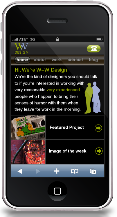
Let’s look at an example of how one design firm created a second mobile-specific version of its main Web site. W+W Design is a small but full-service agency in Santa Cruz, California. The principals, Jennifer Wills and Monika Wolff, wanted to showcase their client work with a mobile-specific site.
According to Wolff, “We intended to make our site quick, easy, and simple for the mobile user.” They decided to optimize the site for the iPhone.
Full site (top) and mobile site example of W+W’s home page. Click the image of the full site for a larger view.

Using Adobe Illustrator and Dreamweaver to create an HTML CSS-based site (the iPhone and some other mobile devices don’t support Adobe Flash), the two designers created a second site that not only showcases their general portfolio but serves as an example when pitching the firm’s mobile-design capabilities. Now, when making pitches or visiting clients, Wolff and Wills can compare their main and mobile sites side-by-side, highlighting the modifications they made for the small screen.
“We started by asking the question, ‘What is the most important information a mobile user would use?'” said Wills. That meant re-formatting images to fill the screen and changing text blocks to minimize scrolling. The two used Mordy Golding’s free iPhone template to test material. They also highly recommend having a mobile device available during the design process. “We really needed an iPhone during the process,” said Wolff. “It’s the only way to confidently preview results.”
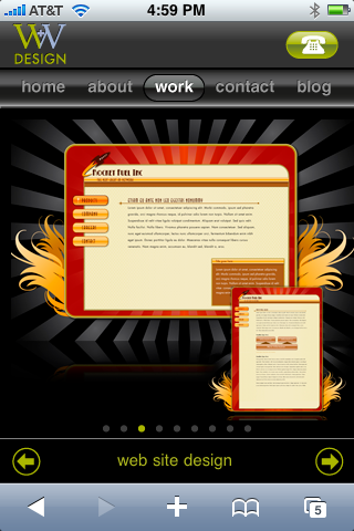
Another example of the same information displayed on both versions of the W+W Web sites. Click the image of the full site for a larger view.

Creating a mobile-centric second site took about two weeks and required a bit more programming knowledge than a typical site. “You have to think about things like minimum type size and finger size,” said Wolff, as well as making the site navigable using one hand. “But any good designer with knowledge of Dreamweaver can do this,” she added. Wolff and Wills found many of the Javascript snippets (to create scroll bars, for instance) for free online, which helped the designers over the rougher coding spots.
Another simple script detects the type of devices accessing the W+W Web site and automatically re-directs visitors to the mobile site when appropriate.
Strategy 3: Getting Help from Others
Maintaining two or more versions of a Web site can be problematic, when making updates and changes, since everything has to be done multiple times (unless you have a single content-management system). If your site is especially large or changes regularly, consider the third strategy: working with a commercial service provider that specializes in mobile content.
One of the more intriguing solutions to mobile content comes from a Canadian company called Mobify. Mobify creates what the company terms a “mobile view” of your existing content. Think of it as a set of dynamic templates that are applied to your edited content on the fly, delivering a unique version to each visitor who views your site on a mobile device.
Mobify’s tools help you select and edit existing content that you want served up to your mobile visitors. Because it uses your existing HTML and CSS, your colors, fonts, and structure are carried over to the mobile view.
Using the Mobify tools, a designer goes through an existing Web site and highlights content to be displayed on the mobile version. Click the image for a larger view.

Once you’ve selected the content and are happy with the results, Mobify servers sit between your site and the mobile user. When someone visits your site from an iPhone, for instance, Mobify detects that and delivers the optimized iPhone version of your site, using your main site’s live information. It’s as if your main site becomes the content management system (CMS) and Mobify formats the content appropriately to the visitor’s device. Mobify also has plug-ins for a number of popular CMSs, which makes the entire process faster.
Here’s how to create a “Mobile View”:
1. Sign up for a Mobify account and download the tool set.
2. Go through your site and highlight the content you want mobile visitors to see.
3. Mobify analyzes those edited selections and re-formats them for the small screen width, building new style sheets from your existing styles.
4. If desired, you tweak these styles before deploying the Mobify version of your site.
5. Mobile visitors to your site are redirected to the edited mobile view created on the fly by the Mobify servers.
Since the Mobify version is virtual, it doesn’t duplicate any of your content on another server. The mobile view is just a re-served version of your existing site based on the editing decisions you made upfront. And because Mobify delivers CSS back to you, you can easily edit and tweak the automated mobile view.
Mobify is free if you include a small Mobify logo in your Web site header. It’s $24.99/month if you include the Mobify logo in the footer and the words “by Mobify” in all page titles. To be free of Mobify’s branding, you’ll need the Pro version, which costs $100 a month but does include additional support and analytics.
McDonald’s Canada uses Mobify. Here’s an example of both the regular site and the edited view a mobile visitor is redirected to. Click the image for a larger view.

According to Mobify founder and CEO Igor Faletski, Mobify set out to combine automation with human decision-making (which he thinks is essential). “We wanted to create a one-time process for designers that didn’t require a lot of updating,” he said.
Once you make some initial editing decisions about the mobile versions, all you have to focus on is keeping the main site running and up-to-date. Since all versions of the mobile site use content from the main site, there’s only one set of data. Unless the main site is substantially redesigned, the mobile versions continue to operate automatically.
And since Mobify works in both directions, mobile visitors coming to your site to do a search are only given results that are available in the mobile version (even though they’re searching your entire site). Mobify captures traffic analytics for the virtual mobile site, so you can compare results between your big site and the mobile view.
Go to page 2 for best practices and more examples.
This article was last modified on May 19, 2023
This article was first published on August 3, 2009
Commenting is easier and faster when you're logged in!

Recommended for you

Achtung! Our InDesign Special Characters Guide in German
Danke (thank you) to Rudi Warttmann for translating our popular field guide for...

Get the Color You Expect When Printing
Do your press checks come with unpleasant color surprises? Then “Meeting Y...

The Type Project Book Excerpt: City Poster
See how to embrace your influences and borrow from them to make something totall...