

A few months back, I took a stroll down memory lane to revisit some popular faces from the 1980s that have been neglected recently and deserve a better fate. But now I’m reaching a bit farther back–a century back, in fact, to 1909–to see what Section 6, Part 2, of my revered Volume 204 of the International Correspondence School Reference Library calls “the best advertising, catalog, booklet, and folder types.” Even if I had revivals in mind, I’d be out of luck; most of these faces never made the transition from metal to digital.
The turn of the 20th century was the beginning of a golden age for advertising types, and the demand for novel and distinctive faces was just as strong as it is today. But the idea of typeface families was new, and the idea of routinely creating bold and italic complements to roman faces was just beginning to take hold.
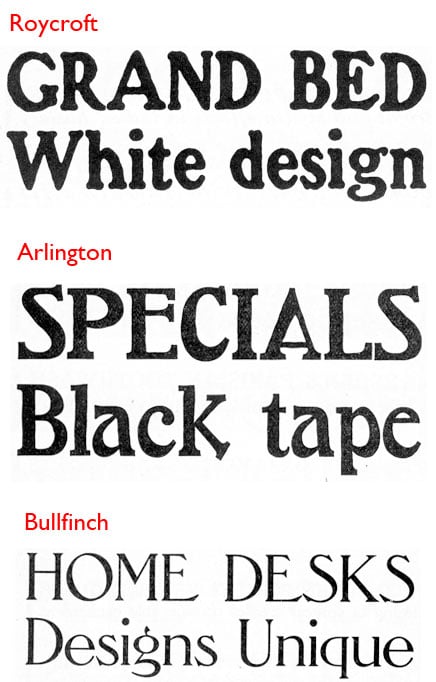
Most of the 30-odd types in the ICS book deserve the obscurity they now enjoy, as they look decidedly out of date. Some are hangovers from the heyday of the “fat faces” commonly seen on circus posters and the like. Many intentionally invoked an “old-fashioned” look even then, complete with rough, eroded-looking edges, and yet others used extreme features (not unlike today) such as exaggerated serifs and exotic character shapes to attract attention (Figure 1).
Figure 1. If Roycroft was supposed to look old-fashioned in 1909, it looks really outdated today. Likewise, Arlington’s quirky letterforms didn’t stand the test of time. Like so many trendy types, Bullfinch Oldstyle speaks to a certain epoch to the exclusion of all others.
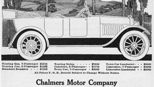
But a handful of the book’s recommended faces are still around and have become classics (or like Caslon, already were). Cheltenham, at work in Figure 2 below, was designed a little over a decade earlier by Bertram Goodhue and by 1910 was ubiquitous. It remains a workhorse today. It’s the headline face for the New York Times, for example.
Figure 2. The Chalmers Motor Company is long gone, but Cheltenham, used here for the display type, motors on into the 21st century.
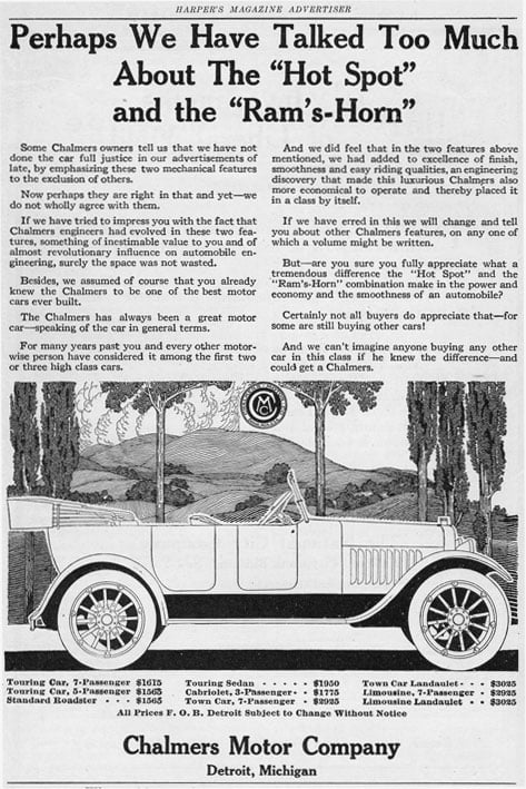
In an ad from a 1918 copy of Harper’s Magazine, a Monotype Caslon Bold title is wed with a Cheltenham Bold Condensed address line (Figure 3). By 1910, the Cheltenham family was already burgeoning in weights and widths. Caslon–in versions by just about every foundry making type–was a staple type right through the 19th century and into the 20th.
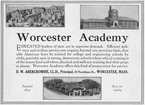
Figure 3. Worcester Academy was hedging its typographic bets with this ad, with the classic Caslon title, the contemporary Cheltenham address line, and the transitional Baskerville sandwiched in between as the text type.
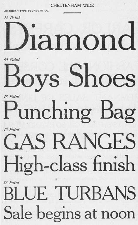
A handsome member of the Cheltenham family, Cheltenham Wide–highly recommended by the ICS–today exists only in metal form, available for hand composition and letterpress printing. If someone would like to take a shot at digitizing a version of this, as shown in Figure 3, I say go for it.
Figure 4. This version of Cheltenham Wide, from American Type Founders, features the relatively short x-height popular 100 years ago. Contemporary versions, such as the ITC version, have a taller x-height, which has the effect of making the ascenders look more squat.
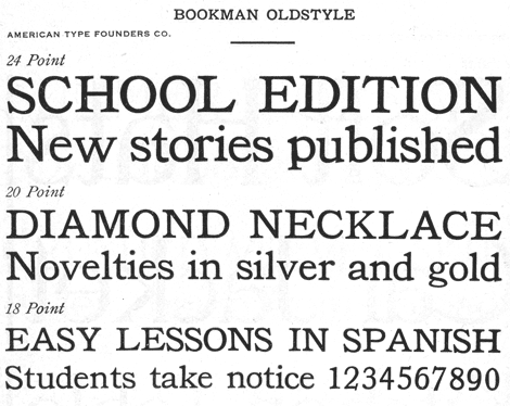
A third face from the ICS list that still makes the grade is Bookman. For a while, during the phototype era, Bookman was used mainly for its swash characters, but it did yeoman’s work as a product-labeling face during most of the 20th century. It enjoyed a mild revival in the 1980s and ’90s when it was one of the first typefaces digitized for use with desktop publishing systems.
Figure 5. Bookman is a rather bland face, a bit too bold for use as a book face, but highly legible in ad text settings. It has the prime attribute of a good display face: It attracts attention, but not to itself.
The reason Caslon, Cheltenham, and Bookman have persisted over the years is that, apart from handsome proportions and balanced color, they are free of gimmicks. They have distinctive designs that make them easily identifiable, but they hew closely to timeless letterforms, and this timelessness rubs off. Their magic lies in being sedate but not boring. If you consider the number of “classic” faces among the 40,000 or so on the market today, you realize that this is no mean feat.
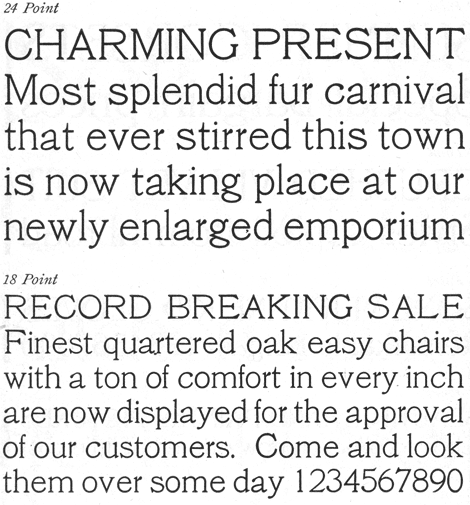
The ICS book also has a couple of faces that–while still looking somewhat dated–have a modern aesthetic that appeals to me. The first, as shown in Figure 6, is Cushing No. 2, with a monoline appearance modulated by unobtrusive serifs. Its large x-height makes its look more modern than it is, and its open aspect anticipates the feel of the geometric faces that came out of the Bauhaus twenty or thirty years later.
Figure 6. Although the wide stance of certain characters such as the capital R and B and the distinctive lowercase a and g recall a different era, Cushing No. 2 nevertheless feels simultaneously timeless and up-to-date.
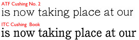
A digital version of Cushing is available from the International Typeface Corporation, but it’s based on Cushing Old Style, a Monotype version of the face that’s substantially darker and narrow and lacks much of the perky quality of the American Type Foundry original, as you can see in Figure 7.
Figure 7. J. Stearns Cushing of Norwood Press commissioned several faces bearing his name, including one from American Type Foundry (top) and one from Lanston Monotype, on which the current ITC version (bottom) is based.
Lastly, I’d like to cite one final face–Globe Gothic–whose distinctive (and a bit dated) design makes it not terribly versatile, for which reason I label it as decorative rather than display. But it’s one of those sans serif faces that feels inspired by the modern aesthetic of Didot and Bodoni: fine proportions, high contrast, with sort of a tuxedo look in the upper case. In the sample in Figure 8, its modeling appears to anticipate that of Peignot some 30 years later. You can find two revival versions at www.myfonts.com.
Figure 8. Globe Gothic, designed in 1906 for Lanston Monotype, has a smart, timeless look, although comparisons to contemporary types show many letter forms that were distinctive of the early 20th century.
Looking back at type sample books from a century ago reinforces the idea that type and typography are quite conservative in their essence. Fashion and novelty abound, and type is just as subject to fad and fancy as clothing or music. But time is a great leveler, and the number of typefaces that make it into the hall of fame 20 or 30 years down the line–much less 200 or 300–is limited indeed. For novelty faces, distinctiveness wears off fast. It’s not without reason, then, that almost 300 years after he opened his first press, it’s still good advice to, “when in doubt, use Caslon.”
This article was last modified on August 12, 2021
This article was first published on January 6, 2011
Commenting is easier and faster when you're logged in!

Recommended for you
Scanning Around With Gene: Old News is Good News
There are a lot of perks to being a highly paid blogger here at CreativePro. The...

Font Fetish: Sudtipos
Sudtipos is an Argentinian type foundry with a flair for the dramatic. I’m...
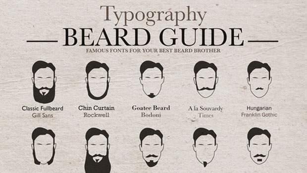
The Typography Beard Guide
Ah, typography and beards. They go together as well as… Hm. Actually, they go to...