
Over the years I’ve answered many questions about the rules for smart quotes, dumb quotes, and primes. I’ve assembled the answers here with some additions, updates, and revisions for clarity, accuracy, and ease of reference.
Smart vs. Dumb quotes
Q. What’s the difference between smart and dumb quotes, and what’s the big deal?
A. One of the most misused elements in desktop typography is the use of straight typewriter quotation marks, or “dumb” quotes, instead of true typographer’s quotes, also called smart quotes and curly quotes. Smart quotes have an opening and a closing version. In addition, they are design-sensitive and are different for each typeface. “Dumb” quotes are usually simple straight or tapered marks. They are often referred to as primes or inch and foot marks, which is what they are most often used for unless the typeface has true primes (see below).
Misuse of “dumb” quotes is one of the most common typographic faux pas, and can be found just about everywhere you look, from high-end print to multimedia advertising, signage, movie credits, Web sites, and a lot more. Why? Because the standard computer keyboard layout is based on the typewriter keyboard with its old-fashioned straight quotes serving double duty, and designers and software manufacturers are left to straighten out the mess!
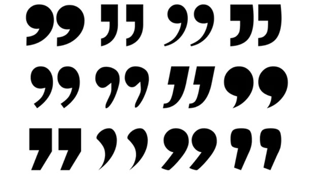
Smart quotes come in many shapes and sizes, such as these in the left-hand column, set in Adobe Chaparral Pro, Monotype Rockwell, ITC Galliard Pro, Terminal Design Giacomo 2.0, and ITC Adderville. Dumb quotes (right-hand column), also called typewriter quotes, aren’t design-sensitive.
</li>
</ul>
<p>NOTE: In a font, an apostrophe is the same glyph as a closed single quote.</p>
<p><em>The wrong punctuation (upper) and the correct punctuation (lower).</em></p>
<p><img src=)
True Primes
Q. What’s the difference between the “dumb quotes” or typewriter quotes that are found in most fonts and used for inch and foot marks, and true primes?
A. Not everyone is aware that the straight marks in most fonts that are used for inch and foot marks aren’t true primes from a historical point of view. They were originally typewriter characters that were used as quotes, apostrophes, and primes. Unfortunately, when typewriters transitioned to computers, most typefaces maintained the straight typewriter quotes instead of offering the angled ones, which is why most fonts don’t have correctly-angled primes.
Several symbol and Pi fonts, as well as some of the newer OpenType fonts, do have true primes in addition to smart quotes and old-fashioned typewriter quotes. Those typefaces include Adobe’s Arno Pro and Hypatia Sans Pro as well as Adobe’s Universal News & Commercial Pi, Symbol, Linotype European Pi, Bigelow & Holmes’ Lucida Math, Linotype Mathematical Pi, and Linotype Universal Greek with Math Pi.
The difference between straight typewriter quotes (left), slightly angled true primes (center), and typographer’s quotes (right) are apparent in this example set in Arno Pro.
, then select desired document and click Open. You can also hold the Shift key while clicking Open to display the Import Options dialog box if you don’t want to make it your default to show it.</p>
<p>Select desired Import Options, and click OK.</p>
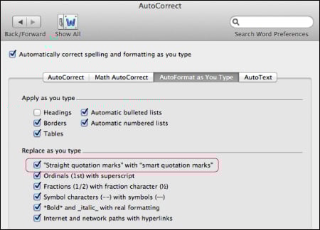
<p>NOTE: When you use the typographer’s quote option, inch and foot marks, as well as contractions and apostrophes used at the beginning of a word will incorrectly be converted to smart quotes, so be sure to check for these instances, and correct as necessary.</p>
<p><em>When importing a Microsoft Word document into InDesign, select Use Typographer’s Quotes from the Import Options dialog box.</em></p>
<p><img src=)
Banish dumb quotes from Microsoft Word files
Q. I often receive Microsoft Word documents with dumb quotes throughout where they should be smart quotes. Is there a way to avoid these errors at this stage?
A. Unbeknownst to many, there is a Word preference that will default to smart quotes when typing. Here’s where it is found:
Go to Preferences > AutoCorrect. Select AutoFormat as You Type. Under Replace as you type, select “Straight quotations marks” with “smart quotations marks.”
For a long term solution, why not create some guidelines for submitting copy that includes all required typographic conventions, including the use of smart quotes? Distribute the guidelines to all the writers, editors, copy editors, proofreaders, and designers you deal with so that everyone is on the same page.
Change the quote default in Microsoft Word from this AutoCorrect panel under Preferences.
Smart quotes on the Web
Q. What about smart punctuation on the Web?
A. While the use of “smart” quotes and apostrophes (as well as other “smart” punctuation, such as en and em dashes), is the accepted practice for print, they are often noticeably absent on the Web. The first step to remedy this is to make sure the original copy contains typographically correct punctuation so that you and/or the programmer know which punctuation goes where.
In some instances, smart quotes have to be manually coded, while other scenarios allow for automatic conversion. Unfortunately, there are some environments which do not support the use of smart quotes at all, or make it too tedious to implement on a large scale. Tthese include some content management systems (commonly referred to as CMSs) as well as some email marketing systems, so do your research carefully beforehand.
When preparing and/or submitting copy, call out the existence of the smart punctuation so the programmer or developer can find the best solution for the site in question.
The use of “dumb” quotes (and other “dumb” punctuation) on the Web should be avoided whenever possible.
This article was last modified on March 15, 2021
This article was first published on February 20, 2013
Commenting is easier and faster when you're logged in!

Recommended for you
Easy as Pi
Back in the days of hand-set type, all the little character blocks for a given p...

New Font Has Its Own Movie Trailer
Heroine is a new typeface designed by Göran Söderström. Söderström was inspired...

Shag, A Retro Font Family with Roots
The Shag family of fonts is a fun, nostalgic collection inspired by the work of...