

TypeTalk is a monthly question-and-answer column on typography. Send your question to ty******@*********ro.com. If we publish it, you’ll receive one Official Creativepro.com T-Shirt!
To Convert or not to Convert… Text-to-Outline, that Is!
Q. Is it acceptable to convert text to outline when sending files to the printer to avoid font problems?
A. Yes and no. Here’s the scoop:
It might be tempting to convert text to avoid the licensing issues related to sending fonts to the printer, or to sidestep missing font and text-reflow problems. However, here’s why you should think twice before converting text to outline:
It’s difficult to make changes after the conversion. Because of this, last-minute corrections present a problem if the file is on press or at the printer and there’s no time to go back to the unconverted version (which you should always have, of course!) to make the change.
In some programs, most noticeably Adobe Illustrator, converting type to outline can make the type a tiny bit heavier (especially for Web images), thus changing the overall color. The smaller the type, the more noticeable the heavier weight can be. This is especially true for type with a marked weight contrast and type with thin strokes. Even if you don’t mind this slight distortion in color, converted text won’t match type that has not been converted to outline.
On the other hand, converting type to outline may be beneficial for these reasons:
- Converting display type to outline makes it easier to perform customizations, such as minor adjustments to character overlaps.
- Using color in creative ways on a headline, such as making the dot of the “i” or the counter of the “o” a different color, is simpler when you convert the letterforms into outline. (For tutorials on this effect, see “InDesign How-to: Fill Type with Artwork” and “Fill Type with Artwork in QuarkXPress“.)
- Converting text to outline can be handy when you want the type to be a bit heavier for production purposes, such as tinting type with hairline thins or dropping type out of black — both instances where ink spread and dot gain might obliterate serifs — or fill in small or lightweight type.
- Converting text to outline might be necessary when you’re importing or repurposing the type or layout in another program.

Figure 1. The upper of these two examples set in ITC American Typewriter is not converted to outline, while the bottom example is. Notice how the weight of the light type on top is true to the original design, and the bold type remains solid black. In the converted example at bottom, the weight of the light type is noticeably heavier (which might or might not be beneficial to your work), and the dots of the bold “i”s have been custom-colored.
Web-Safe Fonts
Q. I’m designing a Web site and need to spec its fonts. I don’t want to use a font that the majority of the site’s visitors won’t have installed. Do the Mac and Windows operating systems share any system-level typefaces?
A. As you obviously already know, the typefaces used for text on the Web have to be installed on the viewer’s computer; if they aren’t, the fonts default to something else on the user’s system, which might not work with your design. To maintain better control over what your viewers see, stick to the five Web-safe fonts that are available on both Mac and PC: Verdana, Trebuchet MS, Georgia, Times New Roman, and Arial (Figure 2).
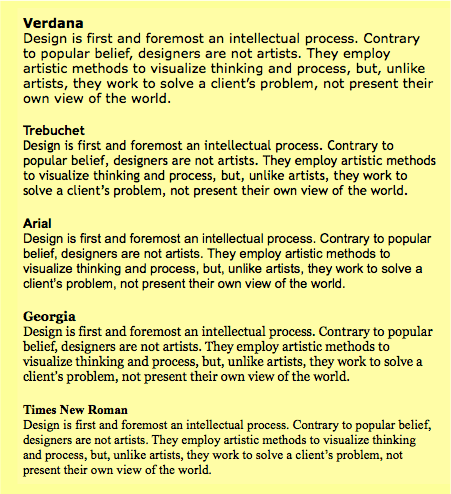
Figure 2. The differences in all five Web-safe fonts are obvious in this quotation by Erik Spiekermann.
Sans Serif
Verdana: Considered the most legible of the five, this sans serif was created by Matthew Carter for Monotype. With its tall x-height, comfortable width, and rather open letterspacing, Carter specifically designed Verdana to be readable at small sizes on the Web.
Trebuchet MS: This sans serif retains clarity and readability at small sizes on the Web. It’s slightly narrower than Verdana, allowing more copy to fit in the same space. Its curved stroke endings and unusual lowercase “g” give it a bit more personality than Verdana.
Arial: Although not specifically designed for the Web, Arial is a fairly readable sans which works in print and on the Web. It’s similar to Helvetica in both width and spacing, but with slight character modification.
Serif
Georgia: Matthew Carter designed this Times alternative for the Web. With its open letterforms and spacing, Georgia is crisp, clean, and easy to read on the Web, especially at smaller sizes.
Times New Roman: Designed for print, this commonly used typeface is hard to read on the Web, especially at smaller sizes. If you like Times, try Georgia instead.
To see extensive examples of these and other fonts as they appear on the Web, go to the Motive Guides site.
Ellipsis Confusion
Q. Is it proper to put spaces before and after ellipses?
A. Confusion reigns over this issue, as we’ve all seen ellipses used with and without spaces before and after. I’ll try to shed light on the matter.
The grammatical rules and conventions for ellipses vary depending on how you’re using the ellipse. The most common usage is to indicate an omission within a sentence.
According to both The Chicago Manual of Style and The Associated Press Stylebook, there should always be a space before and a space after an ellipsis if it indicates an omission and if it’s not followed by punctuation, such as a period or question mark. But the reality is, the spaces are often deliberately omitted in professional typography to avoid the gaping hole they can create in text (Figure 3).
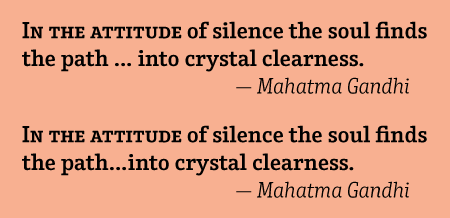
Figure 3. While the top example shows the grammatically correct usage of an ellipsis with spaces on both sides, the bottom illustrates a common typesetting convention that eliminates the spaces for better color and flow. Set in Terminal Design’s Enclave.
Your decision might depend on the look and spacing of the ellipsis, both between the dots and before and after it, as ellipses differ considerably from font to font. Should you use three periods instead of the true ellipsis glyph (Figure 3), you can adjust the spacing between the dots using tracking, although this can be cumbersome for lengthy copy. Before you decide whether to include or omit the space before an ellipsis, ask whether there’s a style manual associated with what you’re working on, and use that as a reference.
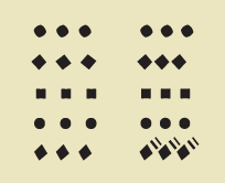
Figure 4. True-drawn ellipsis glyphs (left column) can differ from these created with three periods (right column). Shown are Expo Sans, Culpepper, Giacomo 2.0, Minion, and Tremor.
Getting Personal
Q. What is your favorite typeface?
A. I can’t tell you how many times I’m asked this question. I rarely answer because I don’t want people to use my favorites simply because I like them, with no regard for their appropriateness for the job at hand.
Selecting typefaces is one of the most difficult parts of design; the right choice can catapult you forward toward an effective design solution; an unsuitable choice can make it difficult, if not impossible, to clearly communicate your message.
However, I’m always happy to reveal the qualities I look for when selecting a typeface:
- well-executed design concept
- well-drawn characters
- consistency of design traits
- legibility, especially for text faces
- good letterfit with good kern tables
- ability to work well at the size range of my job
- appropriateness for the design goals

Figure 5. OK, OK, these are some of my favorite fonts. Can you guess their names? The first five people to correctly identify all nine typefaces and send the answers to ty******@*********ro.com will receive a creativepro.com t-shirt.
This article was last modified on May 15, 2023
This article was first published on October 24, 2007
Commenting is easier and faster when you're logged in!

Recommended for you

Photoshop How-To: Making Warhol-style Images
This story is taken from “Adobe Photoshop CS Creative Studio.” The b...

Using Photoshop Tool Presets
If you find yourself using the same settings for a particular tool—or set of too...

How to Create a Single-Image Book Promotion eBlast
Here are step-by-step instructions so you can make a single-image graphic that c...