
Q Are there any guidelines for selecting fonts for use at a range of sizes?
A. In today’s world of digital fonts with their seemingly ‘one-size-fits-all’ capability, it is easy to lose sight of the fact that just because you can, doesn’t mean you should. I’m referring to the ability to set any font at any size, from 6 point to 600 point, regardless of whether it looks good and performs well at the full range of sizes needed for a particular project or usage.
A little background
In the days of metal type, each point size of a typeface was ‘cut’ separately. This allowed for each size or font as they were known, to be slightly and progressively modified for optimum legibility and appeal with respect to character width, weight contrast, x-height, spacing, and other design characteristics.
Today’s digital fonts, on the contrary, consist of one scalable, digital outline that is used for every point size. This has led today’s typeface designers to design typefaces with a particular size range in mind. In fact, typefaces tend to be categorized as text or display designs, due to the fact that overall appearance and performance of a typeface changes with scale. Even so, many typeface designs can be used for a broader range of sizes – but their suitability at any given size varies from typeface to typeface.
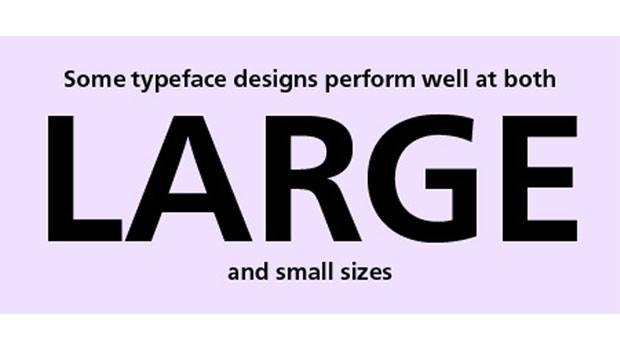
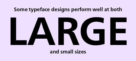
How to choose
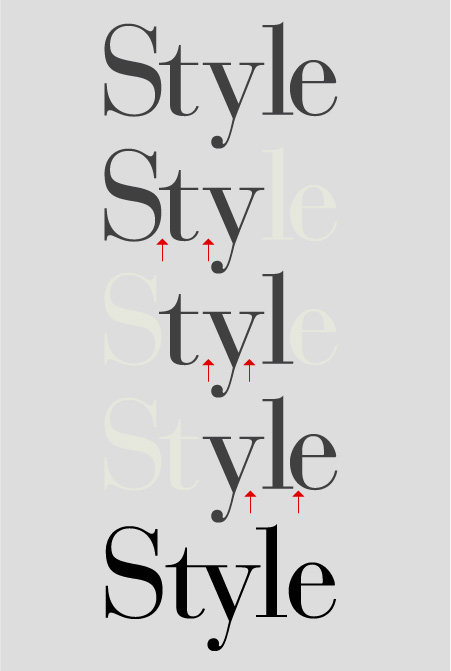
The first and foremost factor to consider when selecting a typeface is knowing what point size range it will be used for. What looks good for a headline, title or other display usage, might be hard to read for smaller type. This is especially true for more decorative designs, as well as those with very thin strokes or extreme weight contrast, and small counters or interior spaces. On the other hand, some type designs intended for smaller or midrange sizes, such as certain handwriting and script fonts, can look clunky and dull at very large sizes.
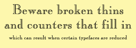
Once you know a font’s intended size range, it is imperative to try out or view what the font looks like to determine how it performs in its range of intended sizes. If you cannot try out the actual font, search for print samples or PDF specimens which are often supplied by font foundries. This is especially important for smaller size settings intended for print that cannot be accurately gauged on a low-resolution computer screen. Make sure that all sizes maintain their legibility and personality, design details are crisp, thin strokes hold up, and counters don’t fill in.
Doing your ‘due diligence’ at the onset of a project will help avoid nasty, unpleasant surprises later on that might be time-consuming and expensive to correct.
A handwriting font such as Caflisch Script looks great at the smaller sizes it was intended for, but loses its effectiveness and appeal when enlarged to display sizes.

Caslon Openface does not work well at smaller text sizes as its tight interior spaces start to fill in, while its thin strokes can break up.
ITC Aftershock makes a powerful statement at larger sizes, but becomes a muddy, unreadable mess when set too small.

Frutiger Neue is a clean, simple sans that can be used for both text and display.
This article was last modified on July 29, 2021
This article was first published on November 21, 2012
Commenting is easier and faster when you're logged in!

Recommended for you
Will the Real Garamond Please Stand Up?
Frank Romano, Professor Emeritus at the Rochester Institute of Technology, recen...

All About Indents and Other Paragraph Separators
Learn how to choose the right method of paragraph separations to add both readab...
TypeTalk: Take the Three-Letter Approach to Kerning
Q. Can you explain the “three-letter approach” to kerning? A. When I...