

Hyphens, en and em dashes are three visually similar yet significantly different punctuation marks that commonly appear in text. Their definition and purpose are frequently misunderstood by designers and writers alike, often leading to inaccurate and unprofessional typography. While some of this confusion is a result of typewriter conventions still being used in today’s digital world, it is ultimately up to the person doing the typesetting—whether it be a production artist, web programmer, or graphic designer—to get it right. Writers, take heed as well!

The differences between all three symbols is clear in this setting of Clarendon.
Description and usage
A hyphen (-) is the shortest in width of the three, and is used to hyphenate words that break at the end of a line, as well as to connect compound words, such as mother-in-law, well-being, and merry-go-round. It is also used for phone numbers. The hyphen is easily found to the right of the zero on most keyboards.

Hyphens are used to connect many compound words, as well as for phone numbers.
An en dash (–) is wider than a hyphen and narrower than an em dash, and is the most misunderstood of the three. This dash is used to indicate a range, that is, elements that are related by distance, including time, years, and dates such as 3 pm–6 pm, Monday–Friday, March 2–7, or pages 20–55. In fact, an en dash is correct in any instance where a preposition such as the words “to” and “from” can be substituted. It is accessed by pressing Option+hyphen on a Mac and Alt+0150 in Windows (Alt+hyphen in InDesign).

The en dash, which is wider than a hyphen and narrower than an em dash, is used to indicate a range, as well as a continuation of time.
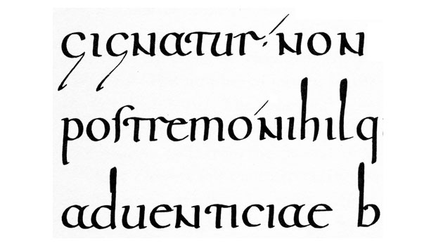
An em dash (—) is the longest of the three, and is most commonly used to indicate a break in thought, or a thought within a thought or a sentence. It is accessed by pressing Option+Shift+hyphen on a Mac and Alt+0151 in Windows (Alt+Shift+hyphen in InDesign). One of the most common type crimes associated with this symbol is the use of two hyphens instead of an em dash. This typographically incorrect practice is a holdover from typewriter days when two hyphens were used as a replacement for the dash, which didn’t exist on the keyboard. Unfortunately, this is still a widespread occurrence that you can see everywhere from print to the web to movie titles and kinetic type.

The standard em dash is grammatically correct for a break in thought, or a thought within a thought (upper left). But if the em dash seems too wide for a particular typeface, and/or the spacing is too tight, it can be replaced with an en dash, and the spacing opened up for either dash as desired (upper right). The use of two hyphens instead of a dash is a major type crime, and should never be used in fine typography (lower). Excerpt from Sinopah the Indian Boy, by James Willard Schultz.
Design differences
The length of dashes is not standard, and can vary from typeface to typeface, as does the designated space surrounding them (technically called sidebearings). Some en dashes are close to the width of the n and em dashes the width of the m, keeping them in proportion to the rest of the typeface. Others have no relationship to the overall width of the typeface at all, with some being a set 500 and 1,000 units to the em square (a measurement relative to the point size of the type), respectively. Because of this, the width and fit of dashes can vary dramatically.

The design, length and spacing of hyphens, en and em dashes can vary tremendously from typeface to typeface.
Finessing the details
When the width of an em dash seems out of proportion to the typeface in use (for example, it may be too wide for use in a condensed typeface), or either dash appears too close to its neighboring characters, there is room for artistic, or “typographic” license to improve their appearance. For instance, when the em dash seems too wide, many typographically-savvy designers will substitute an en dash, which is an accepted practice in fine typography. Additionally, when the spacing around either dash seems too tight, it can be opened up to add additional breathing room and more closely match the overall spacing of the rest of the typeface. A good way to do this is with the use of the kerning feature, which will giving you total control over the amount of space added. Another solution is to add a word space on both ends, which is the recommended practice on the web, but more of a personal preference in print. Just remember to be consistent in your treatment throughout, or the text can become an unprofessional jumble of varying styles.
This article was last modified on March 26, 2014
This article was first published on March 26, 2014
Commenting is easier and faster when you're logged in!

Recommended for you
A Font "Dating" Game
They say that opposites attract, but then again, similar values and shared histo...

Thou Shall Not Use Comic Sans
Excerpted from Thou Shall Not Use Comic Sans: 365 Graphic Design Sins and Virtue...
The Ups and Downs of Ascenders and Descenders
The appearance of ascending and descending characters is largely an accident of...