

In the world of fonts, January is a month of lists. Whether they’re called Best of, Favorites, or Best Sellers, they all enable designers to see what’s new, what’s hot, and what’s trending. Some lists are from major font resellers whose libraries consist of not only their own designs, but also the work of numerous other foundries as well as individual type designers. Others are listings of the personal favorites of the author or blogger. But no matter what the source, they are all worth a looksee, as they provide an opportunity to take note of any typefaces that catch your eye, appeal to your typographic aesthetic, and seem potentially suitable for your next project or two.
Here is a selection of some of the most visually exciting listings for 2013:
Best of 2013 from fonts.com is a showing of some of their newest and most popular typefaces from the past year. From a 60-version superfamily to organic scripts to vintage-inspired display designs and updated classics, there is something for everyone and every project. The appealing and expressive graphics as well as the customized type showings showcase the personality of these designs, while helping you visualize them in-use.

Laura Worthington’s robust Charcuterie family has made it on two of our listings: fonts.com as well as MyFonts.
Fonts.com also has a New Best Sellers as well as an All Best Sellers list. The former is a listing of 100 fonts culled from new releases of the past year, while the latter is their overall best-selling fonts across the board, and is updated daily.

The fonts.com listing also includes smaller graphics of some of their favorites.
Most Popular Fonts of 2013 from MyFonts is their self-described “font hit parade” based on average sales with adjustments made to include all popular genres. They exhibit their offerings in big, juicy showings that optimize their appeal. Lots of decorative display designs on this list including a range of thick and thin scripts, 3-D, Deco-inspired designs, and distressed vintage typefaces, as well as several geometric sans, slabs, and humanist serif designs.
Their list, which is sent out as part of their January e-newsletter, also includes an informative summary of each font, with engaging information about the typeface as well as the designer—both of which help give a more personal “face” to each design.

Monotype’s Metro Nova family appears on MyFonts list, as well as some other best sellers listings.
MyFonts also has a Best Sellers list consisting of their top 50 best sellers of the last month. This listing consists of large type settings followed by small graphics—not as sexy as their e-newsletter listings, but easily scrollable to get an overview. You can also click to view a large graphic, background info, and a showing of the entire family.

Thirsty Rough by Ryan Martinson of Yellow Design Studio is another typeface that appearas on two lists: both the MyFonts and fonts.com listings.
FontShop describes their Best Type of 2013 as “our picks for best releases of the year.” So what’s on the list is not necessarily their best sellers, but the typefaces they want to showcase. This list is big on graphics, which are colorful, dynamic, full column-width showings, and brief on background info. Or, if Pinterest is more to your liking, check out this listing, which displays their picks in more bite-size showings.
Dulce, designed by Paula Nazal, makes it onto FontShop’s list, and is one of the many popular monostroke casual script and handwriting designs that are trending these days.

FontShop’s Pinterest board lets you easily compare and contrast their Best Type of 2013 offerings.
As with most large foundries, their Best Sellers listing is updated regularly. You can also view their New Fonts as well as their Staff Picks from the navigation bar on the left of any page.
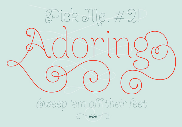
And finally, here are a couple of independent, non-commercial Best of listings with strong graphics that showcase the typefaces:
Did we leave out any of your favorites? Let us know in the comments section!
***
Ilene Strizver, founder of The Type Studio, is a typographic consultant, designer, writer and educator specializing in all aspects of visual communication, from the aesthetic to the technical. Her book, Type Rules! The designer’s guide to professional typography, has received numerous accolades from the type and design community. She conducts her widely acclaimed Gourmet Typography Workshops internationally. For more information on attending one or bringing it to your company, organization, or school, go to her site, call The Type Studio at 203-227-5929, or email Ilene at in**@***********io.com. Sign up for her free e-newsletter, All Things Typographic, at www.thetypestudio.com.
This article was last modified on January 22, 2014
This article was first published on January 22, 2014
Commenting is easier and faster when you're logged in!

Recommended for you

Annie Atkins: Graphics and Typography for Film
Annie Atkins has what many designers would consider a dream job – she creates gr...
Creating Better Brand Images with Graham Clifford
Branding is the term used to describe the creation of an identity for a product,...

Before&After: Optima: The Typeface of 9/11
How Optima brings dignity and humanity to the National September 11th Memorial.