

TypeTalk is a monthly question-and-answer column on typography. You ask, and noted type authority Ilene Strizver answers! Just send your questions to ty******@*********ro.com.
Tabs vs. Indents
Q. Tabs in InDesign confuse me. Often I get inconsistent results when using them to indent paragraphs. Can you help?
A. It’s a good question that brings up a widely unused feature of most design software. Scott Citron, designer and Adobe Certified Instructor, says that your problem, which is fairly common, “stems from the notion that tabs are used to indent the beginning of paragraphs. This habit is a holdover from the old typewriter days when tabs were used for that purpose. But when setting type by computer, or specifically in InDesign, you should always control paragraph indents using the First Line Indent command in the Paragraph palette. Typically the amount of the indent is determined by the length, or measure, of the line. Shorter measures require small indents; longer measures suggest larger indents. There are many rules of thumb about how to determine the precise value of the indent, but frankly, I just use my eye.”
Figure 1 shows the Paragraph palette in InDesign CS2.
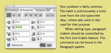
Figure 1. Look for InDesign’s First Line Indent feature in the Paragraph palette (left). The second paragraph of the text (right) has a .3 inch indent. Text is set in Monotype’s Maiandra Pro.
QuarkXPress handles paragraph indents in a similar way. Its First Line Indent feature is in the Paragraph Attributes dialog box (go to Style> Formats).
Hyphenation Harangue
Q. Why do so many magazines use hyphenation in rag-right mode? It’s especially irritating with wide measure type. These magazines are pretty but very difficult to read. Are designers that ignorant of old-fashioned typographic principles?
A. How refreshing that you notice these typographic details! In fact, therein lies part of the problem: Many creative professionals aren’t trained to notice the details that contribute to fine typography and therefore don’t always make conscious decisions about them. (Prior to the digital age, typography was the responsibility of a highly skilled person who worked in a type shop and set type for a living.)
Today’s design software has built-in defaults that control hyphenation. Most defaults are set with hyphenation turned on, and depending on which software you use, are preset to allow two-letter hyphenations, as well as anywhere from three to unlimited hyphenations in a row. Since most designers are not trained typographers, they’re either not aware that they can adjust these defaults or that there’s any reason to do so.
While hyphens are often a necessary evil in narrow columns to create a pleasing rag, wide columns can often go without hyphenations (as you mention), except for the occasional manually inserted hyphen to fix a bad rag here and there. To achieve this, you should turn off hyphenation, which will still allow for manual adjustments. For optimum results, this approach does require a designer’s keen eye to review all the rags and the time to adjust them as necessary. For the record, when using hyphenations, I recommend changing the default settings to allow a minimum of three-letter hyphenations and no more than two in a row.
To Auto Lead or not to Auto Lead?
Q. Why does the leading of a line or a paragraph sometimes change when I add a dingbat, ornament, or some other enlarged character in text? It’s driving me and my coworkers nuts because we have no idea why it’s happening!
A. The culprit is your software’s auto leading, a time-saving feature that can also wreak havoc on your type. When auto leading is on, the program automatically assigns a leading (also called line spacing) value to text based on its point size. Most design software uses a default auto leading setting of 120 percent of the point size, which may result in a fractional value. For example, for 10-point type, the auto leading might be a nice, even 12 point; but for 11-point type, it becomes 13.2, for 12, it is 14.4, and for 14, it is 16.8.
Auto leading can be a real convenience when you’re experimenting with text type sizes because the line spacing adjusts proportionally and automatically. On the other hand, auto leading does have its pitfalls, and a mysterious and unexpected jump in leading is one of them (Figure 2).
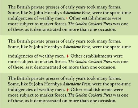
Figure 2. Top: This text contains an ornament as a paragraph separator, but it doesn’t change the auto leading because it’s set the same or a smaller point size as the surrounding text. The text and ornament are set in 15 point ITC Golden Cockerel with 18 point auto leading.
Middle: When the ornament is enlarged to 25 point, the auto leading for that line changes to 30 point, creating an unexpected “jump” in that line only.
Bottom: When the leading for the entire text is converted to a fixed leading of 18 point, the line spacing stays consistent. even though the ornament is still 25 point.
You’re in the fix you describe because you added a character with a larger point size than the surrounding text, which caused the auto leading to increase. The solution is to convert the leading to a fixed value. Once you do that, you can have glyphs of varying point sizes in a line without changes in the leading.
Two Font Search Queries, One Answer
Q. I am completing a boat signage project for the Tahoe Maritime Museum. The boats were primarily built in the 1920s and 30s. I am interested in using a typeface that correlates to that period, is nice to look at, and easy to read. Do you have any suggestions?
Q. Where do you go when you don’t have the name of a font and are looking for a certain style, such as African, Mediterranean, Western, etc.?
A. A very powerful time-saving but often-ignored feature of most major fonts foundries’ and resellers’ Web sites is the Search feature. You can search by Classification, a preset list of searchable categories that varies from foundry to foundry, but for a more specific search, try the Keyword search.
To practice what I preach, I visited www.fonts.com, www.itcfonts.com, www.linotype.com, www.myfonts.com, and www.veer.com. At each site, I used the keyword fields to search for the terms “Western” and “30s” and came up with anywhere from dozens to hundreds of choices.
Keyword search is usually located on the top of the site’s home page. Note that while most smaller foundries don’t have this feature, their libraries are easily searchable without it.
Love type? Want to know more? Ilene Strizver conducts her acclaimed Gourmet Typography workshops internationally. For more information on attending one or bringing it to your company, organization, or school, go to her site, call The Type Studio at 203-227-5929, or email Ilene at in**@***********io.com. Sign up for her e-newsletter at www.thetypestudio.com.
This article was last modified on January 10, 2022
This article was first published on March 31, 2007
Commenting is easier and faster when you're logged in!

Recommended for you

The Case of the Absent Adornment Contest Answer and Winner
Solve this InDesign mystery for a chance at winning a great prize.

Sony RX100 V Review: The Ultimate Travel Camera
The new Sony RX100 V is the latest release in the Sony RX100 point-and-shoot ser...
Fun with Pattern Fonts
Q: Do you have any suggestion on how to liven up my design using some unusual fo...