

The richness, depth and texture of a letterpress-printed piece is an exquisite thing to behold. You can’t help but run your fingers over the blending of type, image, ink, and paper while admiring the sensual beauty of this relief process.
While letterpress has long historical roots, it’s still available to us today. However, it requires a high degree of craftsmanship and finely tuned type and design sensibilities to obtain the best results. Peter Fraterdeus, expert letterpress printer and president of Slow Print Letterpress Studio is a master of many typographic trades, including type designer, information designer, and calligrapher. I asked him to explain best practices for designing with type for letterpress.
TT: What kinds of projects are best suited for letterpress printing?
PF: As a relief process, it is best suited for line and letter, rather than tone and image. Of course, the skillful use of the medium has produced many wonderful examples of tone and image, so we don’t want to be too restrictive in our thinking!
Nonetheless, looking at the history of printing, we’ll see that the most powerful and immediate impressions are made by forms that respect rather than ignore the inherent nature of the medium.
From a corkscrew to small serifs to dot leaders: every detail was captured in this exquisitely designed and printed business card. Printing at SlowPrint Letterpress. Design by Annie Koelker.

So, for me, designing for letterpress means designing with type. The shapes and spaces of letter forms have been the source of great delight for many years. Balancing space and form, negative and positive, deliberate and accidental, design is not an end result, but a process. The final form is merely the state at which one must eventually say, “Enough”.
TT: What kind of typefaces work best (and worst) with letterpress?
PF: At display sizes and poster sizes, just about any type will print and read without too much trouble.
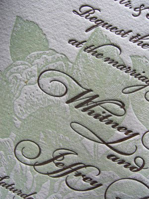
Wedding invitation detail, designed by the bride-to-be. Printing at SlowPrint Letterpress.
The big challenge is at book (or text) sizes, and below. Captions cannot — must not — be set in the same font as 96-point double-spread banner. As the size is reduced, the stem weights become impossibly spindly, and the counters in bold and black weights become pin-pricks. Periods and commas evaporate. Formerly sharp corners become 96-pound weaklings with slumping shoulders, seriously lacking in that Superman physique.
TT: Can I compose the piece on my computer, or does it require special fonts intended for letterpress use, such as metal or wood type?
PF: I call our shop twenty-first century letterpress. All of our commercial work and plenty of our fine-art printing is done with a digital process. We need vector art (e.g., Adobe Illustrator) that can be converted into individual plates. The original art files are sent out for laser imagesetting on film. The exposed film is used to make our printing surface, a photopolymer plate. The exposed part of the polymer hardens under the UV light in the platemaker, while the rest stays water soluable and is washed away, leaving the raised printing form on a plastic carrier backing.
Image as well as type can be richly represented with letterpress. Printing at SlowPrint Letterpress.
TT: What about the paper? And what can be done to minimize the ink spreading into the counters of the letterforms?
PF: We can print on practically any surface up to about 60point board (like a four-ply matte board).
In the final days of commercial letterpress, most printing was done on coated and calendared stock, since this allowed the type to be sharp with good coverage and a minimal (“kiss”) impression. However, again, looking at the history of the medium, letterpress prefers an uncoated soft paper that allows the type and plate to bite into the paper. Contemporary practice accentuates this. I think since letterpress is the only printing process that can produce a literal impression in the sheet, it’s become an antidote of sorts for the flat glossiness of the digital universe.
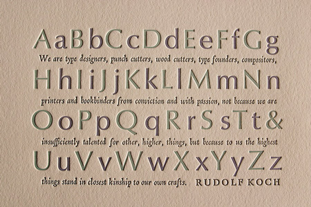
Rudolf Koch quote set in OptimPF: Printing and designed by P Fraterdeus at SlowPrint Letterpress.
This article was last modified on August 2, 2021
This article was first published on June 27, 2012
Commenting is easier and faster when you're logged in!

Recommended for you
10 Essential Tips for InDesign
These tips originally appeared in InDesign Magazine. To have new InDesign tips d...
Scanning Around With Gene: Bon Voyage and Happy Landings
I was 16 when I had my first trip on an airplane, and it seemed like a really bi...

TypeTalk: What Makes a Font a Pro?
TypeTalk is a regular blog on typography. Post your questions and comments by cl...