

TypeTalk: U&lc Magazine Retrospective part 3, Initial Letters and Words
We continue our retrospective of the groundbreaking U&lc (Upper and lowercase) magazine with a look back at the creative use and execution of initial letters and words. U&lc was the award-winning typographic journal published by International Typeface Corporation (ITC) from 1970 to 1999 created to showcase the ITC typeface library, in addition to serving as a palette for virtuoso typography and exceptional typographic design. Originally edited and designed by Herb Lubalin until his death in 1981, U&lc went on to feature an assemblage of prominent designers who used this unique typographic platform to create some of the most expressive, experimental, and stimulating typography of the times.
• • • • •
The use of initial caps—as well as lowercase letters and even complete words—has historically been a technique employed to create visual interest as well as assist with typographic hierarchy. Their use can also play a part in the development of a more balanced, and even exciting design. In the past, the usage and application of initials was governed by typesetting methods, specifically the limitations of metal type. (An exception to this was illuminated manuscripts where initials and other decorations were often hand-drawn on the actual pages). The onset of phototypesetting as employed by Herb Lubalin and others who contributed to the pages of U&lc freed designers from these previous limitations and constraints, making way for more freedom in the use of initials.
The successful usage of initial letters is a blend of form and function, that is, it should direct the reader to an important element(s) of the piece—most commonly being the beginning of the text—as well as contribute to the overall design. Other than those objectives, there are few, if any limitations on how to use initials.
The examples below showcase some of the most interesting, creative, and unusual uses of initial letters and words. Click on each image for a closer look.


Oversized initials that repeat the typestyle and case (cap or lowercase) of the headline treatments signal the beginning of each article in these two spreads. The additional initial caps (right) lead the eye across the spread, as well as punctuate the right page with a more vertical, yet typographically consistent ornamentation. U&lc, Vol. 17, No. 1, 1990, designed by Larry Yang, and U&lc, Vol. 20, No. 2, 1993, designed by Pentagram.
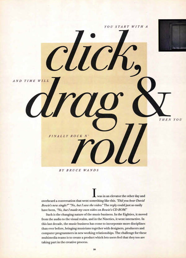


Initial letters can take many forms. A diminutive, centered raised initial cap leads the eye down the page from a dynamic headline treatment to the comparatively calm body text (left). An initial cap set at the same size as the headline helps balance the appearance of images within the text without competing with either (middle). An interesting letterform in fire engine red becomes the focal point—and almost the “speaker”—in this geometric grid of text and imagery (right).U&lc, Vol. 21, No. 4, 1994, designed by Rhonda Rubenstein, U&lc, Vol. 20, No. 4, 1993, designed by Pentagram, and U&lc, Vol. 24, No. 4, 1997, designed by Mark van Bronkhorst.


An oversized italic initial leaning into the vertical space shaped by the text mimics the angle of the giant spoon leaning against the upright fork, all of which provide a powerful contrast to the minimally-sized headline treatment (left). Another angled initial cap treatment breaks the grid, as it helps the reader find the beginning of the article while suggesting a “stone turned,” a play on the words of the headline (right). U&lc, Vol. 16, No. 1, 1990, designed by Larry Yang, and U&lc, Vol. 18, No. 1, 1991, designed by WYD.


Three very bold and assertive giant initials both anchor and provide counterpoint to the surrounding text, turning each layout into an eye-popping typographic and compositional statement. U&lc, Vol. 25, No. 3, 1998, designed by Mark van Bronkhorst, U&lc, Vol. 21, No. 1, 1994, designed by Pentagram, and U&lc, Vol. 14, No. 1, 1987, designed by Mo Lebowitz.


Color and whimsy turn these two initial treatments (both letter and curved word) into creative tours de force. U&lc, Vol. 24, No. 2, 1997, designed by Roger Black Incorporated, and U&lc, Vol. 17, No. 3, 1990, designed by Larry Yang.


A decorated initial cap is applied to a headline rather than the text below it, integrating all elements into an inviting arrangement of text, image, and photograph (left). An eye-catching red O initial draws the viewer to the beginning of the text, while mirroring a similar geometric form in one of the book jackets below it (right). U&lc, Vol. 14, No. 1, 1987, designed by Mo Lebowitz, and U&lc, Vol. 18, No. 4, 1991, designed by WBMG Design.


These two layouts combine both typographic and illustrative initials with either curved or rotated text, integrating the colorful initials into the fiber of the composition. U&lc, Vol. 16, No. 4, 1990, designed by WYD, and U&lc, Vol. 15, No. 1, 1988, designed by Mo Lebowitz.


Numerous small yet very prominent initials sprinkled throughout the text of these two pages weave interesting visual textures as they lead the eye down the pages. U&lc, Vol. 18, No. 1, 1991, designed by WYD, and U&lc, Vol. 19, No. 1, 1992, designed by WBMG Design.
All available back issues of U&lc can be downloaded in PDF format from the archive at fonts.com.
Don’t miss the previous installments of the U&lc retrospective on Reinventing Tables of Contents and Type Shapes.
* * * * *

Ilene Strizver, founder of The Type Studio, is a typographic consultant, designer, writer and educator specializing in all aspects of visual communication, from the aesthetic to the technical. Her book, Type Rules! The designer’s guide to professional typography, 4th edition, has received numerous accolades from the type and design community. She conducts her widely acclaimed Gourmet Typography Workshops internationally. For more information on attending one or bringing it to your company, organization, or school, go to her site, call The Type Studio at 203-227-5929, or email Ilene at [email protected]. Sign up for her free e?newsletter, All Things Typographic, at www.thetypestudio.com.