
TypeTalk is a monthly question-and-answer column on typography. You ask, and noted type authority Ilene Strizver answers! Just send your questions to ty******@*********ro.com.
Word Spacing Woes
Q. I see a lot of headline treatments with good letter spacing and kerning that are spoiled by bad word spacing. Can you provide some tips on what to look for and how to improve word spacing in headlines and other larger settings?
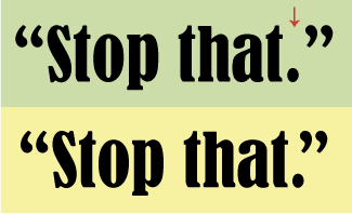
A. Your observation is correct! Many designers fuss with the space between the letters in a headline, only to overlook the space between the words (Figure 1).
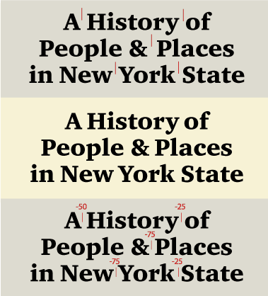
Figure 1: Several word combinations are too open in this setting of ITC Charter Pro. This can occur when a word space is adjacent to a diagonal character, or other characters which have a lot of negative space, such as the ‘A’, ‘y’ and ‘k’. I kerned the offending spaces, creating a more even, balanced look.
First, a little typographic theory of relativity: While the word spacing of a font is a fixed value in relationship to the point size, it visually changes as the type gets larger or smaller. Thus, while the word spacing of a typeface might look fine in text, when using the same face for a headline, the word spacing may appear too open.
On the other hand, some fonts are intended for display usage and have appropriate word spacing in general. But the exact word space will vary depending on what characters surround it. For instance, while the word space between the words “MARCH ON” might look fine, the space between the words “May 1st” or “MAY JUNE” looks too open. This is because the characters surrounding the word space have a lot of negative space, making the word space appear even larger.
So what’s the solution? Reduce the word spacing as necessary until it looks consistent and appropriate for the point size. A good rule of thumb for text word spacing is to match the width of the lowercase ‘n’ or ‘o’. But for headlines, it should be less.
The easiest and quickest method is to kern it using the keyboard command. Yes, you can kern a character to a space, and vice versa. Some programs have a “reduce or enlarge word spacing” command that you can use, as well.
Quark vs. Adobe Units
Q. I am in the process of learning InDesign after using QuarkXPress for many years. When I kern or track in InDesign, I need a much higher number to get the same visual effect as I did in QuarkXPress. What’s the story here?
A. I went through the same confusion when I learned InDesign. The explanation is that InDesign (and other Adobe applications) use a much finer measuring system for kerning and tracking than QuarkXPress, although I have to confess that I always found Quark’s unit system adequate for my very picky needs.
InDesign spaces to 1/1000 of an em square, while QuarkXPress spaces to 1/200 of an em square. This means that an InDesign unit is 5x finer than a QuarkXPress unit, therefore a kern or track value of -5 in InDesign is equal to -1 in QuarkXPress.

Figure 2. The period and the close quote in the top example of Bernhard Condensed are too open for my taste. To create the improved version in the bottom example, use kern values of -30 in QuarkXPress and -150 in InDesign.
You certainly don’t need to know what an em square is to understand this concept, but for the typographically curious, an em square in metal type referred to the size of the rectangle of metal on which a cap M was cast. In digital type, the em square is more a concept than a fixed value, and refers to the imaginary rectangular box that contains the cap M. Since the size of the em square is a relative rather than a fixed value, it gets larger and smaller depending on the point size. Thus, 10 units in 12 point type is much smaller than 10 units in 72 point type.
Innie or Outie Periods, Parenthetically Speaking
Q. I’m always confused as to where to place a period when using a parenthetical phrase. Does the period go inside or outside the parentheses?
A. I’m glad you asked, since today’s designers often have to do a bit of typographic proofreading as well as design.
According to the Chicago Manual of Style, when a sentence is nested within another sentence, you omit the period at the end of the nested sentence. For example:
Incorrect: The garage sale is this Saturday (It will be held rain or shine.).
Correct: The garage sale is this Saturday (it will be held rain or shine).
Also correct: The garage sale is this Saturday. (It will be held rain or shine.)
See Figure 3 for a more graphical representation of these rules.
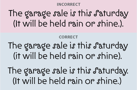
Figure 3. When a sentence is nested within another sentence, grammarians say to omit the period at the end of the nested sentence. Above, I’ve used ITC Ironwork to demonstrate the right and wrong ways to punctuate parenthetical sentences.
Fonts Gone Missing
Q. I work for a newspaper where we frequently we get ads from clients with no design background. They often submit files in Microsoft Word (and no fonts), or as PDFs without properly embedded fonts. Any suggestions on how to handle this?
A. The best solution to your problem is prevention, and that requires education. Why not create a set of file-submission guidelines? Include a list of acceptable file formats (EPS, PDF, etc.) and instructions on how to properly create PDFs from commonly used applications (including Word).
Many font-embedding problems have gone away with newer versions of software, so you might also suggest to your advertisers that they upgrade to avoid potential problems.

Figure 4. A client would be unhappily surprised if its logo, properly set in Helvetica Neue in the top version, was printed in the default Courier of the bottom version because the font was missing or not embedded properly.
Last but not least, make yourself available to assist them through the process so they learn how to do it for themselves; this will not only build goodwill, but also save you time in the end.
Type Size Confusion
Q. Type on my computer and in emails never matches the sizes I’m accustomed to in print. In the days of phototype (the 1970s and ’80s), 12 point type was 12 point type, but on my Mac, 12 point can be hard to read, so I often use a larger size, which then comes out huge in print. Also, the type size and style also mysteriously changes in my emails when it appears in a reply. Are my Mac fonts to blame?
A. The cause of this frustrating situation lies not with your fonts, but with the resolution of your monitor, and the viewing preferences of your email client and Web browser. While all fonts for both Mac and PC have a fixed size in print (they vary slightly from font to font, but usually not drastically), they can vary quite a bit on screen, in emails, and on the Web, depending upon these settings. So even if your favorite font at 12 point looks great in print, it might look very different on your screen.
Although you can easily change the default monitor resolution, font style, and point size in the preferences of your operating system, browser, and email client, your settings might not match other computers, especially recipients of your emails, so when your original email appears in their reply, its appearance may be very different from what you sent.
Love type? Want to know more? Ilene Strizver conducts her acclaimed Gourmet Typography workshops internationally. For more information on attending one or bringing it to your company, organization, or school, go to her site, call The Type Studio at 203-227-5929, or email Ilene at in**@***********io.com. Sign up for her e-newsletter at www.thetypestudio.com.
This article was last modified on January 10, 2022
This article was first published on May 21, 2007
Commenting is easier and faster when you're logged in!

Recommended for you
Arranger: The Smart Way to Arrange Objects in Illustrator
Free plug-in makes it a snap to arrange Illustrator objects in circles, grids, w...

Create an Animated Button Outline in PowerPoint
Create a looping rainbow animation in PowerPoint with Stephy Hogan!

Three New Type Designs from FontShop
Press Release FontShop is launching several original and useful new designs: FF...