
Typographic Tips: Apostrophes & Quotation Marks


Which glyph is correct: the inch, the acute, or the apostrophe? This article describes the proper use of the pesky punctuation mark that signifies omission and forms the possessive (and sometimes plurals).
Apostrophes

Prime symbol, used above to incorrectly create the possessive.
One correct use of the prime symbol is the representation of feet (a unit of measurement common in the United States); for example, 8′ = 8 feet.

Acute accent, used above to incorrectly create the possessive.
The acute accent is properly used as a component of diacritic characters; for example, á, é, í, ó, ú.

Apostrophe: an apostrophe is correctly used above to form the possessive.

In general, an apostrophe curves like a little number nine (9), but the specific form can vary depending on the overall typeface design.
Quotation Marks

Double prime symbol, used above to incorrectly set a quotation. The use of the double prime in quotations is often dubbed “dumb quotes.”
One correct use of the double prime symbol is the representation of inches (unit of measurement common in the United States); for example, 8′ 6″ = 8 feet 6 inches.

Left and right double quotes. Quotation marks look similar to apostrophes. The left quotes opening the quotation above look like two little sixes (66), while the right quotes closing the quotation look like two little nines (99).
Different countries and languages have their own styles and customs for the setting of quotations. Get more information about local specifications.

Left and right single quotes. Different countries and languages have their own styles and customs for the setting of quotations. Get more information about local specifications.
HTML Values
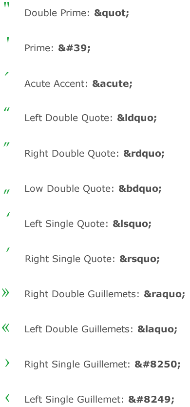
Here are the HTML values of all the special characters used in these samples:
This article was last modified on January 10, 2022
This article was first published on June 21, 2006
Commenting is easier and faster when you're logged in!

Recommended for you

Out of Gamut: Should Creatives Learn Color Management?
For the past few months I’ve been writing about making color management wo...

Review: Canon EOS M
Shutter noise in E flat major I photograph musical events in my community, speci...