


United and Continental Airlines recently announced a merger of the two companies. The new name is “United Airlines”. The new logo is this:
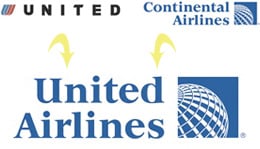
As you can see, while the first word in the name is still “United,” all other visual vestiges of United have disappeared.
What do you think of the new logo? Is it a successful mash-up, or just a mish-mash? Reply in the Comments.
For a bit of history on the design legacy of both companies, see Alissa Walker’s article “The New United-Continental Logo: Flying a Little Too Close Together.”
This article was last modified on August 13, 2021
This article was first published on May 6, 2010
Commenting is easier and faster when you're logged in!

Recommended for you

TypeTalk: Customizing Type Settings in InDesign
Q Is there a way to change the type-related default settings in InDesign? If so,...
Glyph Positioning and Baseline Shift
If you are a creative professional who is a stickler for typographic details, or...

How To Create Sharp Digital Type Images
Images that contain type make frequent appearances on websites and blogs, ebooks...