

The appearance of ascending and descending characters is largely an accident of history, but they now define the texture of what we find comfortable and easy to read.
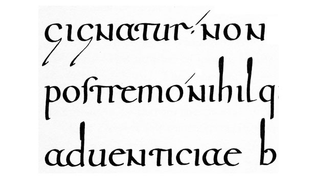
Ascending and descending letters are fairly new in the scheme of things, having first appeared in European texts in the form of what’s called half-uncial script. Uncial was the name given to hand-written capitals during the Roman empire. Half uncial characters, which appeared during the third century, had smaller bodies and certain of them featured strokes that rose above or hung below them, as shown in Figure 1.
Half-uncials also introduced some of the characteristics of contemporary lowercase characters. The upper bowl of the B, for example, disappears, as does half of the bowl of the R, along with its tail. The L is reduced to the familiar simple vertical stroke we still use today. It was the evolution of Carolingian (or Carlovingian) minuscules, some 500 years later, that gave us most of what we now recognize as the lowercase alphabet, but half-uncials blazed the path.
Figure 1: In this modern rendering, half-uncials of the 7th century have already sprouted prodigious ascenders and descenders as well as displaying precursors of several contemporary lowercase forms.
These days, the most obvious role of ascenders and descenders is to help us distinguish characters with otherwise similar shapes. But they—or rather their dimensions—also play a key role in opening up space between lines of text, making reading easier by allowing the eye to find the beginning of each line of text with optimal ease.
The great American type historian Theodore Low De Vinne (1828–1914), in reflecting on how black type needed to be, noted that “Types need a generous relief of white space, not only within but without each character, to give proper value to their black lines.” To a large degree, the practice of typography is the search for this ideal balance.
To this end, De Vinne advocated what he held to be the classic historical proportions of characters: that the lowercase characters should be one-third of the body size (that is, one third of their point size), and that “ascenders and descenders, equal in length, give the full relief of white space between the lines which contributes so much to easy reading.”
De Vinne lived at the end of an aesthetic era that had looked back longingly to an epoch before the advent of the grossnesses of the industrial revolution. It started with the pre-Raphaelite painters who thought that even high Renaissance art was too modern and had lost its humanistic values. It was necessary for art to return to its pure roots. The graphic arts followed suit, with such luminaries as William Morris leading the charge, designing types such as the Golden Type (see Figure 2), which he felt represented type as it was meant to be. That is, the types of the late 15th century.
Figure 2: Morris’s Golden Type harkened back to Venetian types of the turn of the 16th century, especially those of Nicolas Jenson. It’s fairly dark, almost dour, with little contrast between thick and thin.

De Vinne was not so naff as to completely eschew progress—both technical and aesthetic—but he was insistent that in the rush to modernize publishing and type production (to make it more profitable), designers had lost their way. Looking at 19th century books, it’s easy to see his point. It was hardly printing’s golden age.
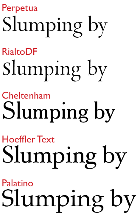
But when we look today at faces that reflect his ideal type proportions, they look a bit small in the body by modern standards. As you can see in Figure 3, contemporary faces in general boast larger x-heights, and consequently shorter ascenders and descenders. It’s particularly rare to find a face whose ascenders and descender meet De Vinne’s standard of equality in size. Descenders in general have become quite modest.
Figure 3: Perpetua (1925) and Rialto (1998) subscribe to De Vinne’s prescription for the ideal proportions of type, but by comparison to the others here they look small, even delicate. Cheltenham (1896) maintains the tall ascenders of yore, but its shortened descenders foretell a 20th century trend. Hoeffler Text (1992) and Palatino (1950) are classic examples of more contemporary type proportion.
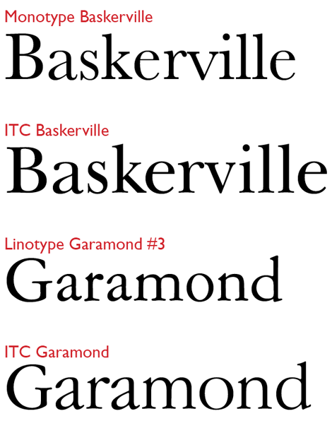
In the 1970s the International Typeface Corporation (ITC), with its influential system vendor–independent typeface library, did much to expand the large x-height aesthetic, as you can see in Figure 4.
Figure 4: Large x-heights were a feature of the ITC look. Compared with Monotype Baskerville (1923), ITC’s 1982 version (officially ITC New Baskerville) looks almost like a larger point size. In ITC’s take on the Jean Jannon face now called Garamond, the contrast in x-heights is even greater.
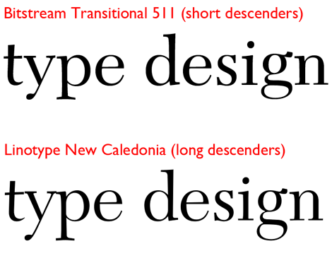
Ironically, despite the burgeoning of the world’s typeface library from a few thousand 30 years ago to almost a quarter-million today, there are probably fewer “long ascender/descender” variants of common faces than there were in the 1930s (see Figure 5). This is a shame, because it deprives us of textural variants in the typeset page that we ought to have at our disposal.
Figure 5: W.A. Dwiggins’s original Linotype version of Caledonia (1938) is now available in a Bitstream adaptation it calls Transitional 511. What was once an alternative cut, featuring long descenders, is now sold by Linotype under the name New Caledonia. But alternate versions of faces with varying ascender/descender lengths from the same vendor are rarities.
In practical terms, ascender and descender lengths along with x-heights have an important bearing on the leading values you choose. They also strongly influence the tracking settings you employ, because along with the weight of the characters themselves, they too are a critical part of the black/white balance across the page. This balance has to be maintained in both vertical and horizontal directions at all times.
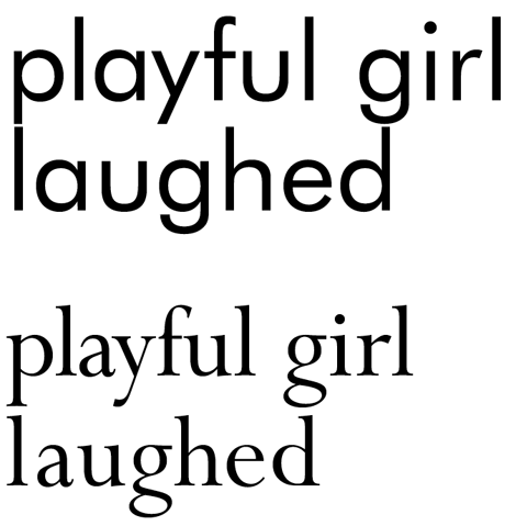
That said, a typeface’s tall ascenders and long descenders alone are not enough to let you cheat on leading. This is because long ascenders and descenders are not made so just by varying their relationship to x-height, but also by how much space they occupy on the body of the type. This body used to be physical (the height of the block a metal character was cast on) but it still exists as a software construct, and the body size for any typeface is one em in height. When ascenders and descenders scrape the limits of these vertical boundaries, leading is apt to look pinched, as seen in Figure 6.
Figure 6: Both Futura and Perpetua have relatively long ascenders, but because Perpetua is “smaller on the body,” a comfortable space remains between the descenders of one line and the ascenders of that below it. This isn’t the case with Futura, which when set solid gives the appearance of near collisions between characters on successive lines.
When looking at type samples to chose a typeface, then, the only way to judge the net scale of a face’s ascenders and descenders is to look at a solid set (point size the same as the leading) to see how much vertical breathing space it offers.
To wrap up, here’s a bit of descender trivia: Why is the capital J so often designed as a descending character? Clearly, it wasn’t designed in light of the problems it would later cause for those of us setting drop caps. While other latter-day caps unknown to the Romans (the W, for example, and the U) stayed base aligned, the J didn’t.
The answer starts with the Romans—whose capitals we still use virtually unchanged—who didn’t have a J and used the I in two roles, both as vowel (e.g., IDEM) and as consonant (e.g., IACTA, where it’s pronounced as a Y). Starting in the 14th century, manuscript writers began to distinguish the two sounds visually by extending both the upper- and lowercase consonantal I below the baseline. The descending i retained its dot, which today’s j does too. Meanwhile, the consonantal form of the I was being used to represent other sounds as well, including the soft g (as in ginger).
That the capital J, now with its own distinctive sounds associated with it, continues to be represented through its descending form is a testimony to the persistence of alphabetic shapes. The large majority of text faces continue to include a descending J, including those born of the 20th and 21st centuries, if only to remain faithful to historical precedents. It’s rare among sans serif faces, but not unknown, as you’ll be aware if you’re a fan of Thomas Phinney’s Hypatia.
This article was last modified on July 31, 2021
This article was first published on September 6, 2012
Commenting is easier and faster when you're logged in!

Recommended for you
History and Usage of the Ampersand
Everything you need to know about one of the most beautiful symbols in Latin-bas...

Choosing Type for Digital Documents
Nigel French shares his best advice for using type effectively in PDF, DPS, and...

TypeTalk: Tongue-Twisting Type
TypeTalk is a regular blog on typography. Post your questions and comments by cl...