

![]()

Versions: 5, 5.5
Operating systems: Macintosh, Windows
Among the numerous methods of image correction, Photoshop’s Curves feature is still one of the best. By learning to master curves, you’ll be able to improve color casts, enhance image detail, and adjust the contrast of an image, all from a single dialog box. A lot of color correcting is subjective and dependent on what you want to enhance in a given image. In this article, we’ll take you through the steps we used to correct the image shown in Figure A.
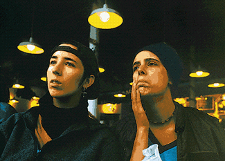
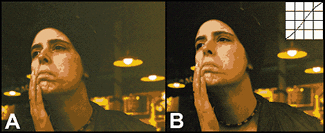
Figure A: This image seems normal now, but look where it started from in Figure B.
Getting Started
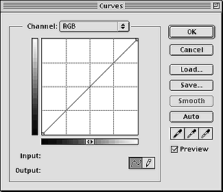
When beginning any serious correction endeavor, you always want to start on the biggest problem first. Our original image, as shown in Figure B, is very dark and appears to have a serious color cast, but we can’t tell how bad it is until we brighten up the image a bit. So, the first thing you’ll want to do is brighten the image. To do this, choose New Adjustment Layer from the Layers palette pulldown menu. In the resulting dialog box, choose Curves from the Type pop-up menu and then select the Group With Previous Layer check box. Click OK, and you’ll get the Curves dialog box, as shown in Figure C. Now, double-click on the black Eyedropper tool to bring up the Color Picker. This is used to set a neutral shadow color, so set the CMYK text boxes to 75%, 63%, 62%, and 90%, respectively, and then click OK. Next, follow the same steps to set the gray Eyedropper tool to 50%, 40%, 40%, and 10%, and the white Eyedropper tool to 5%, 3%, 3%, and 0%. You’ve now set neutral shadow, highlight, and midtone densities, but they haven’t been applied to the image yet. To apply these settings, you must determine what you want to be the highlight and shadow in your image. Depending on the state of your image, you may be able to eyeball the highlight and the shadow. If you can’t tell very easily, as is the case for our image, click Cancel to close out of the Curves dialog box. The Curves adjustment layer disappears since you didn’t use it.
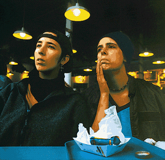
Figure B: As you can see, our original image is in bad shape, but we’ll bring it around.
Figure C: By choosing the proper settings for the three Eyedropper tools, you’ll substantially improve the image with only three clicks.
Adjusting the Brightness Range
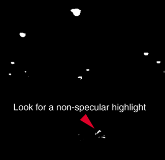
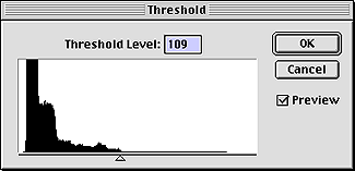
Now, here’s a trick to help you locate the lightest and darkest areas of your image. Choose Image > Adjust > Threshold. Your image immediately turns to black and white. At the bottom of the Threshold dialog box is a slider. Drag it until just a small section of your image is white. Ignore areas that you know are specular highlights, such as reflections or light bulbs. Those areas should be pure white. Look for an area of white that should still carry minimal detail. In our example, we’ve taken note of the small triangle of white formed by crumpled paper on the table, as shown in Figure D. Now drag the slider all the way to the left until your image is mostly white, with only a few black areas indicating the darkest regions of the image. Take note of where these areas are as well and then click Cancel. Now that you know the correct regions to click on with the Eyedropper tools, create another new Curves adjustment layer. In the Curves dialog box, select the black Eyedropper tool and then click in the shadow area. Then select the white Eyedropper tool and click in the highlight area. You can see our results in part A of Figure E.
Figure D: Use the Threshold dialog box to help you locate the highlight and shadow areas of your image.
Neutralizing Color Cast
You’re probably wondering about the gray Eyedropper tool. Now that you’ve determined the brightness range by setting the highlight and shadow, look at the image for any perceptible color cast. Typically, you can best see a cast in the highlight areas of an image. If your image doesn’t contain any good highlights, look for memory colors like skin tone, grass, or sky. Also, if you have an idea of what the color should be numerically, you can take a sample with the Eyedropper tool from the Toolbox to see what the color components are.
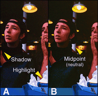
If you detect a color cast, like the magenta cast in part A of Figure E, then select the gray Eyedropper tool and click on an area of the image that you want to appear neutral. We clicked on the shadow on the pole. If you like the results, then click OK. Setting a neutral midtone can go a long way in alleviating the cast at least somewhat, as shown in part B of Figure E.
Figure E: Once we set the shadow and highlight points, you can see that our image has a magenta cast. You can frequently eliminate or reduce a color cast by setting a neutral midpoint.
Converting to CMYK
Now the image is brighter and easier to analyze. It’s best to switch to CMYK at this point to make color corrections and adjust skin tones. Converting to CMYK can be very destructive to the colors in your image. A lot of the colors that look nice and rich in RGB will be considerably duller in CMYK. To be sure that you get the best conversion possible, have your CMYK Setup adjusted to suit the process you’ll be using for printing. (For more information regarding appropriate CMYK Setup, see the article “Improving your print quality by knowing your ink limits” posted on our Web site this month at www.elementkjournals.com/ips.)
When your settings are ready, flatten the image layers and then choose Image > Mode > CMYK Color. Look your image over carefully to see which colors have changed. Don’t dismay if some of your colors look really bad, because you can do a lot to put the sparkle back into an image once it’s been converted. You just need to work on the most important colors first.
Adjusting Skin Tone
If an image contains people, the first thing you want to work on is creating realistic skin tones. Take a look at the sidebar, “Skin color by the numbers” to see typical ranges. The primary tool for this and other color correction work is the Eyedropper tool, because it gives you the numeric values of the pixels. You have to learn to work by the numbers since you can’t depend on what you’re actually seeing on the monitor. Double-click on the Eyedropper tool (ICON) to display its options in the Eyedropper Options palette. Set the Sample Size to 3 By 3 Average. You don’t want to use a point sample for color correcting because you might click on a wild pixel that’s not a general representative of the area.
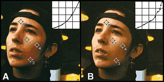
If you want to keep track of particular regions of the face simultaneously, you can set Eyedropper samplers that allow you to view readings from more than one area at once. To place samplers, hold down the [shift] key and click in the desired location with the Eyedropper tool. You can place up to four samplers and view their information simultaneously, as shown in Figure F. As you can see, once we have the samplers in place, the face is significantly more magenta than yellow in three of the sampled areas. To get the skin tone to print “normal,” we need to reduce the amount of magenta ink in these areas. You typically need slightly more yellow than magenta for light skin.
To do so, create a new Curves adjustment layer. In the resulting Curves dialog box, choose Magenta from the Channel pop-up menu. Align the Eyedropper tool within sampler # 1 and [command]-click ([Ctrl]-click in Windows) to place its density on the Magenta curve. Since the yellow is at 57 percent in this area, you’ll want to drag the point down until the Output text box reads 50%. Then, switch to the Yellow channel and [command]-click ([Ctrl]-click in Windows) on sampler # 1 once again to place the dot on the curve. Move the point downward just a tad, until the Output text box reads 55%, and then click OK. You can see our results in part A of Figure G. There’s a significant improvement, but more work still needs to be done with the Magenta curve. The beauty of adjustment layers is that you can continuously edit without damaging the image. In part B of Figure G, you can see our final image and how much we tweaked the Magenta curve to get the effect we wanted.
Tip: You can move samplers to new locations by holding down the [shift] key. To remove them from the image, simply drag them out of the window.
Figure F: Placing color samplers can help you keep track of more than one area at once.
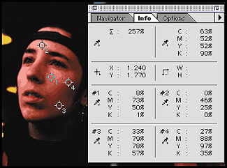
Figure G: By tweaking the curves only slightly, you can bring colors under control significantly.
Skin Color By the Numbers
Everyone’s skin tone is slightly different, but the numbers shown in Table A can help get you in the ballpark. The specific numbers aren’t as important as the relationship between them. For most skin types, you’ll want to have slightly more yellow than magenta, but this depends on the race or ethnicity of the individual being considered. Cyan ink may seem sort of surprising, but it does give a somewhat tan appearance to skin and can be adjusted as necessary.
Table A: Skin Colors

Fixing Contrast
You can control the contrast in an image by adjusting the overall curve shape. By making a curve more concave, you’ll increase the contrast in an image, but also the noise. If you make a curve more convex, you’ll reduce image contrast. For underexposed images like our example, an S-shaped curve enhances image contrast. For overexposed images, you’ll want to go with a more convex curve. In our example, the right side of the image has flatter contrast when compared to the left. To even up the contrast between the two sides, select Background and then switch to the Channels palette. Select just the right section of the Black channel. Be sure to feather the selection. Then, choose Image > Adjust > Curves to bring up the Curves dialog box. Now create a slight S-curve. If your adjustments look good in the Black channel, click OK and return to the composite channel to see how it looks with the rest of the image. We have quite a difference as you can see in part B of Figure H.
Figure H: An S-shaped curve in the Black channel improves the contrast in underexposed images like this one.
Taking the Time to Tweak
In this article, we’ve taken you through the process of correcting tone and brightness in an image with Curves. Before our final image was completed, several other steps were taken, such as sharpening the Black channel and balancing the contrast across the scene. You can apply a similar method to your own image, and you’ll see that color cast removal and other Curves-based corrections aren’t really that difficult.
Copyright © 2000, Element K Content LLC. All rights reserved. Reproduction in whole or in part in any form or medium without express written permission of Element K Content LLC is prohibited. Element K is a service mark of Element K LLC.
This article was last modified on January 3, 2023
This article was first published on August 14, 2000
Commenting is easier and faster when you're logged in!

Recommended for you

Mastering Photoshop Smart Objects: Layer Comps
If you need to develop several versions of a composition in Photoshop, Layer Com...

Batch Process Images with PhotoBulk
If you work on a Mac and regularly have to process images to size, optimize, or...

CreativePro Tip of the Week: Viewing Illustrator Artwork as Outlines
This CreativePro tip for viewing Illustrator artwork as outlines was sent to Tip...