Using InDesign, Illustrator, and Photoshop Together: Colors and Swatches
Next to fonts, colors are probably the most important aspect of InDe-Illu-Shop work. But there are so many mysteries about color and the programs almost handle colors similarly—except when they don’t. Here is a look at where the programs work perfectly together, and where differ.
Syncing Color Settings
When Adobe joined its programs into a Creative Suite, one of the first thing they did was make it super-easy to sync all the color settings for printing. This meant that all three programs would work to make colors look as similar as possible. Unfortunately, it’s not quite as obvious as it used to be as to how to automatically sync the color settings for the three programs.
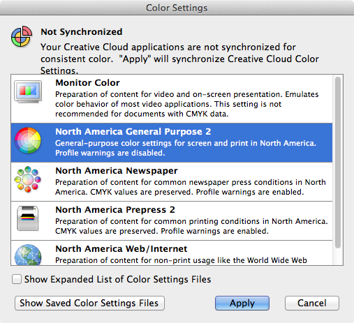
Start by choosing Edit > Color Settings in any of the three programs. Most likely your settings are synced correctly and you’ll see the color registration mark nicely put together as shown below.
But as soon as you make one change to the color settings for any of the three programs, the color registration mark breaks up.
So even though you made the change to Illustrator, Photoshop and InDesign don’t show that they sync to each other.
The problem here is you don’t know which application has the errant setting. Rather than frantically opening all three programs and looking at the Color Settings, it’s a lot easier to coordinate them all using Bridge.
Installing Bridge
Bridge used to be installed automatically as part of the Creative Suite. If you’re using CS6 or earlier, you can skip this section. However, when Creative Cloud came around, Bridge was quietly relegated to a separate and intentional install. Perhaps it was the myriad of users who never opened it and wondered why it was taking up space on their hard drive. (These were definitely NOT my students who are always taught the benefits of using Bridge.)
In any case, you can install Bridge through the Creative Cloud. Open the Creative Cloud application or, if it’s already running (as it should be) click its icon in the menu bar or system tray. Go to the Apps section, then scroll down until you see the entry for Bridge CC and click Install. There is no Bridge CC 2014, but Bridge CC also works with the CC 2014 apps just fine.
Once youve got Bridge running, go to the same menu as in the InDe-Illu-Shop applications, Edit > Color Settings. The Bridge color settings dialog box appears. Click the color setting you want and that’s it. Bridge automatically reaches out to your InDe-Illu-Shop applications and sets them all to the same color setting.
Even better, Bridge reaches out and changes Acrobat’s color settings. However, you won’t find the dialog box in the same place as InDe-Illu-Shop. It’s in Acrobat’s Preferences dialog box under Color Management. (Why you ask? Hey, I have no idea. It’s Acrobat.)
The Default Swatches
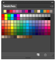
All three programs give you a starting set of default Swatches. In Photoshop these are a combination of RGB, CMYK, grayscale, and other others. It doesn’t matter what color mode or intention of where the document will be used, such as print, web, or video, or basic RGB; the same default Swatches panel appears.
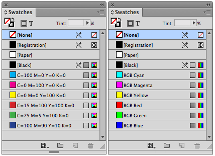
It’s a little different when you work with InDesign. There are two diferent default Swatches panel. If you choose Print as the intent for a new document, the Swatches panel displays CMYK swatches. If you choose Web or Digital Publishing, the Swatches panel displays a set of RGB swatches.
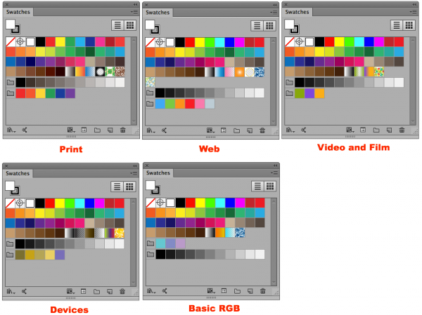
It’s hard to keep track of all the default swatches you can find in Illustrator. There’s a unique set of swatches for each of Illustrator’s five different document profiles: Print, Web, Devices, Video & Film, and Basic RGB. This has caused me great confusion on more than one occaision. I start one document with a Print profile and then another with a Web profile. As I work on the Web document, I can’t figure out where that cool pattern that I saw in the Print Swatches panel is. As long as you can remember that not all default swatches show up in each profile, you’ll be OK.
Creating New Swatches
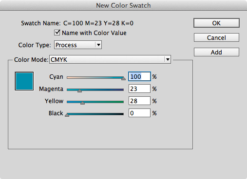
As nice as it is to have default swatches to start with, at some time or another you’re going to want to create your own swatches. It’s pretty straight forward in InDesign. Opt/Alt-click the New Swatch icon at the bottom of the Swatches panel or choose New Color Swatch from the Swatches panel menu and InDesign’s New Swatch dialog box appears. If you don’t hold the Opt/Alt key when clicking the icon, whatever color that was set in the Color panel will be added without going through the dialog box. Set the color how you want, and click OK. The swatch appears in the panel. Or click the Add button and you can make as many swatches as your heart desires without leaving the dialog box.
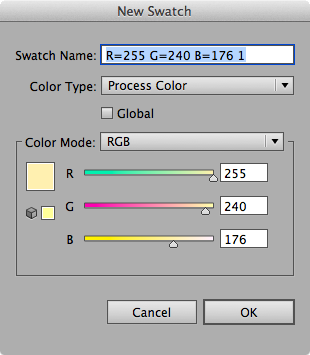
Illustrator gets to its New Swatch dialog box very similarly. Choose New Swatch from Illustrator’s Swatches panel menu. But instead of holding the Opt/Alt key as you click the New Swatch icon, just click with no keyboard modifier. This opens Illustrators New Swatch dialog box. If you do hold the Opt/Alt key as you click the New Swatch icon, you’ll add the currently defined color without going through the dialog box.
I know—it’s backwards. You would think that the Illustrator engineers would have coordinated with the InDesign ones, but no such luck. I’m constantly clicking holding the Opt/Alt key when I shouldn’t and not holding them when I should.
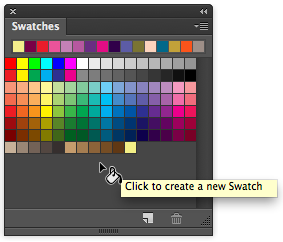
Things are even more different over on the Photoshop side of the fence. The New Swatch icon does nothing more than bring up a dialog box that lets you name the currently defined color as a swatch and add it to the panel.
If you want to add swatches without naming them, arrange the Swatches panel so that there is an empty area below the swatches. Then create a swatch and move your cursor down to this empty area. The cursor becomes a paint bucket that lets you drop the color onto the empty space.
The Color pickers
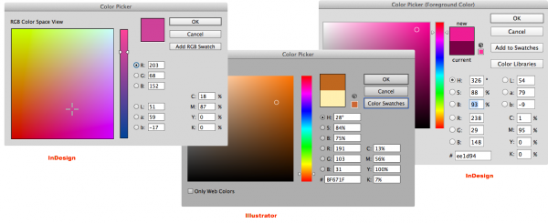
As an old print person, I rarely use the color pickers to choose colors. My primary reason is the pickers can only show colors in HSB, RGB, or L*a*b view modes. I just can’t think that way. But so many users, especially in Photoshop, define colors using the color picket.
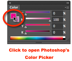
You open the Color Picker in Photoshop by clicking either the Foreground or Background square in the Color panel.
Double click the Fill or Stroke squares in InDesign or Illustrator to open their color pickers.
The Color panel
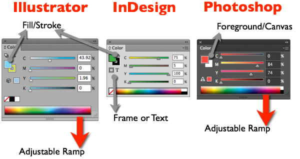
All three programs have Color panels that look very similar. However, Photoshop’s panel has a very important difference. Instead of the Fill and Stroke settings found in Illustrator and InDesign, Photoshop’s panel controls the foreground color for painting and the background canvas color that can be used for erasing.
The color ramps (spectrums) in Illustrator and Photoshop can also be lengthened and widened to make it easier to pick a specific color. Just pull the bottom of the panel down to expand the ramp.
If you have a text frame selected, InDesign has an extra setting to control if the color you’re defining should be to the frame that holds text or the text itself.
Defining Colors
All three programs define swatches slightly differently. Understanding these differences can help you avoid many problems later on.
Illustrator
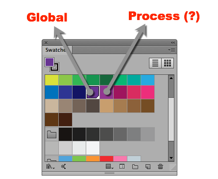
Illustrator has two types of color swatches: global and process. When a color is defined as a “global” color, it means that if you make a change to the swatch, the color definition for that swatch updates throughout the document. This is a real time saver when the client wants to change all the blues a “tad brighter.”
The other type of color in Illustrator is a Process color. This means the Swatch can be modified, but any instances of that color in the document will not be updated. The name Process is totally misleading as global colors can be (and often are) defined using the four process colors and will separate onto the CMYK plates. And it’s not like Illustrator uses these non-global colors for spot colors. Those are defined differently. I’d rather call them non-global colors.
However, if you define a color as non-global, it’s like having a color that has no link to where it’s been used. What is the benefit of such swatches? It’s not my cuppa-tea, but it’s supposed to give an artist more freedom to keep modifying the same color and use it all over a document.
You can tell the difference between global and process colors by looking at the Swatch. A white triangle in the color square means the color is global and will update all across the document. No white triangle means the color is non-global.
InDesign
Any color that goes into InDesign’s Swatches panel is automatically a global color. If you modify that color, all instances of that color update.
Photoshop
Photoshop only has non-global color swatches. When you define a swatch, the color is controled by that specific swatch. If you change the formula for the color, any instances of that color do not update in the document.
Unnamed Swatches
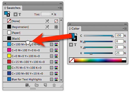
When you drag the Color panel sliders around, you are making “unnamed” colors. You can easily add them to the Swatches panel, by dragging them into the panel.
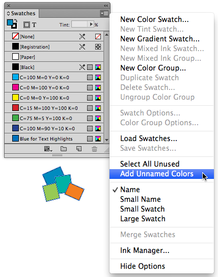
It’s very possible to forget to drag unnamed colors into the Swatches panel, and wind up with many unnamed colors floating around your document. Unnamed colors don’t hurt a file, but it can cause problems for print prepress managers who don’t realize other colors than what are in the Swatches panel are going to be printed. If you’ve created a mess of unnamed colors, use the Add Unnamed Colors command in InDesign to find all these colors hanging around the document and add them to the Swatches panel.
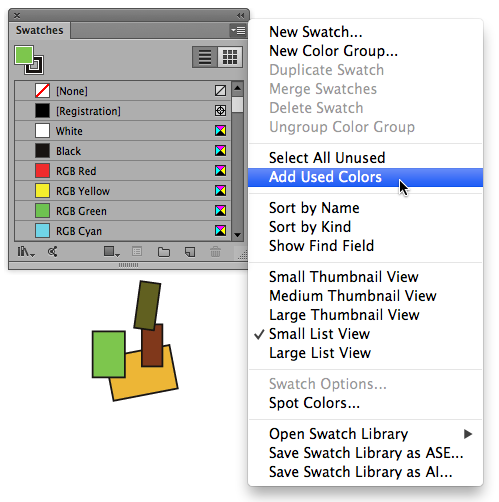
For some reason, the Illustrator team named this command Add Used Colors.
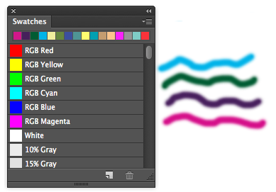
There is no equiivalent in Photoshop. Once you put a color on the Photoshop canvas, it’s always unnamed. Ther closest thing Photoshop has in saving swatches is the most recent colors list that appears at the top of Photoshop’s Swatches panel.
all three program’s Swatches panel.
But wait, there’s more…
Colors are such an important part of working in InDe-Illu-Shop, that it’s difficult to cram everything into one article. So, in part two, I’ll cover color groups, exchanging swatches between the program, color libraries, using the color rules from Illustrator, “stealing” swatches from Illustrator, and using Adobe’s Kuler community colors.
This article was last modified on January 8, 2023
This article was first published on July 17, 2014
Commenting is easier and faster when you're logged in!
Recommended for you

CreativePro Video: Using the Touch Type Tool in Illustrator
In this week’s CreativePro video, Mike Rankin demos how to adjust type with Illu...
Should You Use Photoshop CC, Elements, or Lightroom?
It can be a bit intimidating trying to decide which image-editing software you n...

CreativePro Tip of the Week: Photoshop Blend Mode Shortcuts
This CreativePro Tip of the Week for Photoshop blend mode shortcuts was sent to...


