
Web How-To: Create Liquid Layouts that Never Fail


To buy this book click here.
In Web-page design, page layouts with columns that expand and contract have certain advantages. They also have certain weaknesses if you don’t set them up properly. A flexible, fluid layout should meet the following criteria:
- Readable by a wide variety of browsers and untraditional devices.
- Friendly to search engines.
- Easy to maintain.
It’s possible to create liquid layouts using tables. But to best satisfy the above criteria, you need CSS.
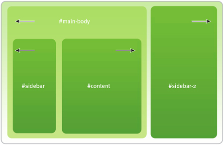
A fluid, CSS-based site could look like this.
After you’ve finished this article, you’ll be able to design CSS-based fluid Web sites with less code, a more easily maintained codebase, and a flexibility that will help the sites adapt to as many environments as possible.
We’ve posted this excerpt as a PDF file. To open the PDF file in your Web browser, click “Bulletproof.” You can also download the PDF to your machine for later viewing.
To open the PDF, you’ll need a full version of Adobe Acrobat (5 or higher) or the Adobe Reader, which you can download here:
 .
.
To learn how to configure your browser for viewing PDF files, see the Adobe Reader tech support page.
Excerpted from Bulletproof Web Design: Improving flexibility and protecting against worst-case scenarios with XHTML and CSS by Dan Cederholm. Copyright © 2006. Used with the permission of Pearson Education, Inc. and New Riders.
This article was last modified on January 8, 2023
This article was first published on November 18, 2005
Commenting is easier and faster when you're logged in!

Recommended for you

Where to Share Your Photos
When it comes to photography, finding your focus isn’t just about getting...
PIA/GATF Workflow Conference Features a Revolutionary Printer
Building successful graphic arts companies requires innovative thought. One of t...

Insider Software's FontAgent Pro Brings Professional Font Management to Windows
Insider Software today announced the immediate availability of FontAgent Pro 3 f...