In White Space, No One Can Hear You Scream

This is a new column on type, which will appear on CreativePro.com approximately every two weeks. In this first installment, I’d like to talk about white space. No yawning! I promise it will be interesting, important, and help explain why setting good type involves so much fiddling around.
The topics of spaces and spacing come up frequently when we talk type (and especially when I’m doing the talking). That’s because what we call type is actually the marriage of the visible characters and the blank space around them. You can’t think of one without considering the other.
Of all the empty areas on a page, the spaces I’ll begin with are the ones built into fonts. They set the stage for all that follows.
Thinking Inside the Box
In digital type, each character occupies its own tiny frame, called a bounding box. When you select type onscreen, these boxes become visible. The height of each box is the same as the point size you’ve chosen for your type, but its width depends on the design of the particular character. Just as a typeset page is 90% white space, most of a character’s bounding box is empty as well.
This composite screen image highlights alternate characters’ bounding boxes. Each character is bounded left and right by thin spaces that separate it from its neighbors, and these define the default spacing of a typeface.

Most of the time, when you ask your program to align type to this or that, it’s not aligning the visible type, it’s aligning the edges of that type’s bounding boxes.
The typeface designer’s job is to create a harmonious relationship between the visible character and the white space around it, and the way this is done defines how you should set that face. For example, if the bodies of the lowercase letters are small — that is, the face has a short x-height — there appears to be extra white space between one line of type and another.
This affects the leading values you choose: Faces with larger x-heights normally want more leading than those with smaller ones.
The amount of space in each bounding box occupied by a typeface’s lowercase letters affects the apparent leading of lines set in that face. These two samples are set with the same leading, but the spacing between lines seems more generous in the upper lines (set in Futura Book) than in the lower ones (Antique Olive Light).

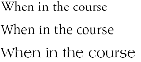
The proportions of each character also affect the apparent size of the type. In the following examples, all the lines are set at the same point size, but their sizes appear to vary depending on the character widths and x-height of each face. But the point size of the type is defined by the height of its bounding box. When leading is set solid (that is with the same value as the type’s point size), the rows of bounding boxes sit one on top of another, and ascending and descending characters may nearly touch.
The point size of type isn’t based on the size of its characters but on the heights of their bounding boxes. All three samples here (from top to bottom, Adobe Garamond, Raleigh, and Americana) are set at the same point size.

When a type designer’s work is done well, the balance between black and white from letter to letter and word to word is evenly modulated, creating a smooth and even texture over all. Any loose spots will look pale, and congested areas dark, making the color of the type look blotchy. This is, in the terminology of the type shop, “not pretty.”
Spacing by Default
In one of the trickiest aspects of typeface design — called character fitting — slivers of white space are assigned to each side of each character. You can think of these as indents within each character’s bounding box. When artfully applied, these side bearings establish a balanced spacing between characters that’s in keeping with the play of black and white in each individual character. In computer terms, they establish the default spacing values of your type.
When you set type with a ragged right margin (with no stretching or squeezing of spaces, as in justified type), you get the spacing that the typeface designer defined. It’s built into the font you’re using — your program can’t take any credit for it. Even the widths of word spaces are defined in the font, because the word space is just another character, designed to harmonize with the widths of the visible ones.
The main thing to take away from all this is that when you muck around with the spacing of type you do so at your own peril, because no one knows as much about that face and how it should be set as its designer.
Size Matters
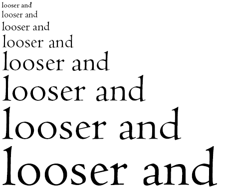
But then reality intrudes. A typographic truism states that as type grows larger, white spaces appear to grow faster than the visible strokes of characters. That is, the bigger the type gets, the looser is seems to be spaced.
The type set in the smaller sizes here (Centaur) has what you’d call normal spacing. But as point size increases, the type seems to become more and more loosely spaced. It’s an optical illusion, but it’s a fact of life for the typesetter. Larger type needs to be spaced more tightly to avoid appearing too loose.

Digital typeface designers have to reckon with this fact, despite generally being obliged to choose a single point size at which to define the ideal character spacing for a face. In the old days of handset type, it was normal for every point size of a typeface to have unique character fitting. But in digital fonts, it’s typical for all point sizes of a type to be generated — scaled — from a single master set of designs. And these work best only in a small range of point sizes, usually those used for body text, as in a book or magazine.
It’s normally impossible to know which point size a particular typeface was designed at. A handful of OpenType fonts feature what Adobe Systems calls opticals, which are point size–specific iterations of the typeface. A single font, for example, may contain versions to be used in small sizes (say, footnotes), as body text, and in large display sizes. But for the vast majority of text fonts, it’s safe to assume that its master outlines — from which all point sizes are generated — were created at 12-point. And “one size fits all” is about as true for type as it is for shoes.
This means that when the type you’re setting gets much smaller or larger than 12-point, you’re obliged to adjust its tracking. In small sizes, you’ll have to loosen it; in larger sizes, tighten it. (I’ll take a close look at managing tracking in a future column. I’ll also be tackling the issue of how relying on a single set of master outlines makes type less legible in small sizes and appear badly proportioned in large sizes.)
Fitful Character Fitting
Despite a type designer’s best efforts at character fitting, no one can predict which characters will end up sitting next to which others. Characters with squarish sides — m, i, h, for example — tend to nestle up against each other neatly and predictably. But others have more problematic shapes, such as rounds (d, p, o) and angles (y, v, w). Then there are those that reach out and gobble up nearby space, such as T and f. When incompatible character shapes appear next to each other on a line, the spacing of the characters gets choppy, as knots and gaps disrupt the flow of letters and words. As a reader, the effect is like driving on a bumpy road. You’re getting to your goal, but it’s not a very pleasant ride, and you’re happy to pull over and stop.
The solution is kerning, which is the adjustment of spacing between individual pairs of characters. Fonts contain long lists of character pairs with known spacing problems — Te, for example — along with spacing adjustments that should be made between them when they occur on a typeset line. Page layout programs and most word processors (Microsoft Word, for example) can read these kerning tables and adjust spacing automatically on the fly. Free or cheap fonts often rely on computer-generated — as opposed to eyeball-generated — kerning tables and character fitting, and the results are usually second-rate, if not third or fourth.
But again, the kerning values in a font work best at the size at which the character outlines were designed, which is usually 12-point. At sizes below, say, 8-point, it’s often better to turn automatic kerning off, as it can cause spacing to appear too tight, especially on medium-resolution desktop printers. Likewise, at large sizes, the exaggerated impact of white spaces between characters renders many automatic kerning values inadequate. Kerning problems that are insignificant at text sizes suddenly become an issue, and these need to be fixed by hand. Kerning is another topic I’ll dig into deeper in coming issues.
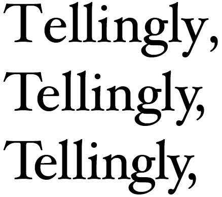
A magnified view of how kerning works. In the Hoeffler Text sample at the top, automatic kerning has been turned off to show that even the most assiduous character fitting can’t assure perfect spacing. The Tel combination is particularly loose, and the comma is drifting off into space. In the middle sample, automatic kerning has been turned on, and at text size everything would look hunkey dorey. But when enlarged to display size as it is here, tiny flaws loom large. In the bottom sample, hand kerning has been used to draw the Tel combination even closer together, so it better matches the rhythm of black and white in the llin that follows. The ngly sequence has also been subtly tightened to provide consistent color throughout the word.

The Bright Side of Uniformity
A major part of typesetting is the pursuit of good type color. While uniformity and evenness is often a formula for dullness — in typeface design, for example — in text spacing it’s a virtue. Perfect, regular spacing is invisible to the non-typoholic reader. That’s as it should be. It’s bad spacing — the gaps, the clots, the alternately loose and tight lines — that stand out.
So that’s the point of this column #1: White space management begins when you choose a typeface. And the better-made that typeface is, the farther along you are to lovely type before you even set the first character.
Are there type topics you want to learn more about? Font problems that make you nuts? Programs that won’t set type the way you want them to? Do you have questions about how type should be set or where typographic conventions came from? It’s all grist for the mill — just let me know by clicking the Comments button below, and I’ll try to work it into an upcoming column.
This article was last modified on August 18, 2021
This article was first published on August 10, 2009
Commenting is easier and faster when you're logged in!
Recommended for you

TypeTalk: Typography for Presentations
Follow these simple guidelines to create a visually successful presentation that...

Legibility and Readability: What’s the Difference?
Learn the difference between "legible" text and "readable" text and how to ensur...

TypeTalk: Standard vs. Discretionary Ligatures
In typography, a ligature refers to a specially designed character created by co...


