

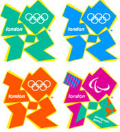
The logo for the 2012 Olympic Games comes in several permutations:
There’s also an animated version, but anecdotal reports of it causing seizures in some viewers apparently prompted the Olympic Committee to remove the animation from the Internet for now.
The BBC asked visitors to its Web site to create their own logos. Many were worse than the original brand, but a few weren’t half-bad:
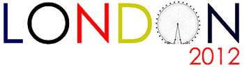
Does the fact that I prefer Ryan J. Fuller’s clean, spare logo mean I’m an old geezer?
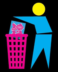
Oliver Fergusson Taylor’s “brand” just makes me laugh.
To post your opinion of the original London 2012 logo, click on the word “Comments” above and below this post. You can also include URLs to your own attempts at the brand.
This article was last modified on July 20, 2021
This article was first published on June 11, 2007
Commenting is easier and faster when you're logged in!

Recommended for you
The Making of a Typeface
Rob Keller took almost three years to design the Vesper typeface. He chronicles...

Get Creative with This iOS 8 Keyboard
Why type your texts or use the same tired emoji icons in your emails when you co...

OnOne Software Supports QuarkXPress 7 with QX-Tools Pro 7
Quark Inc. and onOne Software Inc. announced today the upcoming availability of...