


A new service launched that aspires to take the mediocrity and expense out of infographics. Rather than rely on Powerpoint’s ho-hum charts or on pricey custom graphics, people whose task it is to present visual data have an alternative in an online infographic-creation service from Visual.ly.
Visual.ly says that in a world of data overload, representing facts visually is an important way to communicate essential information. Indeed, the use of infographics has been on the upswing, and not all of the ones produced are for corporate use. Browsing the blogs finds individuals creating infographics based on personal interests or cultural observations. For example, just this past week Inspiredm.com reposted infographics about how fat Americans will be in the future and what are the benefits of having a mustache. Some infographics are clearly tongue in cheek, but others are about serious subjects — the “fat Americans” infographic, while represented in a lively graphic style, is actually from the Medical Coding Career Guide that seems to suggest our impending obesity as a society is a good reason to study medical coding.
Visual.ly defines infographics as “design meets journalism meets analysis” or “story + data + design.” At its most basic implementation, users pick a design and theme, which range from the cartoonish to the sophisticated, then select what type of data they want represented. The site then scours other sites for the pertinent information. For example, to compare activity on Twitter, you enter the @ name and Visual.ly searches the Twitter API for the most recent usage data. It then puts the data in context of the pre-designed layout. You choose to download or embed the file, but be prepared to wait a long time as the site pulls the data and generates the finished product.
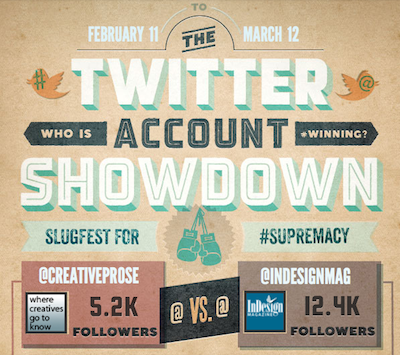
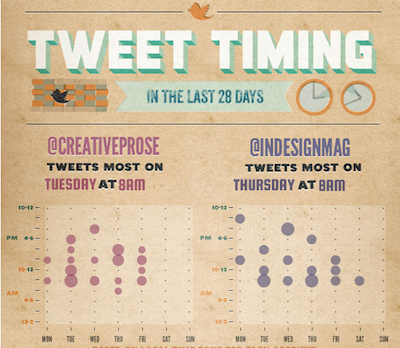
Two portions of the infographic showing activity of the Twitter accounts for @CreativeProse and @InDesignMag. (Don’t follow us yet? Sign up!)
The site offers not only a way to create meaningful visualizations of hard-to-decipher statistical information but also to provide a social network of sorts, where people can post and share their data creations. The service is free, but Visual.ly says that it will offer a premium, paid version. It also says that it welcomes designers to submit layouts and themes to be added to the pool of available designs.
Visual.ly is not the only site to offer data-visualization services, but its vision is big. Looking ahead it sees opportunities to serve up data dynamically on a mobile device so that an infographic is constantly updated.
Learn more by watching Visual.ly’s promotional video.
This article was last modified on August 9, 2019
This article was first published on March 13, 2012
Commenting is easier and faster when you're logged in!

Recommended for you

Interview with Deborah Corn, Intergalactic Ambassador to the Printerverse
Q&A with Deborah Corn, who is presenting at The Design + Marketing Summit 2025
Scanning Around With Gene: The Dead Letterhead Department
Like many baby boomers, I didn’t plan as well as I should have for my future bac...

Thou Shall Not Use Comic Sans
Excerpted from Thou Shall Not Use Comic Sans: 365 Graphic Design Sins and Virtue...