

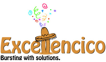
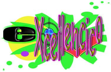
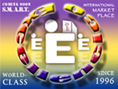
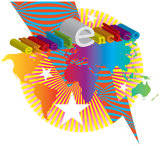
The How Low Can Your Logo? contest challenged designers to create the worst logo possible that meets a fictional client’s brief. The mock client, Excellencico, requested a logo that’s “simple and yet detailed, complex yet spare… ‘Just right’ is the vibe we are looking for.”
There were almost 1,500 entries, which ranged from bad to worse; you can see them all here.
The judges must have had a hard time separating the chaff from the chaff, but at last, the winners have been declared:
Winner: John Herd [Mmm, Hobo.]
First runner-up: Jesse Andrew Tilley
Second runner-up: David J Swift

Third runner-up: Jason Jones
Fourth runner-up: Brian LaRossa
You can read more on the contest history here.
This article was last modified on August 12, 2021
This article was first published on December 30, 2010
Commenting is easier and faster when you're logged in!

Recommended for you
InDesign Template: Presentation
This 1920 × 1080 InDesign template comes with 15 slide designs, plus additional...

How to Create an Effective Product Label
Product labels describe a product as well as help it to stand out from comp...

How to Create Numbers in Circles Within a List in InDesign
Learn how to put numbers inside of custom circles in InDesign—even if they are p...