

Gregory W. Jacobson of Dead Image Design created Millesime, a French word that, according to the Interwebs, means “vintage year” when it’s a noun and “vintage” when it’s an adjective. Either way, the name fits.
“I draw heavily from vintage design while incorporating contemporary elements,” Jacobson says.” The idea is to create and conceptualize something unique yet timeless while avoiding your typically sterile computer generated artwork. I believe the human element has disappeared from most modern design, and I aim to rectify that with my own work. Also, I sincerely hope that the aforementioned statement doesn’t make me sound like a pretentious twit.”

Now, are you ready for the best news? This font is only $3.99 from Chank Diesel’s Web site. Yet another reason to love the guy.
Do you suffer from font fixations? There are sympathetic ears in the Fonts and Typesetting Forum.
This article was last modified on December 17, 2022
This article was first published on March 24, 2008
Commenting is easier and faster when you're logged in!

Recommended for you
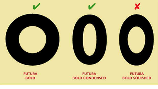
TypeTalk: Why Distorting Type Is a Crime
Ilene Strizver explains why not to distort type and what to do instead.

Stylish New Fonts and Goodies from House Industries
Every design discipline resides at the crossroads of art, influence, relevance,...

Marcel’s Letters: A Font and the Search for One Man’s Fate
Marcel is more than just a beautiful script typeface. It is the product of a fan...