

Sudtipos is an Argentinian type foundry with a flair for the dramatic.
I’m in love with the foundry’s logo, which neatly conveys the foundry’s location and purpose in just a few lines:

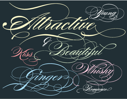
Sudtipos’ Burgues Script ($99 from Veer) recently won an award from the Type Directors Club:
Thanks to CreativePro reader Chris Cousins for telling me about Sudtipos. If you’re in love with a typeface (or a foundry), let me know!
This article was last modified on January 9, 2022
This article was first published on March 6, 2008
Commenting is easier and faster when you're logged in!

Recommended for you

Learn Typography in Ten Minutes with Butterick’s Practical Typography
What could you learn in ten minutes? A few Photoshop tips? How to speed read (so...

TypeTalk: U&lc Magazine Retrospective part 3, Initial Letters and Words
We continue our retrospective of the groundbreaking U&lc (Upper and lowercas...

Chalk Lettering, a Return to Low Tech
One of the most charming trends to hit graphic design and typographic solutions...