
Like many baby boomers, I didn’t plan as well as I should have for my future back when it was still a future, so now I find myself looking for a new career opportunity, one that won’t just pay the bills but may actually help me get ahead. So I’ve been dusting off my résumé and getting ready to send a few notes and letters to people and places I’ve considered working for.
The last time I looked for a job was in 1991, and in those dark days we didn’t have email, PDF files, personal Web sites, LinkedIn, or Plaxo. Most of my time back then was spent on developing a look for the various printed elements needed as part of a job search. There were thank-you cards, note cards, personal business cards, and most importantly, a personal letterhead. And even though I know job searches no longer start with the design of letterhead, I simply had to dig out the “good letterheads” file I’ve been keeping for a few years.

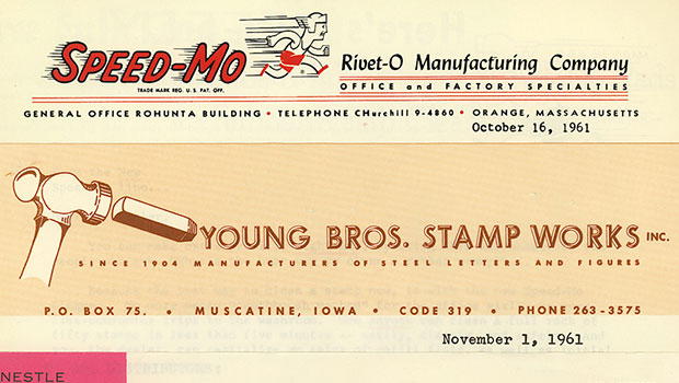
All of the letterheads shown here are scanned from the actual stationery, and if you click on them you can see a larger version.
I also ordered them by date, starting with 1940 and ending with 1969, which is just about when letterheads starting getting too trendy and over designed for my taste. If you look closely at most of these, you’ll see the dates when the letters were written.

There are lots of great letterheads out there, and plenty of books that display them — these are just the ones I physically have on hand. I don’t think you can properly evaluate a letterhead design unless there is actually a written letter on it, but I didn’t show the text here for space and privacy considerations.
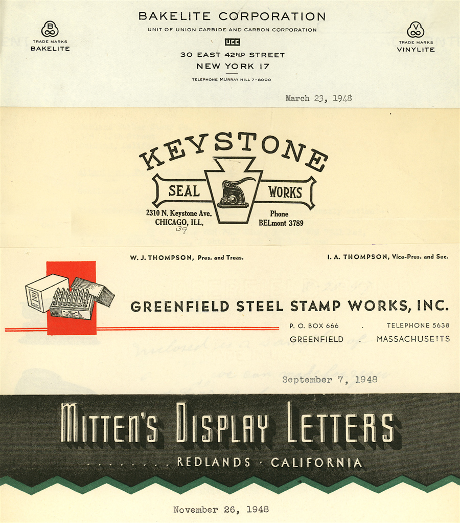
Today letterheads, when they even exist, usually consist of a logo and minimal contact information. But in the old days, especially for smaller businesses, the letterhead was also a primary marketing vehicle, with descriptive text and slogans.

And while it’s understandable why, in our current global economy, most companies don’t show headquarter building or factories on their letterheads, I am most drawn to those designs that represent a company’s physical image. If that doesn’t take the form of a photo or drawing of a building, I think it should at least show a product or service.


But alas, today’s massive corporations often don’t want to be associated with any single product, industry, or even country. So letterheads are just brand extensions that mostly appear at the top of mass-marketing materials. The amount of letters containing a real signature that go into the postal system each day have to be pretty minimal compared to the decades represented here.


I’m sure designers still provide most clients with sets of letterhead, envelope, and business card designs, but the individual letter is surely no longer the primary means of business communication.


I’ve decided that, in my current career machinations, I’m going to avoid submitting things electronically whenever possible, so I still need a nice letterhead design and a few boxes of Crane stationery (phew!). If you see any favorite designs among this group, let me know. The only thing I do worse than save for the future is make design decisions!
This article was last modified on May 18, 2023
This article was first published on September 12, 2008
Commenting is easier and faster when you're logged in!

Recommended for you

Social Media Guide For Graphic Designers
As Creative Professionals we can’t ignore the value of Social Media and wh...

How To Create Sharp Digital Type Images
Images that contain type make frequent appearances on websites and blogs, ebooks...

Introverts and The Art of Self Promotion
Many creative professionals tend to be introverted. Often they feel this is hold...