Scanning Around With Gene: It's a Wonderful Typeface

16

I’ve always been a sucker for Frank Capra movies, a genre lovingly referred to as “Capra-corn.” Who can resist “Mr. Smith Goes to Washington,” “You Can’t Take it With You,” “Mr. Deeds Goes to Town,” “Meet John Doe,” and of course the ever-present Christmas classic “It’s a Wonderful Life?”
So this week I thought I’d look at the graphic design in and around everyone’s favorite Christmas classic starring Jimmy Stewart and Donna Reed. Click on any image for a larger version.


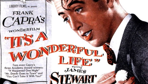
Like so many other 1940s movies, “It’s a Wonderful Life” has hand-lettered opening titles that peel off like pages in a book, one of my favorite title tricks. Despite the colorized versions floating around, the movie was most definitely filmed in black and white. It was released in 1946.


Originally intended as a vehicle for Cary Grant, “It’s a Wonderful Life” was based on a short story called “The Greatest Gift” by Philip Van Doren Stern. Unable to find a publisher for his short story, Van Doren self-published “The Greatest Gift” as a Christmas card in 1939. He sent it to approximately 200 people and it caught the eye of an RKO producer, who convinced the studio to buy the rights for $10,000.


But Cary Grant was busy, so the story and the rights ended up with Capra’s production company, Liberty Films, which made the movie for approximately $3 million.

When it was released in 1946, the movie opened to mixed reviews and mediocre success. It wasn’t until much later, when it showed up on television each holiday season, that the movie came into its own as a true classic.


The set of Bedford Falls (and Pottersville) was built on RKO’s ranch in Encino and is thought by the residents of Seneca Falls, New York, to be based on their town (which Capra did visit in 1945). Each year Seneca Falls holds an “It’s a Wonderful Life” Festival. It’s also home to the Hotel Clarence, named after the guardian angel in the movie.


The original set was destroyed in the 1950s, but the gymnasium floor with the pool underneath still exists at Beverly Hills High School, where those scenes were filmed.


There are a lot of great neon signs in the Pottersville version of the town, the implication being that neon is tawdry and associated with cruder forms of entertainment, pawn shops, and the like.


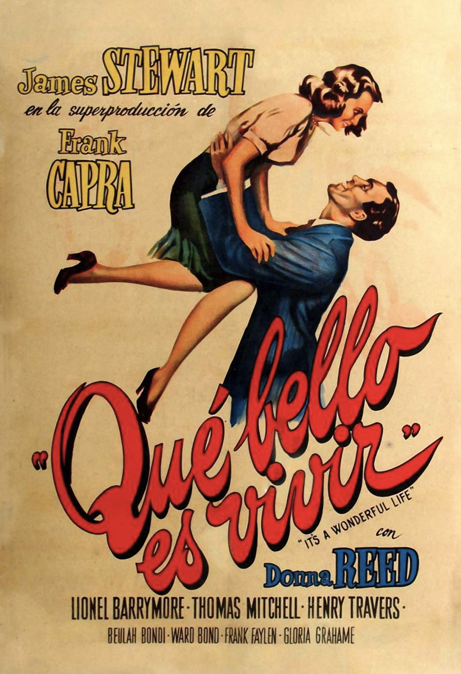
Thanks to copyright problems over the years, the movie has had a lot of different owners, and various versions have been released worldwide. Here are just a few of the foreign-language posters for the film.


The original theatrical trailer, from which these screen shots come, pitched the movie more as a romance than a moral tale. While not generally controversial, the FBI did receive at least one complaint at the time that “It’s a Wonderful Life” was “Communist propaganda” because it portrayed bankers as evil and insensitive.


Did “It’s a Wonderful Life” win an Oscar? And was it the inspiration for a certain famous Muppet duo? Go to page 2 to find out.


1 2 Next

Gene Gable has spent a lifetime in publishing, editing and the graphic arts and is currently a technology consultant and writer. He has spoken at events around the world and has written extensively on graphic design, intellectual-property rights, and publishing production in books and for magazines such as Print, U&lc, ID, Macworld, Graphic Exchange, AGI, and The Seybold Report. Gene's interest in graphic design history and letterpress printing resulted in his popular columns "Heavy Metal Madness" and "Scanning Around with Gene" here on CreativePro.com.
  • Anonymous says:

    I first saw the film in the middle 1970’s, our local PBS affiliate (WNEO/WNIO in NE Ohio) started showing it around Christmas time. Being in my middle teens at the time, I had no idea who Frank Capra was, or the story surrounding the film. All I really remember is that it seemed like a very intelligent film compared to much of the dreck that got (and still gets) shown around this time of year on TV.
    It wasn’t until several years ago that I saw the movie again on broadcast TV, NBC was showing it and several times during the ‘holiday’ season. I feared they were going to ‘TBS’ it (rerunning constantly until trite), but they seemed to have backed off of doing that. Still one of my favorite Christmas movies, along with Jean Shepard’s ‘A Christmas Story’.

  • Anonymous says:

    I would be aware of this movie every xmas and might just catch a glimpse of it here and there but not really sat down and watch it from beginning to end until recently. I was hooked from that day and look forward to watching it every holiday season with the rest of my favorites. You see, I am an optimist and believe beauty is in the eye of the beholder so I really loved the film. Thank you for this wonderful feedback, this movie wouldn’t be the same without James Stewart and who knew they named a hotel after Clarence? lol!

  • Anonymous says:

    …to Gene, the web’s best visual sociologist!

  • Anonymous says:

    This is my favorite, favorite film. I know, I’m a sap. I was so excited to see this article, and always enjoy seeing what you put together. Thank you, and have a Merry Christmas!

  • Anonymous says:

    Disappointed that you don’t have the”Ask Dad, he knows” sign from one of the early scenes in the pharmacy – I’ve been looking for one of these for my kids for years!

  • Anonymous says:

    Great research and wonderful to view.I will take a closer look next time iI see the original poster and movie Do you have any credits for the original pioneering lettering artists?
    Vincent McEvoy London

  • GeneGable says:

    Sadly, during the studio days of movie making, there was not often credit given for the terrific titles, which simply came out of a department on the studio lot. Someday I’d love to do a little more research and find some of the artists who did this hand-lettering. But I could not find any credits for this particular movie.

    Gene Gable

  • Anonymous says:

    Frank Capra’s was a style and an approach to filmmaking that no others have consistently been able to emulate. Many of his stories, in other hands, would have been slapstick or maudlin or both. Attempts have certainly been made, about which the less said, the better.

  • Anonymous says:

    Thanks, Gene, for yet another great piece of research! Never had heard about the Bert and Ernie rumor…nor the Seneca Falls festival and hotel named after Clarence!! Now I’ll never watch the film in quite the same way again. You really are the web’s true “visual sociologist”. I look forward to your pieces every week! Keep up the good work! And Merry Christmas!

  • bruce272 says:

    Gene,

    One of the best pieces you ever wrote. I really enjoyed it

    Merry Christmas

  • ajasys says:

    …you never actually discussed the fonts used in the titles, the advertising, or anywhere else.

    Sheesh, Gene… Did you forget what your article title implied?
    – – – – – – – – – – – – – – – – – –
    Sanity is a relative concept.
    If you don’t believe me,
    let me introduce my relatives.
    – – – – – – – – – – – – – – – – – – –

  • Terri Stone says:

    In the third paragraph, Gene explains that the type was hand-lettered.

    Terri Stone
    Editor in Chief, CreativePro.com

  • Anonymous says:

    Gene,

    wholeheartedly I say, thank you, you’ve made my life wonderful!

  • Anonymous says:

    Gene,
    Great article! I’ve always loved the hand lettered credits and I’m always “willing to buy into this story hook, line, and sinker”. Watching this movie is an absolute must for me during the Christmas season!
    Happy New Year!
    Pat in Missouri

  • Marc says:

    I really enjoyed reading this. Thank you and merry christmas!

  • Terrence Meehan says:

    Glad you brought Gene back! With introduction of VCRs I had the opportunity to pause playback to study those opening titles. I know it was filmed in black and white but I would love to see them in the original color. I still pause them…

  • >