

Today’s installment requires a leap of faith that, by the time you view many of the images, you may have a hard time maintaining. So I’m going to repeat the basic premise several times: Every image here was made from a black and white photograph with the colors added through a patented lithographic process that relied on photographer’s notes to accurately reproduce the colors. All of these images (with the exception of the first example) were made before the invention of color film, which took place in 1907 but didn’t become practical until the 1930s.
Shortly after the invention of photography, printing companies sprung up to produce hand-tinted color prints, which involved adding a layer of color by hand over the black and white images. While some of them look pretty decent, they have an unreal quality and lack the subtle shading and detail of a real color photograph. Here’s an example of a hand-tinted photo of the intersection of Hollywood and Vine Streets in Hollywood. Click on any image for a larger version.

In the 1880s in Switzerland, an inventor by the name of Hans Jakob Schmid came up with a process using lithographic stones and a series of light-sensitive chemicals he ended up calling Photochrom (also known as Aac). From a single black and white negative, the Photochrom process enabled craftsmen to add subtle and surprisingly realistic color to an image. Here, from the Library of Congress collection, is an original black and white image of Half Dome in Yosemite, followed by the Photochrom version.


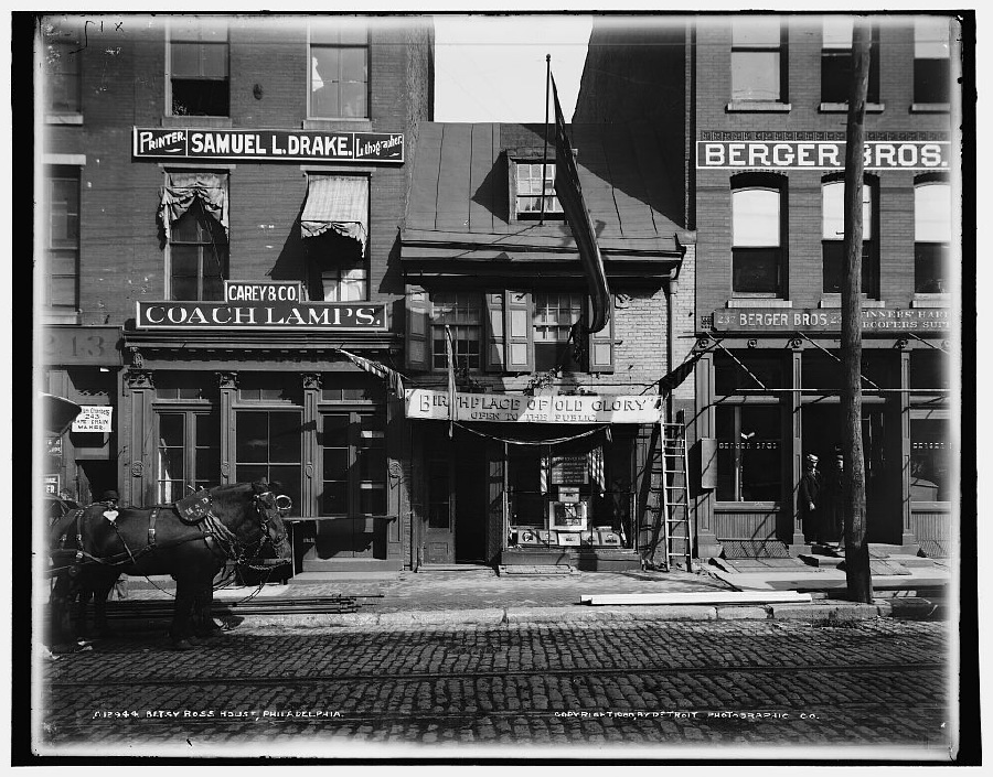
And here, an image of the Betsy Ross house and then a detail of the color version produced with the Photochrom process.

The way the Photochrom process worked is somewhat of a mystery. Only one company, The Detroit Publishing Company, was licensed in the United States to produce Photochrom images. What we do know is that the original black and white negative was reversed into a halftone positive and then exposed to highly polished limestone litho stones covered with the chemical bitumen. This process was standard in photo lithography, but with a twist.


With Photochroms, multiple exposures were made on multiple litho stones, one for each color tint. The final color image typically was produced by at least 6 and up to 15 different stones. By varying the exposure (which was done in daylight and took from 10 minutes to several hours) and then manipulating the developing of the stones (by brushing various chemicals into certain areas), the artists were able to separate the black and white image into color tints.
Again, each of these images were made from a black and white photograph, often by a printer who had never viewed the original scene.


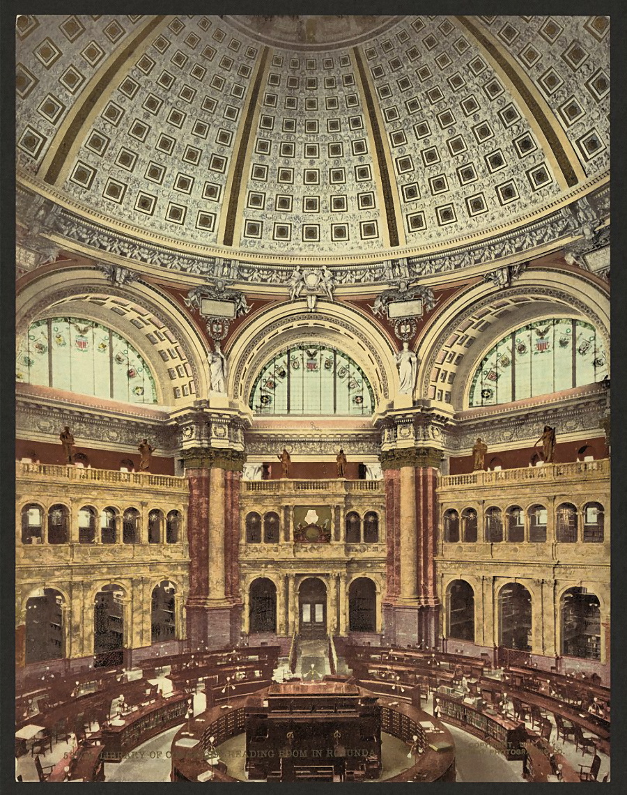
Thanks to a special 1-cent postage rate passed by Congress in 1898, post cards took off in America, and Photochrom prints became one of the more popular printing methods. At its peak, the Detroit Publishing Company printed as many as 7 million Photochrom prints per year and had a library of 10,000 to 30,000 images. Here are three images of the Library of Congress, complete with highly detailed color interiors.


In most cases the photographer would take extensive notes on the colors in the image and supply them along with the original black and white negative. The negative would then be retouched, often to de-emphasize a background or to highlight part of the image.


Next, artists would do their best to paint over a black and white print with colors to serve as a guide for the litho stone maker. But the final colors weren’t added by hand — they were done in the exposure and developing process, often using classic dodge and burn methods. Images were also manipulated by sanding the exposed litho stones with a fine pumice powder.


When there were no photographer’s notes accompanying the black and white photographs, the colors were left somewhat to the imagination of the artists and may not resemble true colors at all, regardless of the realism of the image.


Here’s how the Detroit Publishing Company described the process in one of its 1901 catalogs: “…the only successful means yet known of producing directly without the aid of hand color work a photograph in the colors of nature. The results combine the truthfulness of a photograph with the color and richness of an oil painting or the delicate tinting of the most exquisite watercolor. The colors are absolutely permanent and attain the virility and strength of nature so often lacking in hand colored work. The prices are no more than those of ordinary photographs. The inventors have spent thousands of dollars and years of study before reaching their present success.”


The images in today’s column are from both the Detroit Publishing Company and the original Swiss printing company where the process was developed, Orell Füssli. The process was also licensed to a London printer. Some of the images have an ethereal quality to them, but mesmerizing nonetheless.


During World War I post cards lost popularity, and by the 1920s new and cheaper printing methods were coming on the market. The Detroit Publishing Company went into receivership in 1924 and its assets were liquidated in 1932.


The Library of Congress (from which these images came) has a collection of about 6,000 photochroms, and the Henry Ford Museum in Detroit also has a large collection. Because of the quantities produced, you can even find Photochroms outside of institutions. Most prints are either 6.5 x 9 inches or 3.75 x 7 inches, though there were also much larger panoramic Photochroms.

If you’re interested in giving an existing digital color image the Photochrom look, check out this method to do so in Photoshop Elements (easily transferred to Photoshop).
For you Sherlock Holmes fans, here’s a Photochrom of Reichenbach Falls in Switzerland, where Holmes had his famous battle with Professor Moriarty.

You can view more of the collection at the Library of Congress Web site, which has put together a special collection of Photochrom images.


And just to make the point one last time, I’ve included a final example of a black and white photo and the Photochrom image of the same scene.


This article was last modified on May 17, 2023
This article was first published on November 13, 2009
Commenting is easier and faster when you're logged in!

Recommended for you

Social Media Guide For Graphic Designers
As Creative Professionals we can’t ignore the value of Social Media and wh...
Scanning Around With Gene: Vote Like Your Life Depends on It!
I was lucky to benefit almost immediately from the passage of the Twenty-Sixth A...

Communication Arts 7th Annual Typography Competition
Communication Arts magazine, a professional journal for those involved in visual...