

TypeTalk is a regular blog on typography. Post your questions and comments by clicking on the Comments icon above. If Ilene answers your question in the blog, you’ll receive one Official Creativepro.com T-Shirt!
Q. Most design software lets me stretch and squeeze characters, but I’m not sure how far is too far. Are there acceptable parameters for distorting type?
A. If someone threw you a noose, would you hang yourself with it? That’s what you’re doing by using computer-generated distortions. When type is stretched or squeezed by your software, it distorts the shapes in ways that not only destroy the integrity of the glyph, but reduce readability by creating a fun house mirror effect. When type is widened, the horizontals are stretched but the verticals remain the same, creating a deformed shape. When type is squeezed, the reverse happens, creating skinny verticals without addressing and balancing the horizontals — all of which turn a skillfully crafted, well thought-out design into a myopic, misshapen mess!
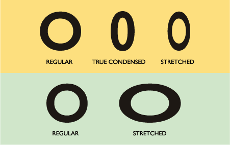
Take the above image as an example. Gill Sans comes in a Regular width and a companion Condensed version, which maintains the integrity of the stroke widths, contrast, and overall shape. The computer-generated stretched version has a distorted look because the verticals are squished while the horizontals remain the same width, resulting in an unattractive, pointy shape. The computer-expanded version also looks distorted due to its stretched verticals and awkward weight contrast.
A skillful designer will address the challenges of creating a good design, including the use of emphasis, contrast, and negative space, strictly with the appropriate choice of typeface(s) and the size and arrangement of the elements on the page. For those who say a two or three per cent distortion is acceptable, I say if it’s enough to make a difference in your design, its enough to adversely affect the integrity of your typography.
Love type? Want to know more? Ilene Strizver conducts her acclaimed Gourmet Typography workshops internationally. For more information on attending one or bringing it to your company, organization, or school, go to her site, call The Type Studio at 203-227-5929, or email Ilene at in**@***********io.com. Sign up for her e-newsletter at www.thetypestudio.com. You can also follow Ilene on Facebook and Twitter.
This article was last modified on August 15, 2021
This article was first published on November 11, 2009
Commenting is easier and faster when you're logged in!

Recommended for you

The Candy Wrapper Archive is One Sweet Collection of Package Design
If you’re looking for a little typographic inspiration, thoughts on the evolutio...

TypeTalk: Scaling Logos
TypeTalk is a regular blog on typography. Post your questions and comments by cl...
Free Emigre Type Specimen Catalogs
Emigre’s type specimen catalogs are known for their beautiful looks and de...