

Q. You’ve written about figures in Open Type fonts, both oldstyle and lining variants and tabular and proportional spacing. But I have trouble figuring out which fonts have which. Can you help unravel this numerical mystery?
A. I understand your confusion. Many type designers and foundries include more than one style of numeral in their fonts, but it’s not always easy to identify which styles are in a font.
Begin by selecting the font in question and bringing up the OpenType controls. In InDesign, you do so from the Control bar or by choosing Type > Character and selecting OpenType from the dropdown menu. In Illustrator, go to Window > Type > OpenType. In QuarkXPress (7.x and up), use the Measurements palette.
Now you should see the OpenType figure options. If the options are bracketed, the font only has one figure style (most often tabular lining).
If options are unbracketed, pay close attention — this is where the confusion and occasional inconsistency come in.
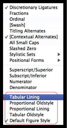
• InDesign lists all four figures styles as well as a Default figure option on the bottom of the OpenType panel. You can only select one.
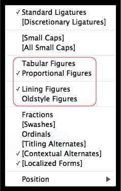
• Illustrator lists a Default figure option and all four figures styles in the OpenType panel’s figure pull-down menu. You can only select one.
• QuarkXPress (7.x and up) breaks up figure options into two groups: Tabular and Proportional, as well as Lining and Oldstyle. The user selects one option in each category.
If a font has all four figure styles, no problem — just choose among them. But in a font with more than one but less than all four figure styles, all options usually remain unbracketed and thus presumably selectable. This can be misleading. For instance, if a font has both proportional and tabular lining figures, such as ITC American Typewriter Pro, but no oldstyle figures, all remain unbracketed, even the nonexistent oldstyle.
The same situation can arise if a font has both proportional lining and oldstyle figures, but no tabular figures, which might still remain an unbracketed option.
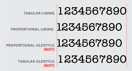
The solution to this problem? The fastest and easiest way is to set some numerals and see for yourself if the settings are accurate.
This article was last modified on May 29, 2023
This article was first published on October 29, 2009
Commenting is easier and faster when you're logged in!

Recommended for you

Helvetica A to Z
In recent years, Helvetica’s ascension to celebrity font status has been f...

TypeTalk: Designing For the Aging Eye
As we age, our eyes and vision change, making it more difficult to read – and fo...

Shag, A Retro Font Family with Roots
The Shag family of fonts is a fun, nostalgic collection inspired by the work of...