

TypeTalk is a regular blog on typography. Post your questions and comments by clicking on the Comments icon above.
Q. Are there guidelines for setting footnotes?
A. Footnotes and their cousin, endnotes, are explanatory notes or references that provide additional information about a point made in the main text. Footnotes appear at the bottom of a page, while endnotes are grouped together at the end of a chapter, article, document, or book.
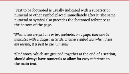
Text to be footnoted is usually indicated with a superscript numeral or other symbol placed immediately after it. The same numeral or symbol also precedes the footnoted reference at the bottom of the page. When there are just one or two footnotes on a page, you can indicate them with a dagger, asterisk, or other symbol. But when there are several, it’s best to use numerals. Endnotes, which are grouped together at the end of a section, should always have numerals to allow for easy reference to the main text.
You should set footnotes and endnotes slightly smaller than the body text — usually about two points smaller, as long as they remain readable. The line spacing can be a bit tighter than that of the body text, but this will vary based on the legibility and proportions of the typeface you use to set them. Set footnotes and endnotes in the same type family as the body text. In some instances, you can use a heavier weight or even an italic for better legibility, readability, and fit.
Figure 1. Footnotes can be indicated with a superscript numeral (upper), an asterisk (middle), or a dagger (lower). Set in TypeCulture’s Expo Serif Pro. Note: I enlarged the size of these examples so you can see them easily on your monitor. I don’t recommend this size for footnotes in your projects.
Unless the job or client in question has specific guidelines for footnotes and endnotes — often the case with academic and legal documents — use your judgment with respect to maintaining the overall readability of footnotes and endnotes.
Love type? Want to know more? Ilene Strizver conducts her acclaimed Gourmet Typography workshops internationally. For more information on attending one or bringing it to your company, organization, or school, go to her site, call The Type Studio at 203-227-5929, or email Ilene at in**@***********io.com. Sign up for her e-newsletter at www.thetypestudio.com.
This article was last modified on May 15, 2023
This article was first published on November 11, 2010
Commenting is easier and faster when you're logged in!

Recommended for you

InDesign How-to: Balance Columns with Vertical Justification
It’s not unusual for a layout to specify that all pages should start and end on...

Presenting Anisette, the Typeface with Three Sets of Caps
Anisette, designed by Jean François Porchez of Typofonderie in France, is not a...
The ABCs of H&J
Market research indicates that almost 90% of page layout software users never ti...