

Ever wonder what’s the purpose of the character that looks like a lowercase f with a short crossbar? And why is it in some fonts but not others?
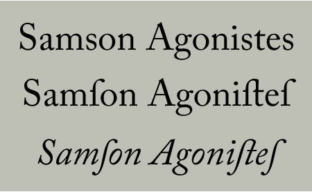
This mysterious character is not an f but a long s, which derived from the old Roman cursive medial s. In its upright form, it looks like f without the right side of the crossbar. The italic form of the long s usually lacks the crossbar entirely. Both the long and short forms of the lowercase s were used up until about 1800, after which they went out of fashion in most printing.
In this setting of Adobe Caslon Pro, the top line uses the modern lowercase short s (traditionally called the miniscule s). The lower two lines illustrate the different designs of the Roman (upright) and Italic versions of the long s.
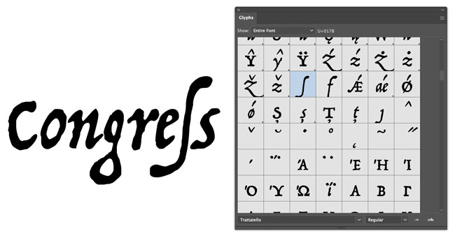
Because OpenType fonts can accommodate thousands of characters, the long s is popping up again in some typefaces. The two and three-letter long s ligatures are most often categorized as Standard Ligatures, while the single version is usually classified as a Historical Form.
Use the long s and its variants judiciously, as today’s readers are apt to read a long s as an f. But when you’re aiming for an historical look and feel, go for it!
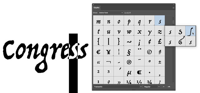
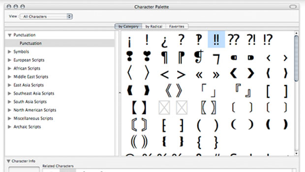
To enter a long s in text in InDesign or Illustrator, type a regular lowercase s and select it. Then head to the Glyphs panel and click and hold on the highlighted glyph to view the popup menu where you can choose alternates for the s, including the long one.
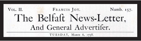
This facsimile of a 1738 newspaper set in Caslon Old Face contains the long s and its variants.
For more detailed information, check out James Mosley’s scholarly explanation.
This article was last modified on February 10, 2021
This article was first published on February 4, 2009
Commenting is easier and faster when you're logged in!

Recommended for you

Fonts on Friday: Food Fonts
What better time to round up new typefaces than on Friday. Not only is “Fo...
A Question of Character: Finding What You Need in Your Fonts, Part 2
In the previous installment of this column, I talked about the first generation...
1950s Filmotype Fonts Resurrected for the Digital Age
Press Release In the 1950s, the Filmotype machine — able to set over 500 a...