TypeTalk: Greeking Out

TypeTalk is a regular blog on typography. Post your questions and comments by clicking on the Comments icon above. If Ilene answers your question in the blog, you’ll receive one Official Creativepro.com T-Shirt!
Q. Is it ok to greek text in a preliminary layout? I’ve heard both yes and no.
A. Greeking is the name given to placeholder or dummy text used in place of actual text. Greeked text often begins with Lorem ipsum. Although originally derived from classic Latin literature (Cicero’s De Finibus Bonorum et Malorum), it is basically nonsensical.
Some designers use greeked text in the preliminary stages of a design when final copy isn’t available. I advise against it, especially if you’re showing the design to clients. Greeked text attracts attention to itself by virtue of its unreadability, thus distracting the eye from the overall layout.
I think a better solution is to use dummy copy that’s English so that nonsensical text doesn’t distract from the entire layout. The ideal dummy text relates to the topic (especially the first sentence or paragraph). Look for suitable placeholder text on the Web, such as Project Gutenberg.
If you’re determined to use nonsense text, you can do so easily in InDesign and QuarkXPress.
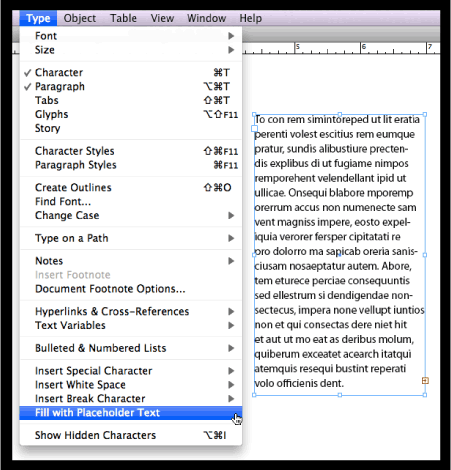
InDesign:
1. Select or place curser in textbox
2. Go to Type > Fill with Placeholder Text

QuarkXPress:
1. Place curser in textbox
2. Go to Utilities > Jabber

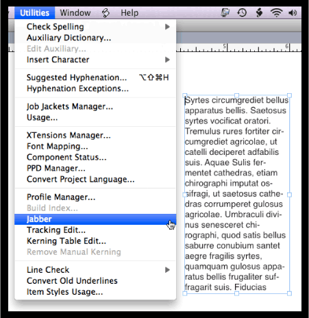
Note that in QuarkXPress 8, the Jabber text (from Lewis Carroll’s word-play poem “Jabberwocky”) is not editable, but it is in some previous versions.
Love type? Want to know more? Ilene Strizver conducts her acclaimed Gourmet Typography workshops internationally. For more information on attending one or bringing it to your company, organization, or school, go to her site, call The Type Studio at 203-227-5929, or email Ilene at [email protected]. Sign up for her e-newsletter at www.thetypestudio.com. You can also follow Ilene on Facebook and Twitter.

Ilene Strizver is a noted typographic educator, author, designer and founder of The Type Studio in Westport, Connecticut. Her book, Type Rules! The designer’s guide to professional typography, is now in its 4th edition.
  • Anonymous says:

    I used placeholder text in five sample voucher designs (in InDesign CS4) where the terms and conditions were to go. The next time I opened up the vouchers (I opened all five at the same time) my machine ground to a halt. The reason… I eventually figured out, was that I had dynamic spelling turned on. As soon as I turned it off, I was back to normal speed. But remember, Greeked text is not compatible with Dynamic Spelling

  • Anonymous says:

    While I agree the “Lorem ipsum” can be distracting, it’s also a problem using real English text. And if it’s ‘appropriate’ to the client, you risk them reading it and focusing on the words. The worst thing you can do is throw in rough headlines and subheads, particularly jokey ones. Many clients will take them literally and get distracted by the fact that you’re not “on message”.

    I say this having had to explain it too many times!

    Personally I think there’s a case for representing text more like the traditional marker layout using grey lines or boxes.

    Greek text is handy when you’re thinking typography, to get the ‘colour’ of alternative typefaces.

  • Anonymous says:

    Maybe this is just true in the academic world (I’m an art director at a University), but I’ve found that the closer my fake text is to what my client expects to see in the final product, the more problem I have convincing them that it’s just fake text and will be replaced. I’ve had people get into irrational arguments with me over it and waste time trying to edit it! Using greeking makes it easy. They seem to get immediately that they’re looking at placeholder text and move on. –Don

  • Anonymous says:

    While I agree the “Lorem ipsum” can be distracting, it’s also a problem using real English text. And if it’s ‘appropriate’ to the client, you risk them reading it and focusing on the words. The worst thing you can do is throw in rough headlines and subheads, particularly jokey ones. Many clients will take them literally and get distracted by the fact that you’re not “on message”. I say this having had to explain it too many times
    sesli sohbet sesli chat

  • Anonymous says:

    While I agree the “Lorem ipsum” can be distracting, it’s also a problem using real English text. And if it’s ‘appropriate’ to the client, you risk them reading it and focusing on the words. The worst thing you can do is throw in rough headlines and subheads, particularly jokey ones. Many clients will take them literally and get distracted by the fact that you’re not “on message”. I say this having had to explain it too many times
    Bakiresohbet

  • Anonymous says:

    Maybe this is just true in the academic world (I’m an art director at a University), but I’ve found that the closer my fake text is to what my client expects to see in the final product, the more problem I omegle sohbet have convincing them that it’s just fake text and will be replaced. I’ve had people get into irrational arguments with me over it and waste time trying to edit it! Using greeking makes it easy. chat roulette They seem to get immediately that they’re looking at placeholder text and move on. –Don

  • >