

TypeTalk is a regular blog on typography. Post your questions and comments by clicking on the Comments icon above. If Ilene answers your question in the blog, you’ll receive one Official Creativepro.com T-Shirt!
Q.Thanks for last week’s post on vertical alignment. now can you write about horizontal alignment? I often see centered lines that don’t look truly centered.
A. Creating proper horizontal alignment is a bit more challenging than vertical alignment due to the subtleties involved, but it’s just as important to professional-looking typography.
Software aligns characters by the edge of the character plus its side-bearing, which is the space added to the right and left of a character in a font to prevent it from crashing into other characters. The characteristics of the spacing of certain characters, such as a cap T, A, the numeral 1, as well as periods, commas, apostrophes, dashes, quotations marks, and ellipses, will often create a visual hole or indentation at the beginning or end of a line, making that line appear to be slightly off-center. This occurrence is magnified in larger type settings, including centered headlines and subheads.
When this occurs, shift the line in question slightly to the right or left until it visually looks centered. The easiest and most precise method (and least problematic when changes are made to the size and font) is to kern the offending character to a space added before or after it until the line looks visually centered.
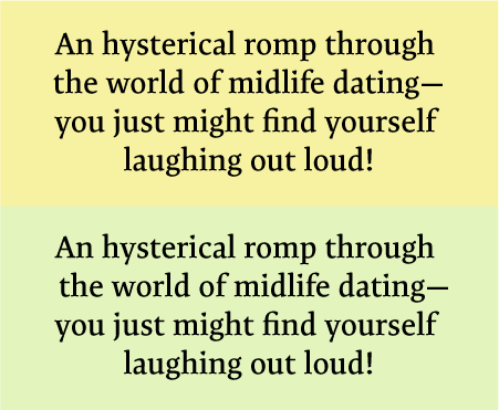
The example on the yellow background is technically centered using Adobe Illustrator’s Align center command, but the second line visually appears off (too far to the left to be exact) due to the em dash at the end of the line which has a lot of negative space above and below it. The horizontal alignment is improved in the example on the green background by adding two word spaces at the beginning of that line, and then using negative kerning between the spaces to fine-tune it. Set in TypeCulture Expo Serif Pro.
Love type? Want to know more? Ilene Strizver conducts her acclaimed Gourmet Typography workshops internationally. For more information on attending one or bringing it to your company, organization, or school, go to her site, call The Type Studio at 203-227-5929, or email Ilene at in**@***********io.com. Sign up for her e-newsletter at www.thetypestudio.com.
This article was last modified on January 4, 2022
This article was first published on November 20, 2008
Commenting is easier and faster when you're logged in!

Recommended for you
Inkwell: a Type Family for Expressive Writing
A very striking and unusual typeface family recently caught my eye: Inkwell. Thi...

Typographic Checklist for Top Notch Typography
One of the challenges of setting type, a major component of most design work, is...

Neue Haas Unica: The Lost Sequel to Univers and Helvetica
Pardon me for waxing enthusiastic. Some things are just too cool to stay calm ab...