
Q. What is an interrobang?
A. An interrobang is a seldom-used, non-standard punctuation mark that combines a question mark and an exclamation point. It was invented in 1962 by Martin K. Speckter, an advertising executive and editor of a magazine called Type Talks, to fill a gap in punctuation (particularly in advertising headlines) in which neither an exclamation point nor a question mark could fully convey the writer’s intention. He came up with the interrobang to indicates an exclamatory or rhetorical question, such as “Can you believe that?!”
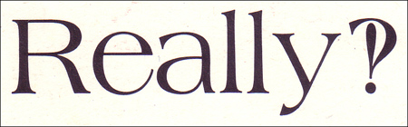
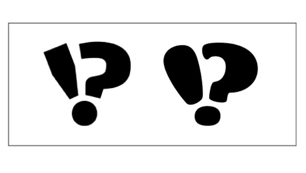
Figure 1. The interrobang in use in the Americana typeface, designed by Richard Isbell. This was the original design of the interrobang. This character is not included in digital versions of the font.
It garnered attention from some graphic designers and type enthusiasts in the 1960s and was included in several fonts of the time, including Americana, which was designed by Richard Isbell and released by ATF (American Type Founders) in 1967. After that, its popularity faded for decades. It has experienced a mild resurgence lately, making appearances in more-current designs, including Amplitude Wide Bold and Fritz Robusto by Christian Schwartz, Constantia by John Hudson, and Fontesque Sans by Nick Shinn.
The usefulness of this 20th century punctuation mark, as well as the soundness of the design, is controversial among writers and typeface designers alike. These days, it’s used more for its clever-sounding name than the actual symbol, such as in the title of a publication from The Society of Typographic Aficionados (SOTA), a letterpress studio, a design studio, and other non-typographic applications — all of which go by or include “interrobang.”

Figure 2. Amplitude Wide Bold and Fritz Robusto, both designed by Christian Schwartz, contain different interpretations of the interrobang.
This article was last modified on June 20, 2022
This article was first published on September 3, 2009
Commenting is easier and faster when you're logged in!

Recommended for you

TypeTalk: A Dash of This, a Dash of That
TypeTalk is a regular blog on typography. Post your questions and comments by cl...
Jan Tschichold, Master Typographer of the 20th Century
Few have left deeper impressions on modern typography than Jan Tschichold, desig...
Marrying Types: Sans on Sans
Finding typefaces that work well together can be tricky. There are no mix-and-ma...