

Q. How can I get the best result when setting justified text? My boss told me to use tracking to fix badly spaced lines, but I was taught that this is a no-no.
A. You are right to question the use of tracking in justified settings, but let’s look at the big picture before addressing the details.
You justify type by adjusting the space between words and letters, and in some cases, by adjusting the glyphs themselves. The objective of good justification is to achieve even color and texture (similar to unjustified text); to avoid very tight or very open lines that interrupt the texture; and to prevent rivers of white space.
Factors affecting justification are the column width, type size, and width of the typeface used — all of which contribute to the average number of characters per line, which is the most important factor in how justified text will look.
Having said that, I don’t advise justifying type unless the above factors result in even color and texture.
If you must justify type on a too narrow width, play around with the settings in the software application’s justification palette to see if you can get a better result. There is no one solution for everyone, as results depend on the specs of your type, the actual text (text with shorter words will justify better than text with very long words), and your preferred hyphenation settings. Use trial and error, keep a record of your findings for different layouts, and change the defaults as need be.
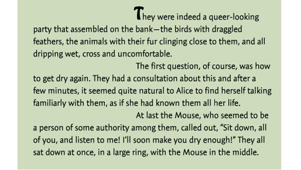
A narrow column width (left) often results in justified text with lots of holes and rivers of white space. A wider setting (right), while not perfect, improves the color and the texture. Tale of Two Cities, by Charles Dickens, set in TypeCulture Expo Sans.
This article was last modified on January 9, 2022
This article was first published on April 1, 2008
Commenting is easier and faster when you're logged in!

Recommended for you

This Week in InDesign Articles, Number 123
Last week was “pi approximation day” (22/7) so I’ve been thinking a lot about es...
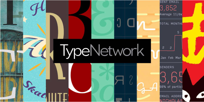
Font Bureau and Partners Launch Type Network
For the past two decades, Font Bureau has been one of the leading digital type f...
TypeTalk: Creative Indents
TypeTalk is a regular blog on typography. Post your questions and comments by cl...