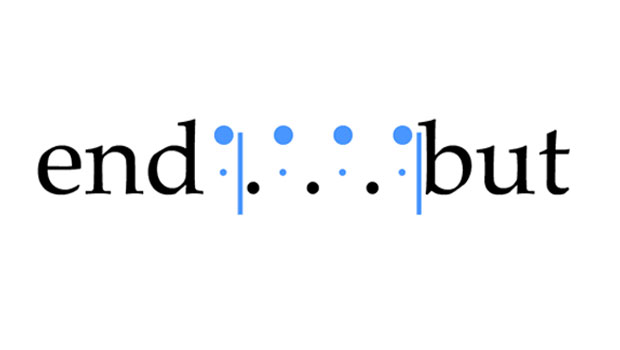
Q. What is a nonbreaking space?
A. This space is actually a command that prevents two words (or any type grouping separated by a space) from being broken apart at the end of a line. You can use nonbreaking spaces (also called word joiners in QuarkXPress) to prevent proper nouns, titles, and headlines from splitting at the end of a line.
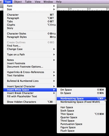
Nonbreaking Spaces in InDesign
InDesign has two kinds of nonbreaking spaces: flexible and fixed width.
The Nonbreaking Space is the same flexible width as you’d get by pressing the spacebar, but it prevents the text in question from being broken at the space character. Use this one for justified settings.
The Nonbreaking Space (Fixed Width) also prevents the text from being broken at the space character but doesn’t expand or compress in justified text.
To access either kind, highlight the word space between the words or characters in question. Choose Type > Insert White Space and select the Nonbreaking Space you desire.
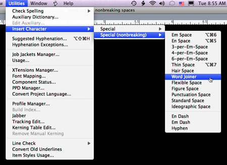
QuarkXPress
Quark calls a nonbreaking space a Word Joiner. To access it, place the cursor before the character you don’t want to break. Choose Utilities > Insert Character > Special (nonbreaking) and select Word Joiner.
This article was last modified on August 18, 2021
This article was first published on July 8, 2009
Commenting is easier and faster when you're logged in!

Recommended for you

InFocus: April 2017
A bewitching bouquet of InDesign-related goodies, just in time for spring.

TypeTalk: To Hang or not to Hang…
TypeTalk is a regular blog on typography. Post your questions and comments by cl...