

TypeTalk is a regular blog on typography. Post your questions and comments by clicking on the Comments icon above. If Ilene answers your question in the blog, you’ll receive one Official Creativepro.com T-Shirt!
Q. Kerning is a black art I have yet to get my head around. How much is too much? Is it purely visual or can it be mathematical?
A. Kerning is the adjustment of space between two specific characters. While there usually are hundreds of kern pairs built into a font, sometimes you have to make manual kern adjustments — mostly to display type — to balance out the negative spaces between some letter combinations.
The goal of kerning, as well as proper letterfit in general, is to create even color, texture, and balance between all characters. All character pairs should theoretically have the same negative space between them.
Another way to look at it is to imagine pouring sand in-between each pair of characters: Every space should have roughly the same volume of sand. This might sound simple, but in reality, it can be difficult to achieve due to the idiosyncrasies of the individual characters. So in answer to your question, it is a combination of mathematical and visual.
Here are five basic principles to keep in mind when kerning:
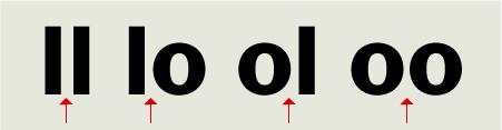
1. Proper kerning begins with understanding the spatial relationship between straight-sided characters, such as an l, and rounded characters, such as an o. Here’s the concept: the distance between two straight characters begins with one value; the distance between a straight and a round character (or vice versa) should be slightly less than two straights in order to visually look similar; and the distance between two rounds is slightly less than a straight and a round for the same reason. The operative word here is “slightly,” as round-to-rounds are often over-kerned by people unfamiliar with proper kerning principles (or with an untrained eye). Note that some characters are a combination of straight and round, such as b, d, g, p, and q.
Figure 1. Note the relationship between the space of straight and rounded characters: straight to straights are one distance, straight to rounds (and vice versa) are slightly less, and round to rounds are slightly less than that. Set in ITC Franklin Pro.
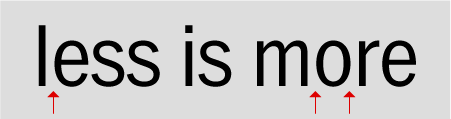
2. Like, or similar, letterforms have like, or similar, spacing. That is, a round to a straight character in a specific setting, such as “or,” should have the same spacing as a straight to a round, such as “le.”
Figure 2. Similar letterforms, such as le, mo, and or, should have the same space between them. Set in ITC Franklin Narrow Pro.
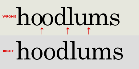
3. Straight-sided characters with serifs should not touch each other. (Neither should rounds, for that matter.) Diagonals can touch or overlap slightly, as well as some other combinations whose shapes create large negative spaces, but it’s a question of taste, not a hard and fast rule.
Figure 3. Straight characters with serifs shouldn’t touch each other, as shown in the upper example. Neither should rounds to rounds. The lower image illustrates the proper relationships. Set in Century.
4. Don’t over-kern. “Less is more” when you’re becoming familiar with proper kerning. When in doubt, go without… kerning, that is.
5. Consistency is critical! When kerning, review your work often to make sure you maintain consistent negative spaces, especially between the same or similar characters.
Figure 4. Both EW combinations are spaced differently in this example of inconsistent kerning. They should look exactly the same. Set in Gloucester MT Extra Condensed.

You can train your eye to see spacing more acutely by observing character shapes and their spacing all around you — subway posters, magazines, book covers, packaging, menus, logos, etc. Just as musicians practice their instruments, or athletes practice their sport, looking at your surroundings with a critical eye will help you to see spatial relationships that you have trouble seeing now, which in turn will help you to properly kern your typography.
Click here for my follow-up column on kerning.
Love type? Want to know more? Ilene Strizver conducts her acclaimed Gourmet Typography workshops internationally. For more information on attending one or bringing it to your company, organization, or school, go to her site, call The Type Studio at 203-227-5929, or email Ilene at in**@***********io.com. Sign up for her e-newsletter at www.thetypestudio.com.
This article was last modified on January 8, 2022
This article was first published on October 9, 2008
Commenting is easier and faster when you're logged in!

Recommended for you
25 Gorgeous Typographic Experiments
Ah, typography! Is there anything that inspires print designers more? No? Then g...
Redesigning Concert Tickets
Because they’re so familiar, the design of everyday things can become invisible....

InType: Making Text Fit
When you have too much text to fit a given space and editing is not an option, u...