
TypeTalk is a regular blog on typography. Post your questions and comments by clicking on the Comments icon above. If Ilene answers your question in the blog, you’ll receive one Official Creativepro.com T-Shirt!
Q. Is there a difference between readability and legibility, or do they mean the same thing?
A. Although it might seem like splitting hairs, there is a difference between the two: Legibility refers to the design of the typeface, while readability refers to how the typeface is set.
The legibility of a typeface is related to the characteristics inherent in its design, including x-height, character shapes, stroke contrast, the size of its counters, and weight, all of which relate to the ability to differentiate one letter from another.
Legibility is more of a consideration for text designs; the more legible a typeface is, the longer you can hold the reader’s attention. Because display faces are generally used for a few words in larger settings where the objective is to be instantly noticeable and to convey a mood or a feeling, legibility might not be as important.
Readability is related to how you arrange the type. Factors affecting type’s readability include point size, line spacing, letter spacing, word spacing, line length, and alignment. Therefore, a legible typeface can be made unreadable by how it is typeset, while a typeface with low legibility can be made more readable in the same way.
Figure 1. ITC Johann Sparking, a powerful handwriting design, is not the most legible of typefaces, especially when set for blocks of copy in small sizes, but its readability increases when set larger for just a couple of words. From the Gettysburg Address.
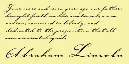
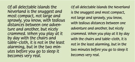
Figure 2. Even a legible typeface, such as ITC Flora, can lose readability when set 14/15. But its readability improves dramatically when set 12/18. From Peter Pan by J. Barrie.
Love type? Want to know more? Ilene Strizver conducts her acclaimed Gourmet Typography workshops internationally. For more information on attending one or bringing it to your company, organization, or school, go to her site, call The Type Studio at 203-227-5929, or email Ilene at in**@***********io.com. Sign up for her e-newsletter at www.thetypestudio.com.
This article was last modified on January 8, 2022
This article was first published on June 12, 2008
Commenting is easier and faster when you're logged in!

Recommended for you

Scanning Around With Gene: Where the Steering Wheel is on the Wrong Side
I’ve never owned a British car, though I’ve been attracted to a few...

Fonts Bundled with Adobe CS4
In his blog Typblography, Adobe’s Product Manager for Fonts & Global Typogra...

Take Your Inner Child to the Letter Playground
Professional illustrator Nate Williams says that creativity comes from “cu...