

TypeTalk is a regular blog on typography. Post your questions and comments by clicking on the Comments icon above. If Ilene answers your question in the blog, you’ll receive one Official Creativepro.com T-Shirt!
Q. I’m designing a typographic logo that will be used in sizes both relatively small (a business card) and very large (signage). Are there tricks to make a logo readable in a range of sizes?
A. Absolutely! The concept is simple: You can tweak the logo so that it’s readable, legible, and visually in proportion in a range of sizes. Many people don’t realize that logos often have several versions that correspond to size ranges, all of which is specified in the company’s design guidelines.
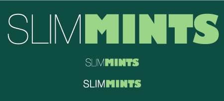
This logo set in Helvetica Neue Ultra Light and Gill Sans Ultra Bold looks fine at the larger size (top), but when reduced (middle), it looks too tight, and the word SLIM looks too light. The improved reduced version (bottom) has its tracking opened up, as well as Helvetica Neue Light replacing the Ultra Light.
Scaling type or a logo visually changes its appearance, so your adjustments to the design must be subtle and gradual to give the illusion of being exactly the same at all sizes. The tweaking can include adjusting the letter, word, and line spacing (making them more open as the logo gets smaller); opening the counters (enclosed negative spaces within a character); and adjusting the weight of the thin strokes or the entire letterforms (heavier as the logo gets smaller, and vice versa).
Before you begin a logo design, ask about the size range for its final usage, and deliver versions with specific size ranges for each use.
Love type? Want to know more? Ilene Strizver conducts her acclaimed Gourmet Typography workshops internationally. For more information on attending one or bringing it to your company, organization, or school, go to her site, call The Type Studio at 203-227-5929, or email Ilene at in**@***********io.com. Sign up for her e-newsletter at www.thetypestudio.com.
This article was last modified on January 4, 2022
This article was first published on January 8, 2009
Commenting is easier and faster when you're logged in!

Recommended for you
TypeTalk: The Best Fonts for Newsprint
TypeTalk is a regular blog on typography. Post your questions and comments by cl...
The Exquisite Stylings of deVicq Design
Roberto de Vicq is an award-winning designer who is known for his stylish, sophi...

Legibility and Readability: What’s the Difference?
Learn the difference between "legible" text and "readable" text and how to ensur...