
TypeTalk is a regular blog on typography. Post your questions and comments by clicking on the Comments icon above. If Ilene answers your question in the blog, you’ll receive one Official Creativepro.com T-Shirt!
Q. I see so many business cards that contain phone numbers with bad spacing. What is the best way to remedy this?
A. Some people — even a few designers — think that worrying about phone numbers on business cards and other collateral is too picky. But since business cards, letterheads, labels, and other identity and branding materials represent a person or company, they deserve careful attention. And it’s as important for a Fortune 500 Company as it is for the student or job hunter hoping to make a good first impression.
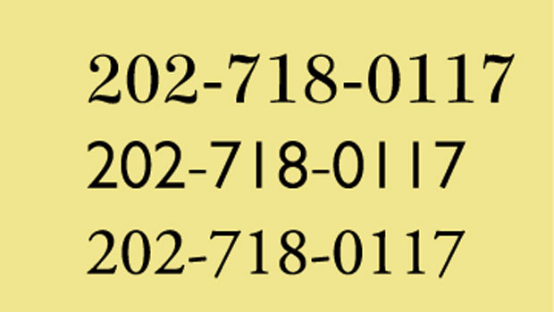
Begin by setting the phone number using the desired style of numeral. Lining figures are the most common numeral style in the majority of Type1 and TrueType text fonts, as well as the default in most OpenType fonts. Let’s start with them, as they usually need the most attention.
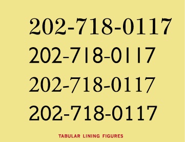
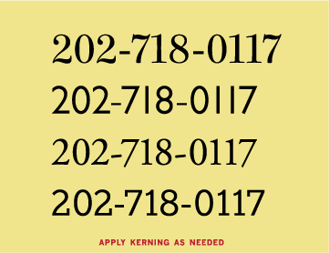
If the spacing is too open around the numeral 1 and uneven in general as shown in the example below, the numerals are most likely tabular. That means they’re designed to align vertically in columns but look uneven when set horizontally. For tips on making these kinds of numerals look as good as possible, see “TypeTalk: Make the Most of What You Have.”
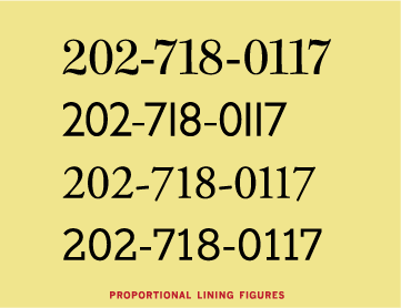
If you’re using an OpenType font, it might contain proportional lining figures, so check the OpenType palette and choose proportional lining figures if they’re available. Read “TypeTalk: Find Figure Styles in OpenType Fonts” for details.
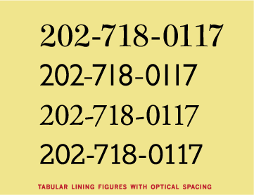
If your font doesn’t have proportional lining figures but you’re using InDesign or Illustrator, highlight the numerals and change the kerning to the Optical setting, which will improve the overall spacing.
If you’re still dissatisfied with the spacing, or if your program doesn’t have Optical kerning, use manual kerning to adjust the spacing until you achieve even color and spacing between all the numerals. Be sure to enlarge the type on your screen when kerning to see what you’re doing at a higher resolution.
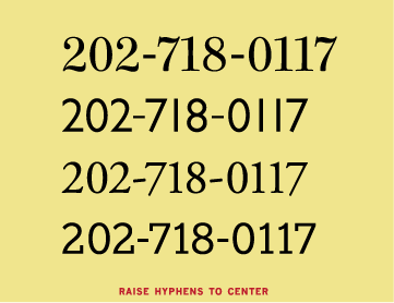
If you separate numerals with a hyphen (as opposed to a period, for instance), you’ll most likely need to raise the hyphen a bit using the baseline shift. That’s because hyphens are generally centered against a font’s lowercase characters, not caps and lining figures.
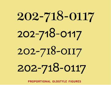
If your font contains Proportional Oldstyle figures, as many OpenType fonts do, try them — you probably won’t need to make any spacing adjustment.
I set the above examples in Consul, Gill Sans Pro, Adobe Garamond Pro, and Egyptian Slate Pro.
Love type? Want to know more? Ilene Strizver conducts her acclaimed Gourmet Typography workshops internationally. For more information on attending one or bringing it to your company, organization, or school, go to her site, call The Type Studio at 203-227-5929, or email Ilene at in**@***********io.com. Sign up for her e-newsletter at www.thetypestudio.com.
This article was last modified on August 13, 2021
This article was first published on January 28, 2010
Commenting is easier and faster when you're logged in!

Recommended for you

TypeTalk: Ellipsis Etiquette
TypeTalk is a regular blog on typography. Post your questions and comments by cl...

Creative Blöks: The Perfection Fairy
Each step you take on a creative path—whether you’re designing, drawing, or deve...
