
Q. What exactly is a ligature, and what is the difference between a standard and a discretionary ligature?
A. A ligature is a special character created by connecting or combining two or more characters into one.
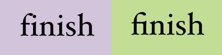
A standard ligature solves the problem of characters crashing into each other when set next to each other. The most common standard ligatures are the f-ligatures: fi, fl, and sometimes ff, ffi, and ffl. These specially designed letter combinations avoid the unattractive collision that occurs in some typefaces between the hook of the ‘f’ and the dot of the ‘i,’ or the ascender of the ‘l’ or second ‘f’.
The problem of the colliding characters (left) is elegantly solved by Hoefler Text’s fi ligature (right).
The fi and fl ligatures are standard in most fonts and are usually turned on by default in design programs. Many of the new OpenType fonts contain more standard ligatures than just these two.
A discretionary ligature is more decorative in nature and, as the name implies, is intended to be used at your discretion. Discretionary ligatures can be historic, ornamental, elegant, or just plain fun. Although occasionally part of Type1 and TrueType fonts, discretionary ligatures are more common in newer OpenType fonts.
The discretionary ligatures of Adobe’s Bickham Script Pro and ITC Rennie Mackintosh dramatically alter the appearance of these words.

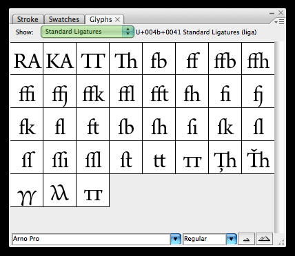
You can access ligatures in two ways: globally by turning them on and off from an OpenType palette, or individually by clicking on them from a glyph palette.
You can view Arno Pro’s standard and discretionary ligatures separately using the pull-down menu of the glyph palette. As you can see in the upper example, there are many more standard ligatures in this typeface than the typical fi and fl, including all-cap and long s (looks like an f with only half a crossbar) ligatures. Below it are Arno Pro’s historic discretionary ligatures.

Note that if your tracking is extreme, some programs replace ligatures with the original single characters to maintain consistent spacing.
This article was last modified on October 23, 2023
This article was first published on January 15, 2009
Commenting is easier and faster when you're logged in!

Recommended for you

RTF Stern: A New Font in TrueType, PostScript OpenType & Hot Metal!
Stern was created at the Pie Tree Press & Type foundry in collaboration with...
The History of Olympic Poster Design
In search of some world-class design inspiration? Check out the huge collection...

10 Typefaces from the '80s
Typefaces go in and out of style, and except for a handful of perennial favorite...