

TypeTalk is a regular blog on typography. Post your questions and comments by clicking on the Comments icon above.
Q. Do you have any suggestions or guidelines for the use of initial caps?
A. Initial letters—enlarged letters (not just capital letters) used as the first character of a paragraph—can be a dramatic and powerful graphic element that can add visual interest and excitement to a page. They can also direct your readers’ eyes to the beginning of an article or another content entry point.
Initial letters come in several styles:
Dropped: The enlarged character begins at/aligns with the first line of text and drops down into the body text.
Raised, or stick up: The baseline of the initial aligns with the first line of text and raises above the body text.
Overlapped: The enlarged initial overlaps and (partially) sits behind the text, or a combination of the above.
They can be used for brochures, annual reports, editorial design, invitations, and many other projects.
Here are some usage basic guidelines:
• Don’t limit yourself to the same typeface as your body copy. Experiment with different weights, styles, and versions. In fact, decorative, calligraphic and ornate type styles can create a very effective and striking contrast. You can even use a lowercase character or even a whole word if you are bold enough!
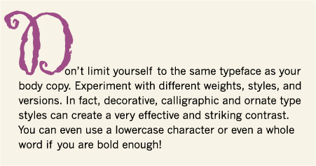
Set in Gigi and News Gothic.
• The key to using initial letters successfully is proper alignment. If the character is intended to appear flush left with the text, it should align optically rather than mechanically. Certain characters, such as those with rounds (C, O, S, etc.), diagonals (A, V, W, Y) and characters with serifs (which get proportionally larger with size), should be pulled out of the margin a bit to align visually. Create and adjust your initial manually, rather than using the initial cap feature of your software to get the results you want.
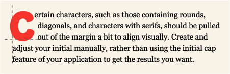
Set in ITC Eborg and Georgia.
• If the initial cap is the first letter of a word, rather than a single-letter word, such as “A” or “I”, try and move the rest of the word close enough to the initial so that the eye reads it as a single word.
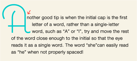
Set in Coquette and Helvetica Neue.
• Don’t repeat the letter you use as the initial cap at the beginning of the body text.
• Don’t use too many initial letters in one layout. One per length of copy or long section is enough.
And last but not least, use your imagination, have fun, but don’t sacrifice readability for style.
Love type? Want to know more? Ilene Strizver conducts her acclaimed Gourmet Typography workshops internationally. For more information on attending one or bringing it to your company, organization, or school, go to her site, call The Type Studio at 203-227-5929, or email Ilene at in**@***********io.com. Sign up for her e-newsletter at www.thetypestudio.com.
This article was last modified on August 12, 2021
This article was first published on August 25, 2010
Commenting is easier and faster when you're logged in!

Recommended for you

Download Famed Type Magazine Online
Richard Nixon was inaugurated for his second term as president of the United Sta...

TypeTalk: Finding and Using Alternate Characters
Alternate characters allow you to spice up your type, but unless you take the ti...

Scanning Around With Gene: Getting Your Kinks at Home
One of my favorite magazines, at least from a vintage perspective, is Popular Me...