
TypeTalk is a regular blog on typography. Post your questions and comments by clicking on the Comments icon above. If Ilene answers your question in the blog, you’ll receive one Official Creativepro.com T-Shirt!
Q. I’m bored with the look of digital fonts, even the ones that try to look grungy. Do I have other options?
A. Most definitely! In the days before personal computers (or “BC”), designers and art directors created nontraditional type and type treatments using their imagination. We can still do that today.
For example, you can make words using press-on letters or by writing in paint, pencil, charcoal, and so on. You can then use a camera or copy machine to copy, distress, distort, and scale those words. Try crumpling up a photocopy and copying the crumpled paper. Once you like the look, you can scan the results and place them in your digital design.
Nancy Campbell and Trevett McCandliss are a design duo who create exciting, expressive designs, often using tools other than digital fonts and software.
In this spread about couture shoes and a girl who loves them, Nancy Campbell and Trevett McCandliss wrote the title in red lipstick on a large mirror in their hotel room to capture the spirit of her obsession. Talk about low budget! Footwear Plus Magazine. Creative Director: Nancy Campbell. Art Director: Trevett McCandliss. Shot by Andrew Woffinden.

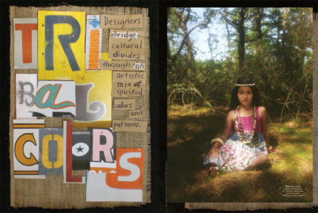
“Ransom typography” is the approach used in this spread about ethnic-inspired clothing. “We wanted to create type that felt raw and hand-done. Trevett has a huge digital photo ?le of interesting typography he has shot on buildings, signs, etc.,” explains Nancy. Using print-outs of the found type, Trevett did a collage on burlap. Nancy added the subhead in handwriting. The collage was then shot on a digital camera. Earnshaw’s Magazine. Creative Director: Nancy Campbell. Art Director: Trevett McCandliss. Shot by Aneta Bartos with an antique Polaroid camera.
To give the appearance of cold type (literally) for this spread, the pair actually froze the type! “We bought 3-D wooden type at an art supply store and painted it. We ?lled a large plastic container with 2 inches of water and let it freeze overnight. The type was added on top of ice and then water was added to the container. When frozen, we ran the block under warm water to create interesting cracks. The block was put on a windowsill with a desk lamp behind the ice to create a glow. It was then shot with a digital camera.” Earnshaw’s Magazine. Creative Director: Nancy Campbell. Art Director: Trevett McCandliss. Shot in polaroids by Diane Vasil.

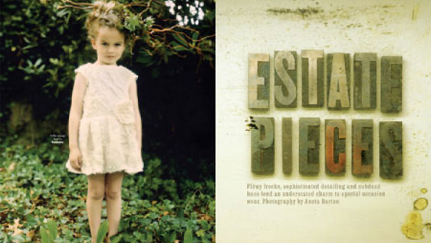
In this opening spread of a story about classic children’s fashion, the pair went for a vintage-inspired treatment using wood type photographed in an antique mirror (which is why it is right-reading) to complement the antique classic beauty of the photography. Earnshaw’s Magazine. Creative Director: Nancy Campbell. Art Director: Trevett McCandliss. Wood type supplied by Ross MacDonald. Type photographed by Alison Cartwright.

Opener to a fashion story about using recycled products in footwear. “We created type using found items. At a scrap metal junkyard we bought about $30 worth of stuff. We borrowed vintage items, including aged hardware from an antique store.” The type was designed by Nancy using scrap, antiques, roses and India ink with oil pastels on brown paper. The type page was shot by Trevett. Going Greener Digital Magazine. Creative Director: Nancy Campbell. Art Director: Trevett McCandliss. The shoe page was shot by Dean Powell.

Don’t be a slave to your computer for your design inspiration. Step away from your desk, close your eyes, and get into your head, and you might come up with your best work yet!
Love type? Want to know more? Ilene Strizver conducts her acclaimed Gourmet Typography workshops internationally. For more information on attending one or bringing it to your company, organization, or school, go to her site, call The Type Studio at 203-227-5929, or email Ilene at in**@***********io.com. Sign up for her e-newsletter at www.thetypestudio.com. You can also follow Ilene on Facebook and Twitter.
This article was last modified on May 15, 2023
This article was first published on November 24, 2009
Commenting is easier and faster when you're logged in!

Recommended for you

InPerson Interview: Nadine Chahine
David Blatner interviews an expert in Middle Eastern type design to learn about...

Free WhatTheFont for the iPhone
WhatTheFont has long been available online for people who need to identify a cer...

Legibility and Readability: What’s the Difference?
Learn the difference between "legible" text and "readable" text and how to ensur...