
What better time than January to make typographic resolutions? Adhering to the ten points below is a great start. And if you already have all of these rules down pat, give the list to someone else. Just change “I shall not” to “You shall not” and you have the Ten Commandments of Type!
One: I shall not fall in love with a typeface that doesn’t fit the project at hand.
Two: I shall always use “smart” (or typographer’s) quotes and apostrophes, and save the use of “dumb” (or typewriter) quotes for inch and foot marks. Ideally, I shall use primes for inch and foot marks.
Three: I shall not letterspace lowercase characters, set lengthy text in ALL CAPS, or set swash typefaces in all caps.
Four: I shall not take for granted that my type is properly aligned. I shall always check the horizontal alignment of any centered headlines, which might visually appear off-center due quotation marks, dashes, asterisks, or other punctuation at the beginning or end of a line. I shall also check the vertical alignment of heads and subheads, which can look unequal, especially when a line of all caps is mixed in with upper and lowercase text.
Five: I shall choose typographic treatments that honor my clients’ needs, desires, and wishes, and that support my clients’ design and marketing objectives, target audience, and readability requirements.
Six: I shall not murder type by applying over-the-top distortion, including scaling, extensive outlines, shadows, glows, or any computer effect that goes too far.
Seven: I shall look out for widows and orphans and eliminate them by whatever means available to me within the context of the work.
Eight: I shall not steal my neighbor’s fonts, denying the designer and/or foundry of their rightful royalty for their blood, sweat, and tears.
Nine: I shall not use typefaces just because they appeal to my personal taste. I shall conduct extensive font explorations, not limited to the fonts I have on my computer, until I find the right typeface(s) for the job.
Ten: I shall not commit typographic adultery by combining fonts poorly. When in doubt, I shall explore the use of type families, super families, or systems, such as the Scala, Stone, and Compatil families.
This article was last modified on August 12, 2021
This article was first published on January 12, 2011
Commenting is easier and faster when you're logged in!

Recommended for you
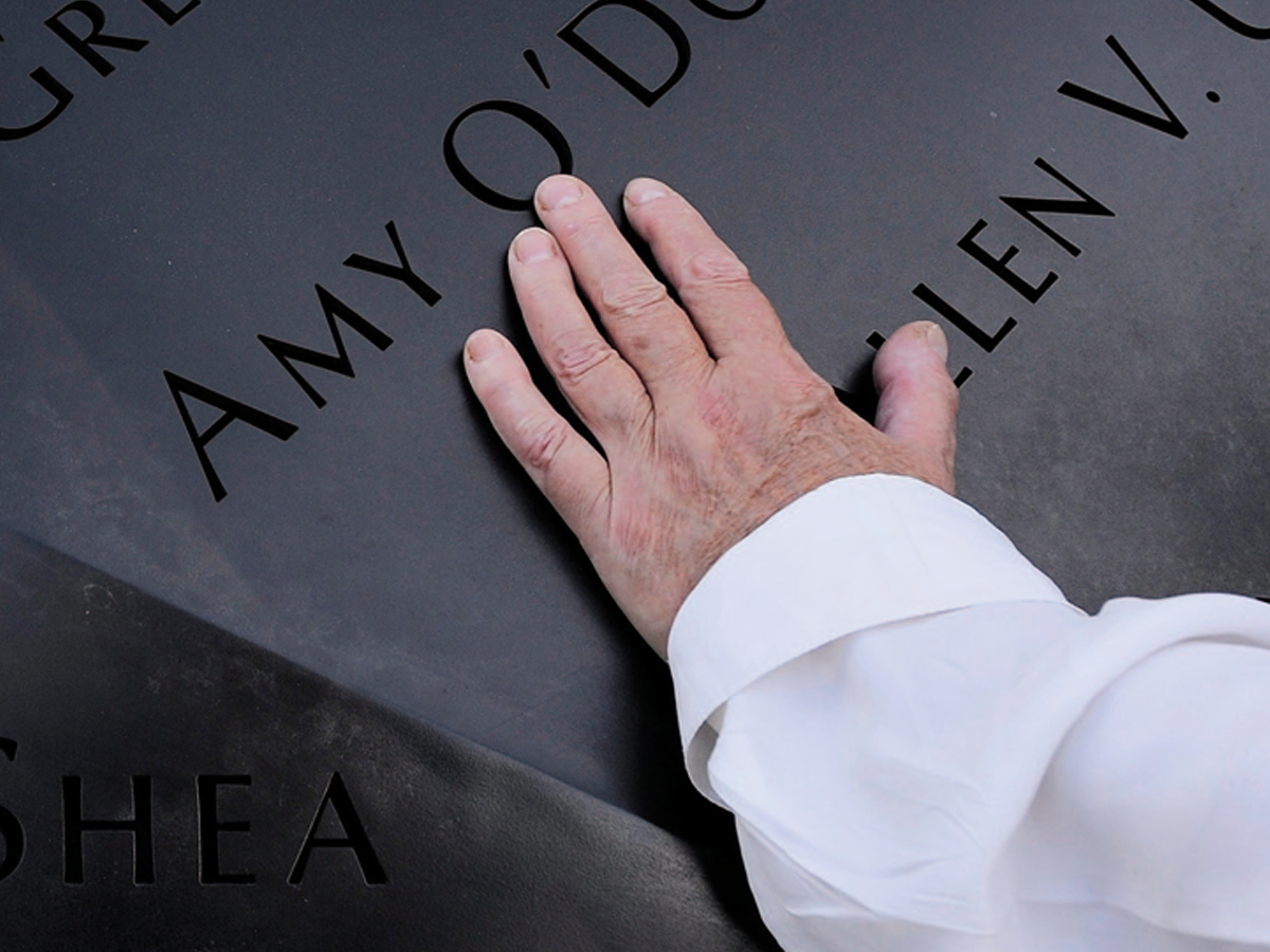
Before&After: Optima: The Typeface of 9/11
How Optima brings dignity and humanity to the National September 11th Memorial.
InDesign Typography
InDesign users who want to improve their typography knowledge and skills have an...

TypeTalk: Which Flavor of OpenType Is Best?
There are two kinds of OpenType fonts: CFF and TTF. Learn the difference and whi...