
Q. How can I tell the difference between a text font and a display font? Are there any rules for their use?
A. The bad news is there is no easy, automatic way to tell if a typeface was originally intended for text or display usage. But the good news is no matter what their intended usage, many fonts can be used for both.
Let’s start from the beginning. There are two primary categories of type: text and display. In general, text type is designed to be legible and readable at small sizes. This usually implies fairly clean, consistent, uncomplicated design features; more open spacing than a display face; and thin strokes that hold up at smaller sizes. Display type, on the other hand, can forgo the extreme legibility and readability needed for long blocks of text at small sizes for a stronger personality, elaborate and more expressive shapes, and a more stylish look.
Sometimes they’re interchangeable, but not always. Typefaces look different depending on the size at which you view them. Spacing, proportions, and design details change optically. A text face used at large sizes can sometimes look clunky, heavy, and unattractive, and the spacing looks too open. On the other hand, display designs used at small sizes can have design features that break up, disappear, or fill in when viewed small; become less readable; and look too tight.
To avoid unwanted surprises when choosing a typeface, always try to see how it looks at the size(s) you plan on using. It’s very difficult to visualize what 14-point text will look like from a 60-point showing, and vice versa. In addition, pay close attention to the spacing, and be prepared to open or close the spacing (tracking) as necessary.
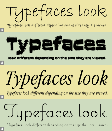
Compare and Contrast:
1. This setting of ITC Bradley Hand looks very natural at the smaller, handwriting size, but looks clunky and unremarkable when set large.
2. ITC Aftershock is dramatic and powerful at display sizes, but its details get muddy and blurred at smaller sizes.
3 and 4. ITC Garamond Condensed and Mark Simonson’s Coquette look great at any size.
This article was last modified on October 23, 2023
This article was first published on April 16, 2008
Commenting is easier and faster when you're logged in!

Recommended for you

Type Talk: Gerard Huerta, Master of Hand Lettering
Gerard Huerta is one of the most highly-respected and accomplished lettering des...

"Typeface" the Movie Now on iTunes
Press Release Typeface is now available for download on iTunes for just $14.99!...
5 Great Script Fonts From Adobe Fonts
Need a great script font for use in your next InDesign project? Look no further!