Hot Stuff

Weekly Contest
myPANTONE for iPhone and iPod Touch & PANTONE COLOR BRIDGE coated
CreativePro.com Podcast
Don't miss it! Updated every Monday.
FREE Mags for Creative Pros!
Creativity, Website Magazine, and more!
TypeTalk: Trademark and Register Symbols
Register and trademark symbols may seem clunky and intrusive, but once you know how to set them correctly, they'll harmonize with the rest of your design.
Written by Ilene Strizver on January 21, 2009
Related Articles
TypeTalk is a regular blog on typography. Post your questions and comments by clicking on the Comments icon above. If Ilene answers your question in the blog, you'll receive one Official Creativepro.com T-Shirt!
Q. Are there any rules for setting register and trademark symbols? What sizes, positions, and fonts are best?
A. These symbols, while annoying to the designer, are legal designations that are required to appear in certain places. While there are no hard and fast rules to how to use them, there are guidelines to using them tastefully (if that is possible!).
The size and design of register and trademark symbols vary widely from font to font. For this reason, you're not married to those in the font in use and are free to adjust the typeface as well as the size and position. (Unless it conflicts with your client’s guidelines, of course.)
Register and trademark symbols can take many shapes and sizes. I set the examples below in Abadi Condensed, ITC Abaton, Antenna, Variex, Adobe Caslon Pro, Enclave, Gill Sans Pro, Myriad Pro, ITC Redonda, and ITC True Grit.

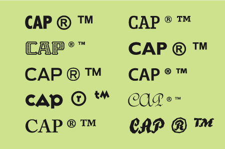
Although many designers prefer to use serif symbols with serif fonts and sans with sans, it's acceptable (and sometimes preferable) to substitute a clean sans symbol (such as those from Arial or ITC Franklin Gothic), as they tend to be more readable and print cleanly at small sizes.
When you're setting text, make register and trademark symbols a little smaller than half the x-height of the adjacent word. At display sizes, the symbols should be proportionately smaller, especially in headlines. In general, the symbols should look clean and legible yet unobtrusive.
Next, adjust the vertical position to your liking using baseline shift. You can align the vertical position with the cap height, x-height, or even the baseline -- wherever it looks best.
Finally, use kerning to position the symbol horizontally. You’ll probably want to enlarge the image on your screen so you can see the spatial relationships more accurately, but be sure to print it as well to see the relationships in scale.
The register symbol in Jimbo Std is well-proportioned for this particular setting (upper). On the other hand, the register symbol in Interstate Black (lower) is quite large and heavy. The setting is much improved when I replace the register symbol with the Regular weight of Interstate, and then reduce its size and adjust position using baseline shift and kerning.

Love type? Want to know more? Ilene Strizver conducts her acclaimed Gourmet Typography workshops internationally. For more information on attending one or bringing it to your company, organization, or school, go to her site, call The Type Studio at 203-227-5929, or email Ilene at info@thetypestudio.com. Sign up for her e-newsletter at www.thetypestudio.com.


using the superscript option...
I have to set these quite often. I find that some of the Pro Open Type fonts have the registration and the TM correctly sized and positioned, but not all. Other times I find that using the superscript option in InDesign (CS2) and Illustrator (CS2) is quite good. When these options fail, then I default to using the methods described above. Obviously if you are only doing one instance of a TM or registration mark, not a problem, but if you do it multiple times, across many documents these options are quicker and almost as good.
trademark symbols
Probably most important after composition is that the trademark symbol, generally speaking, need only be used at the first appearance of the trademark name in a single document. Using it more than once is unnecessary and grossly unattractive.
Interesting Post
I enjoyed your post on the technical aspects of including (r) or tm symbols in typography. Two questions and a comment:
Question: Some trademarks are not trademarks, but "service marks" (technically, all marks used in connection with a service, as opposed to a good, constitute a service mark). The abbreviation for an unregistered service mark is "sm". There isn't an ASCII code for "sm", which makes using it (especially in body text, and REALLY especially on the web) nearly impossible. Do you have any hints to help web designers if their client wants an "sm" mark rather than a TM?
Question: Many trademarks are "design" marks, meaning that it may be a non-word symbol (like the Pepsi swirl, for example, for the NBC peacock). What are your thoughts about setting the symbols when there are no words with which to compare it?
Comment: I wish you would have included a paragraph just letting the typographers know the purpose of the mark designation. TM is for trademarks that have not been registered (at least in the US) with the U.S. Patent & Trademark Office. It can mean that an application is on file, or it can mean that, even though no registration has been sought, the trademark owner claims "common law" or state trademark rights. Adding the "TM" notice is very important to include, because it is the only way to communicate
to the public and to competitors that you're claiming this word as a trademark. I'm sure clients would appreciate a design professional simply asking: "Are there any other words, designs, or symbols in this piece that you claim as a trademark for any particular goods or services?"
(R) is the designation for trademarks that have been registered with the USPTO. There is a (slim) possibility that if a person uses an (R) symbol improperly, the rights holder could forfeit some of her rights in the trademark. So a good design professional may just want to ask the client (especially if the client is smaller): "Has a federal trademark registration been issued for all of the trademarks with which you've requested that we apply the (r) symbol"?
Thanks again for the post,
Kyle Kaiser
arbitraryandfanciful.wordpress.com
trademark symbols
Although it's true that a registered trademark or trademark can be used the first time a trademark is used, that also is up to the client. I've had clients who wanted a circle r the first time it was used on every spread, and others who want it used every single time a name appears. Their typesetting looked like it was hit by gunfire. Also some clients demand a statement at the end spelling out their rights like "Product is a registered trademark of Company."
Trademark and Register Symbols
First time into forums and I find these really useful. Hanging quoatation marks and where to place register symbols didn't register with me until now. JUst placed them before, now I have guidelines. Thanks and I think I have a lot of catching up to do with this forum.
Fantastic post. Bookmarked
Fantastic post. Bookmarked this site and emailed it to a few friends, your post was that great, keep it up.

Register and trademark symbols
It's also worth noting that you only need to use these symbols once per trademark (in each piece of work) for them to serve their legal role of notifying the reader these words are a trademark or registered trademark. There's nothing more distracting than reading text that's interrupted by "TM" on every second line. Or, as I've seen in some, every second word. Note, too, that the legal validity of "TM" varies from jurisdiction to jurisdiction.
TypeTalk
Thanks for sharing these info with us!

I will keep in touch with your blog reading...
Great, your example in the
Great, your example in the above posts also made things easier...
Registerd Mark Placement
Is there a standard for placement of this mark? Does it belong on the text baseline, or should it be superscripted, like the trademark symbol? Our company added a tag line to our logo for branding long enough ago that it is now registered. The new artwork arrived with the R superscripted. It sits next to our logo - which has the same symbol on the baseline. Please help!
Greate
Great article, thank you for sharing with all of us
Hey, I'm new to this board
Hey, I'm new to this board and I just wanted to say that this is the freindliest boards I have ever seen. Keep the good work.


Excellent post thank you
Excellent post thank you very much for taking the time to share with those who are starting on the subject. Greetings
