

Q. Are there official terms for the variants of the lowercase a and lowercase g?
A. The official terms are not very official-sounding, but here’s the scoop. There are two forms of the lowercase letter a: the single-story (sometimes spelled storey) and the double-story (or storey). These variations can also be referred to as “one-story” and “two-story.”
The single-story version is the one most of us learn to write as children and is commonly (but not exclusively) used in handwriting, calligraphy, and many italics. The two-story version is more common in Roman, or upright, typestyles. Both versions evolved from the capital letterform, as you can see in some Uncial scripts where the A looks like a combination of both. Uncial scripts are all-cap letterforms that appeared in Greek and Latin manuscripts from the fourth to the eighth century AD.
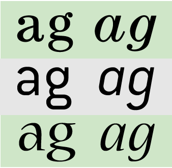
Figure 1. ITC Century Book, ITC Conduit, and Nueva Std. all happen to contain double-story versions of a and g for the upright versions and single-story for the italics.
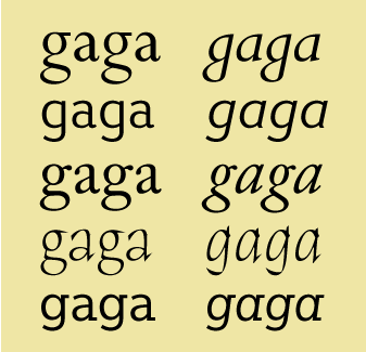
Figure 2. Other typefaces vary tremendously in the style of their a’s and g’s, as shown in these examples set in Perpetua, Giacomo 2.0, Adobe Caslon Pro, ITC Humana Serif, and Egyptian Slate Pro.
The lowercase g also comes in single- and double-story variants (sometimes referred to as the opentail g and the looptail g). We learn to write the single-story g as children, and it’s most common in handwriting, calligraphy, and italics. The more ornate two-story g is found in many Roman, or upright, typestyles.
These rules of appearance are very loose. You’ll see either version of both characters in any typeface following no discernible rule. Even so, knowing the terminology and recognizing the differences between the versions give you a tool to observe differences in typestyles and a language to discuss them.
Read more about the history of the letters A and G.
This article was last modified on April 25, 2024
This article was first published on February 19, 2009
Commenting is easier and faster when you're logged in!

Recommended for you

InFocus: April 2017
A bewitching bouquet of InDesign-related goodies, just in time for spring.

In White Space, No One Can Hear You Scream
This is a new column on type, which will appear on CreativePro.com approximately...
Rag Time Is Perfect Game for Picky Typographers
Fathom, an information design company, has created a game called Rag Time. With...